Food & Drink
Feast For The Eyes
The power of plating.
From Arômes where carrots are adorned with wild carrot flowers to La Cuchara where edible borage blossoms pretty up a plate of veal crudo, in an era of
Instagram, area chefs understand that presentation is everything. (In fact, University of Oxford researchers recently conducted a study in which they
concluded that ingredient arrangement plays a crucial role in influencing taste.) From color to texture to height to shape, there are a multitude of visual
elements to consider when practicing plating as a form of high art. To talk about edible artistry, we checked in with Bagby Group’s corporate executive
chef Chris Becker and Cunningham’s executive chef Jason Lear, who are known for their well-designed dishes. Says Lear, “When that plate goes down before your first bite,
you’re already judging the dish.”

Put Down Roots
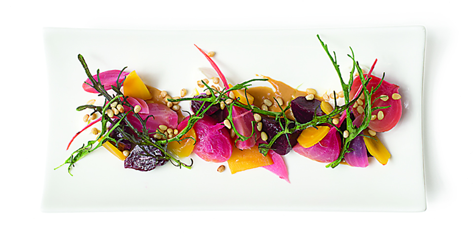
Just in time for Thanksgiving, here’s the step-by-step on how to build a beautiful beet salad:
*Start with a white canvas. “White makes the color pop,” says Becker. “And a square plate is more modern.”
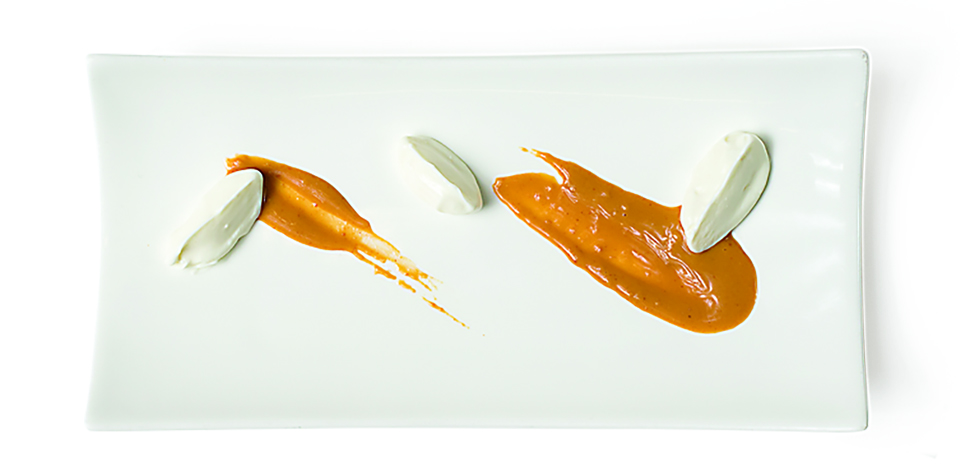
1.Smear pine-nut butter with the back of a canelé spoon to make a “swoosh.” The swoosh adds a design element, a nutty taste, and glues the foundation. Add Greek yogurt for coolness and a counterpoint of color.
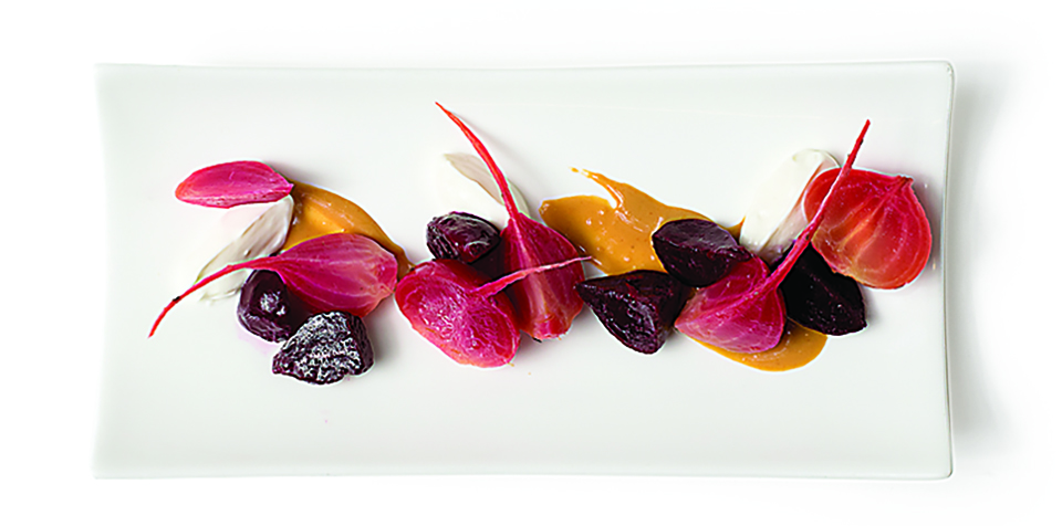
2.Toss red and striated beets in raspberry vinaigrette. Next, arrange several quarters of beets to add height to the plate. Ideally, beets are all a slightly different size to reflect their just-picked farm freshness.
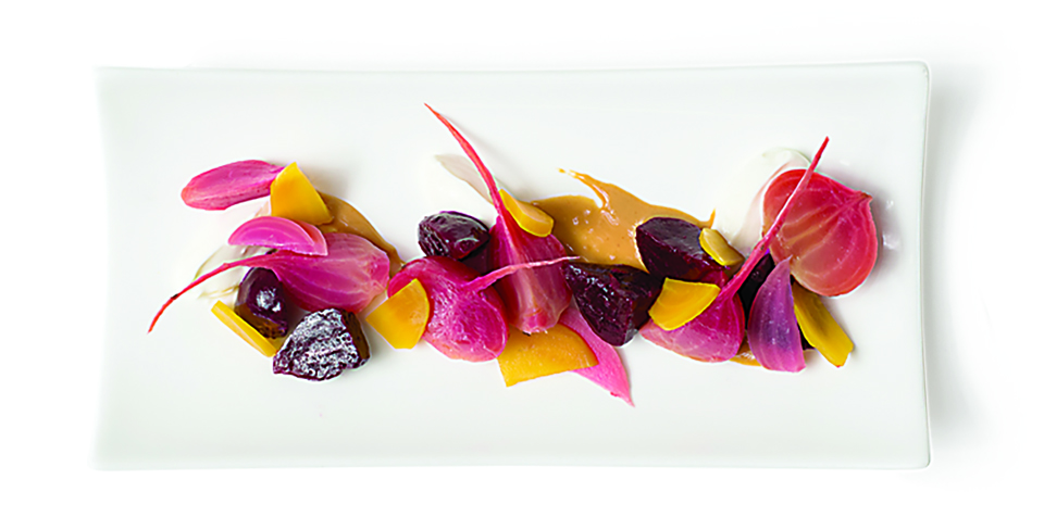
3.Use orange beets to add to the color palette and create visual interest.
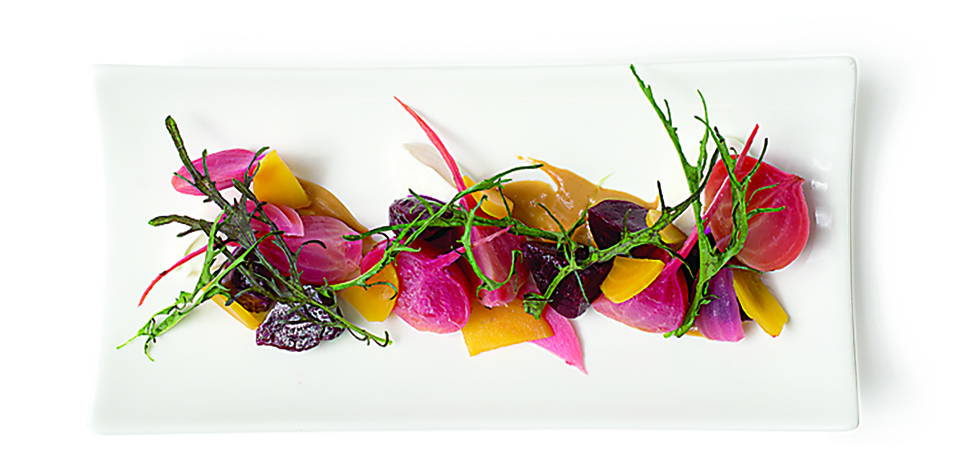
4.Dress the salad with several strands of mizuna. (“Odd numbers usually look best,” says Lear.)

5.For a finishing touch, sprinkle eye-catching beets with pine nuts to create crunch and visual variety. “We don’t put anything on the plate that we don’t need,” says Becker. “We let the ingredients speak for themselves.”
THE SHAPE OF THINGS TO COME
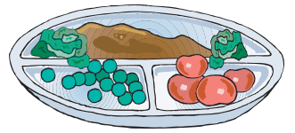
“In the ’70s, we had TV dinners with everything compartmentalized,” says Jason Lear. “Then in the early ’90s and into the 2000s, everything was stacked and
mushed. Now, the trend is that everything looks like it was pushed over and fell to follow the natural contours of the plate."
