Education & Family
The New Nursery
Design a space that will grow with both baby and parents.

Listen up, parents-to-be—gray is the new pink or blue. When it comes to decorating the nursery, more and more families are opting for soft, neutral tones over the bright, themed, gender-specific designs of the past.
But that’s not the only change going on in the world of baby-room design. We checked in with some of the metro area’s top interior designers to find out what’s hot and what’s not, and they offered lots of advice on things to consider before you buy that big bag of garish stick-on wall giraffes.
For starters, the décor tastes of grown-ups are being taken a little more seriously.
“A lot of my clients request a nursery that isn’t too juvenile,” says Elizabeth Lawson, a Baltimore-based interior designer who works with clients across the country. “They want the room to grow with their child. They also want a nursery with a gender-neutral color scheme, because, later on, the room may be used for a second child.”
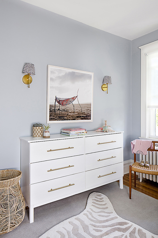
A project Lawson recently completed for a family expecting a baby girl, for example, opted for cool-toned blueish-gray walls rather than pink. Layered rugs over the hardwood floor add warmth and texture, while a white dresser’s gold-bar drawer pulls give the room a grown-up, luxe touch.
Absent are the typical baby animals or ABCs art—instead, a framed photo print of a dusty pink handkerchief on a sandy beach complements the room’s soft color palette.
“We’re also designing with a lot of wood tones and natural materials,” Lawson adds, pointing to the wicker baskets used for storage, unstained natural wood crib, and watercolor bedding.

While it’s a good idea to let a favorite print or accent color inspire your design, Lawson points out one reason parents should avoid anything too “theme-y.” “Grandparents and other family members have the tendency to get carried away, and you’ll be seeing elephants and ducks for years to come,” she says with a laugh.
Nurseries are also adopting a cleaner, less busy look, following in the footsteps of popular interior-design trends, such as minimalist decor and mid-century modern furniture. “The hottest trend right now is eclectic minimalism, and by that I mean nurseries that don’t follow a formula and are relatively sparse compared to nurseries of five years ago,” says Mary Bauer, founder and president of Bratt Decor, a Baltimore-based company that makes designer children’s furniture. “Parents today are breaking old rules of full matching suites of furniture with one voice. We are seeing ornate cribs with modern dressers and custom bedding. Black and white nurseries are a thing right now, too.”
The grown-ups can also win this one: Creating a room that will outlive its initial raison d’être can mean adopting furniture styles and color palettes found in the kitchen and adult living areas.
While two white models of Bratt Decor’s classic-looking iron cribs are its best sellers, Bauer says she’s seeing a rise in black, too. But regardless of the color or style, parents most value furniture that grows with their child.
“Always choose a crib that will transition into a toddler bed, daybed, or full bed,” Bauer advises. “All of our designs can be used indefinitely.”
The concept extends beyond the crib. “When designing, we think a lot about how the nursery will grow with the child, because they grow quickly,” Lawson says. “Rather than using a changing table that is strictly a changing table, I always recommend using a dresser and placing a changing pad on top.”
It’s a concept Ashley Barbalato took to heart when putting together the nursery for her now 14-month-old son, Julien, in the Riverside rowhome she and her husband recently remodeled.
“I wanted to be able to reuse many of the pieces in the future and have things that would grow with my son,” she recalls. “I love monochromatic schemes that allow for a lot of flexibility with accessories. I tried to keep things timeless and simple, but still playful.”
While Barbalato stuck to the neutral tones across the walls and furniture, she infused the space with pops of texture and personality with a few fun pieces, including a fluffy “rocking sheep”—a Nordic take on the traditional rocking horse—made from natural carved wood and soft cream-colored fur. In the center of the ceiling hangs a fanciful light in the shape of a gold crown that looks as though it was plucked from the head of Max in Maurice Sendak’s classic children’s book, Where the Wild Things Are.
“Once my son outgrew the infant stage, I wanted to have as little of a transition as possible into the toddler stage,” Barbalato adds. “I didn’t want to spend more money on things like artwork, bedding and storage. Instead, I chose pieces that I knew would keep up with my child’s interests and growth.”
Finally, Mom and Dad can be a little self-indulgent: As a new parent, you’ll be spending countless—sometimes stressful—hours in this space, so Lawson recommends a tranquil design where you can relax. “Simplicity is key,” Lawson adds. “Parenting is stressful and exhausting and the nursery should be a calming refuge at all times.”
With that in mind, parents shouldn’t skimp on aspects of the room that will make the space enjoyable for them, too. “It needs to be comfortable for both parents and baby,” says Lawson. “A comfortable chair or glider is a must.”
Barbalato agrees. “Keep your baby’s room clean and simple. It will create a calm space for you and your little one. Accessorize for play and imagination. Lastly, remember this is a space that you will spend a lot of time in, too. How do you want to feel in the space? What would you like to see? Moms are allowed to be selfish sometimes, too!”
The Nursery Checklist
Our panel of designers also offered some useful advice on planning the space.
Don’t Rush
“My clients usually want to get started designing their nursery right away, because they’re excited,” Lawson says. “But the first thing new parents should consider when designing is functionality and making sure they have the appropriate furniture pieces.”
Most expectant moms do the bulk of nursery prep in the second trimester, according to a reader survey by The Bump, a website for first-time millennial parents. Cribs and other furniture can take 10 or more weeks to be delivered, so experts recommend parents make selecting and ordering it a priority.
Customize
Nursery checklists are a great place to get started—just be sure to customize them to your family’s needs. As rowhome residents, for example, the Barbalato family learned to select pieces that served multiple functions in order to maximize the tight space. “I’ve actually learned that less is more when it comes to my child’s room,” she says. “When I was first designing and furnishing it, I felt like I had to have everything on ‘The Baby List,’ but that’s not the case.”
Think about the space
With space at a premium, Barbalato says she reevaluated larger pieces that some books and websites cited as must-haves. “Do we really need something like a huge ottoman to accompany our glider? I learned that we don’t. Instead, we have an oversized floor pouf that worked great during those sleepless nights and is now serving as an awesome climbing gym for my son.”
It’s all in the details
When creating your own checklist, think about your specific needs. Will the baby’s room be hit with a strong afternoon sun? Blackout curtains are a must, then, for making mid-day naps easier. Live on a busy street? Consider a sound machine to cancel out outside noises that could keep baby up. Flexible lighting options—like a soft lamp and night light in addition to the overhead light—can help you adapt the brightness for the room’s many uses, from playtime to middle-of-the-night diaper changes and feedings.