Home & Design Awards
For the first time ever, Baltimore magazine honors the top design visionaries in Charm City.
Edited by Janelle Erlichman Diamond
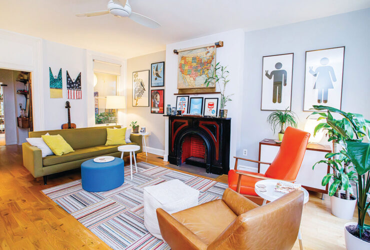
Opener: EastWing Architects—our rising star recipient—won for both Rowhome Revitalization and Library Design for this quintessential Baltimore rowhome. —Photography by Derek & Vee

When it comes to architectural and interior design in Baltimore, creativity abounds. This is a place where old meets new and traditional meets unconventional, from the historic homes of Guilford to the iconic rowhomes of Fells Point. We have an incredible abundance of great talent who have turned many dwellings into showstoppers. That’s why we’ve decided to highlight the best local residential architects, interior designers, builders, and landscape designers in our inaugural Home & Design Awards.
Chosen by a panel of nationally renowned professionals, these 33 winners—in some cases, the same project won in multiple categories—enrich the design landscape from the city to the bay.
Meet the Judges

Lee Starke
Lee Starke is a project manager and interior designer for Cline Design Associates in Raleigh, North Carolina. Starke leads and manages an expansive portfolio of projects, from large-scale residential buildings to golf clubhouses and corporate office spaces.

Bob Wetmore
As a principal partner and one of the two founding partners of Austin-based Cornerstone Architects, Bob Wetmore has developed the company’s design principles and oversees the design development for luxury residential and resort architecture on an international scale.

Kinley Puzey
Kinley Puzey has spent the last 18 years in the design and construction industry. In 2015, he founded Utah-based Onyx Design Collective, which specializes in high-end residential and one-of-a-kind commercial projects.

Kayla Cooper
Kayla Cooper has a bachelor’s degree in industrial design and engineering and a master’s in architecture from Boston Architectural College. Cooper’s first job was designing cars in the automotive industry before moving into fashion and then starting Kayla Cooper Design.

Michelle Rossomando
Michelle Rossomando is a principal and president of McKinney York Architects. She leads planning and design on the firm’s most complex civic, cultural, and higher-education projects for institutional and commercial clients.

Alison Kenworthy
Alison Kenworthy is the founder and CEO of Homeworthy, a media platform devoted to extraordinary people and the beautiful places they call home. The platform has 50 million views. She is a three-time Emmy Award-winning television producer formerly with ABC News and Good Morning America.

Durston Saylor
General Excellence | Architecture
Purple Cherry Architects
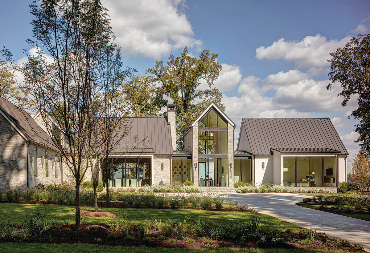
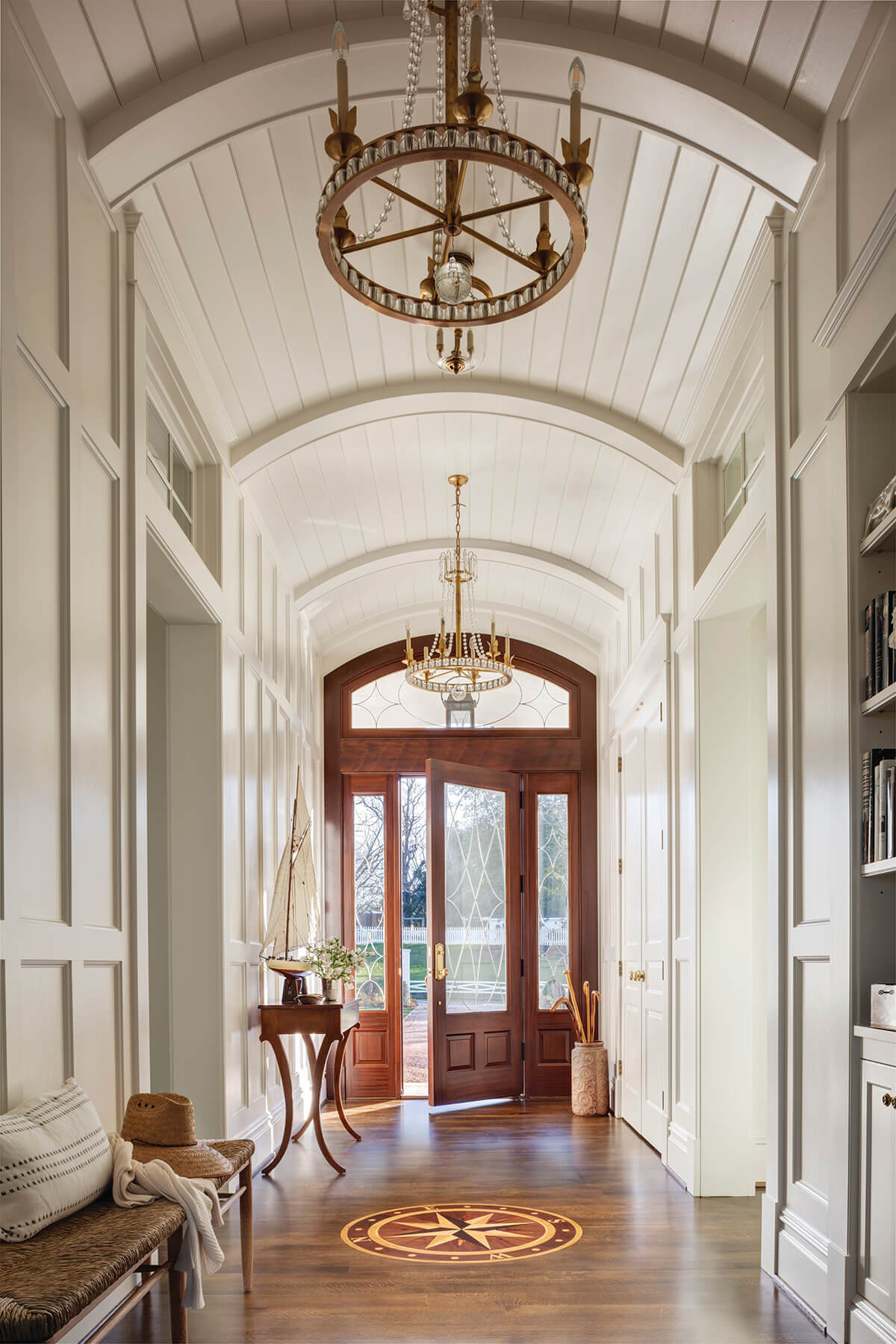
For more than 30 years, Purple Cherry Architects, helmed by Cathy Purple Cherry, has brought to life luxurious residences guided by a desire to produce exceptional homes. Each project—composed with intelligence, sensitivity, and experience—becomes the beautiful backdrop for creating memories. The Annapolis-based firm has extensive experience in designing homes with a view—which includes orienting the property to maximize the vista and understanding and utilizing both wind direction and the path of the sun. They simply produce “classic and beautiful designs,” says judge Alison Kenworthy, founder and CEO of Homeworthy. They’ve built an impressive portfolio of custom residences, says judge Michelle Rossomando, a principal and president of McKinney York Architects. “They are well-detailed with a good use of both natural materials and natural light.” And she notes, “A nice range of traditional and contemporary style.”
Durston Saylor
General Excellence | Interior Design
Purple Cherry Architects
Passionate about their work, the Purple Cherry Architects team considers not only physical forms, but the emotional connections clients will have with their homes and the spaces within them. “Everything they do is beautiful and timeless,” says Kenworthy. The Purple Cherry Interior Design Studio is known for their seamlessly coordinated interior architecture and décor including finishes, wall coverings, and color selections; custom millwork, kitchen cabinetry, coffered ceilings, and built-in bookcases; flooring, lighting, and plumbing fixtures; selection of furniture, upholstery, accessories, and window coverings; and curation and placement of artwork. “It’s consistent, beautiful work,” says Bob Wetmore, principal partner and one of the two founding partners of Cornerstone Architects.
Derek & Vee
Rising Star
Eastwing Architects
This Baltimore firm makes it their duty to contribute positively to the enrichment of their community and seek clients who care deeply about the quality of the spaces they inhabit. “Vibrant and fresh with modern aesthetics, EastWing is truly captivating,” says judge Kayla Cooper, founder of Kayla Cooper Design. They find inspiration in the raw, industrial forms and textures of Baltimore and strive to use conventional materials in unconventional ways. “They are birthing a unique spin on industry trends,” she says. Their expertise lies in the careful rehabilitation of historic structures and breathing new life into the forgotten details of the past, while creating architecture that looks toward the future. Each home is a celebration of the people who dwell within them. Says Cooper, “The raw talent is evident.”
Julie Hove Andersen
Readers' Choice
2E Architects
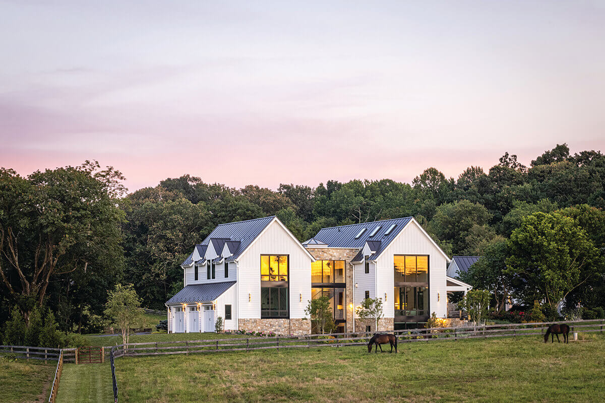
Readers were immediately drawn to this modern farmhouse on a working horse farm. When Timonium-based 2e Architects designed the home, a connection to the land was critical. The foyer features a glass and walnut staircase with a massive window to display Baltimore County’s beautiful rolling hills. The great room features six walnut trusses and skylights between each truss to highlight the room’s volume and create constantly shifting light. The main idea was to design a home that was both elegant and still a little casual.
Jennifer Hughes
Legacy
Jenkins Baer Associates
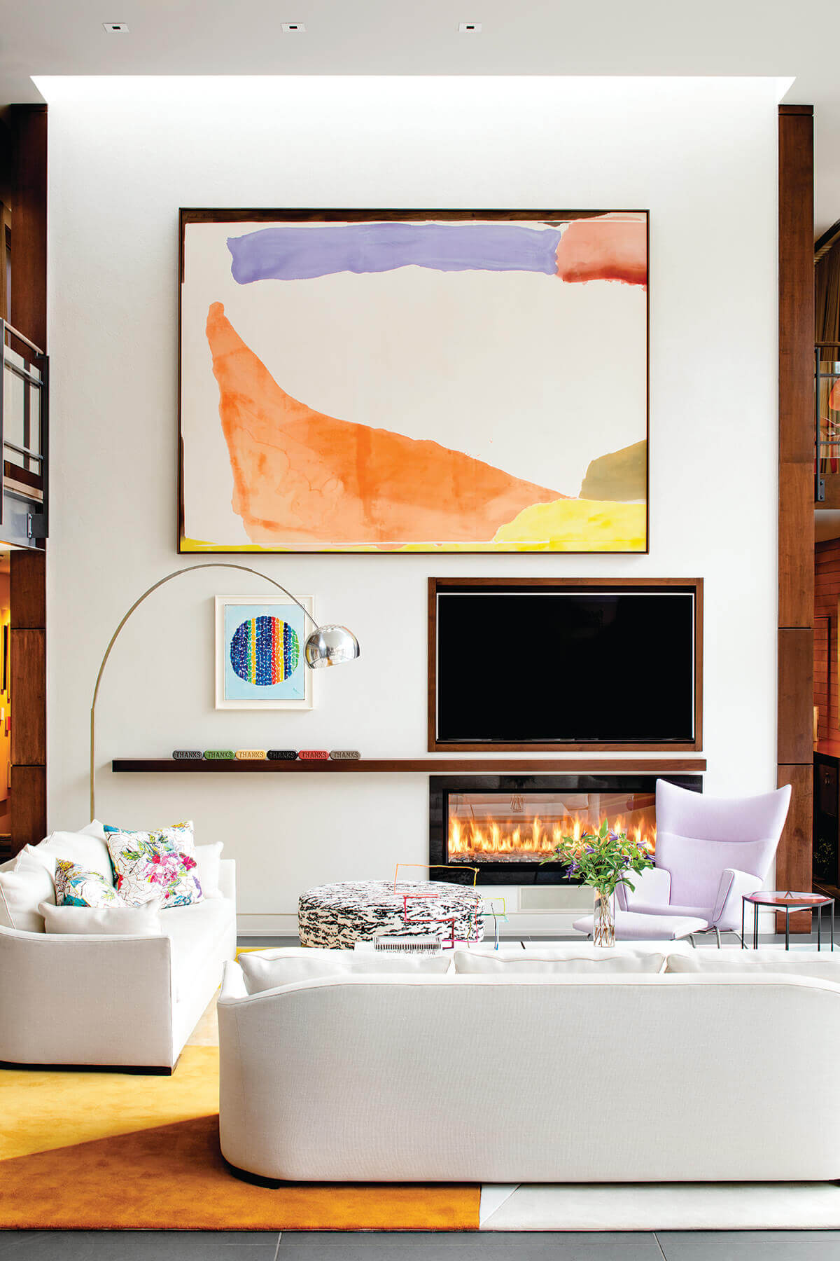
This interior design firm—under the leadership of Jay Jenkins and Alexander Baer—has secured its place as the go-to group for styled interiors, with a flawless combination of contemporary and traditional rooms that feel warm, cozy, and classic. Their well-stocked roster of superstars includes Liz Reich, Rachel Pohlner, Katherine Crosby, Kristina Kral, Leslie Rose, and Nancy Midget, as well as a support staff of project managers and installation specialists making it an easy pick for the first ever Legacy Award as chosen by the Baltimore HOME editors. As Jenkins says—and we agree—“We are taking our art to the next level.”

Tom Holdsworth Photography
Deck | Roof Deck | Patio | Porch
Place Architecture: Design
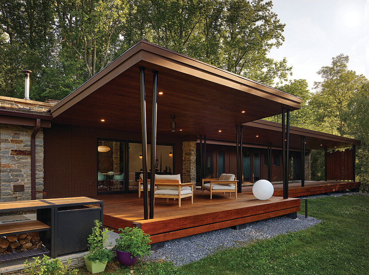
Since the original exterior of this 1960s midcentury modern home was showing its age, and the rear yard was overgrown and inhospitable, the goal was to add an exterior living space where the homeowners could relax and entertain while enjoying the serenity of the landscape. Baltimore’s Place Architecture:Design envisioned two porch spaces and a stone-filled rectangular slot, between the house and covered porch, allowing light to enter the existing interior, while giving accessibility to the porch. “The proportions are really nice,” says Wetmore.
Chris Bavaria
Curb Appeal
Eastwing Architects
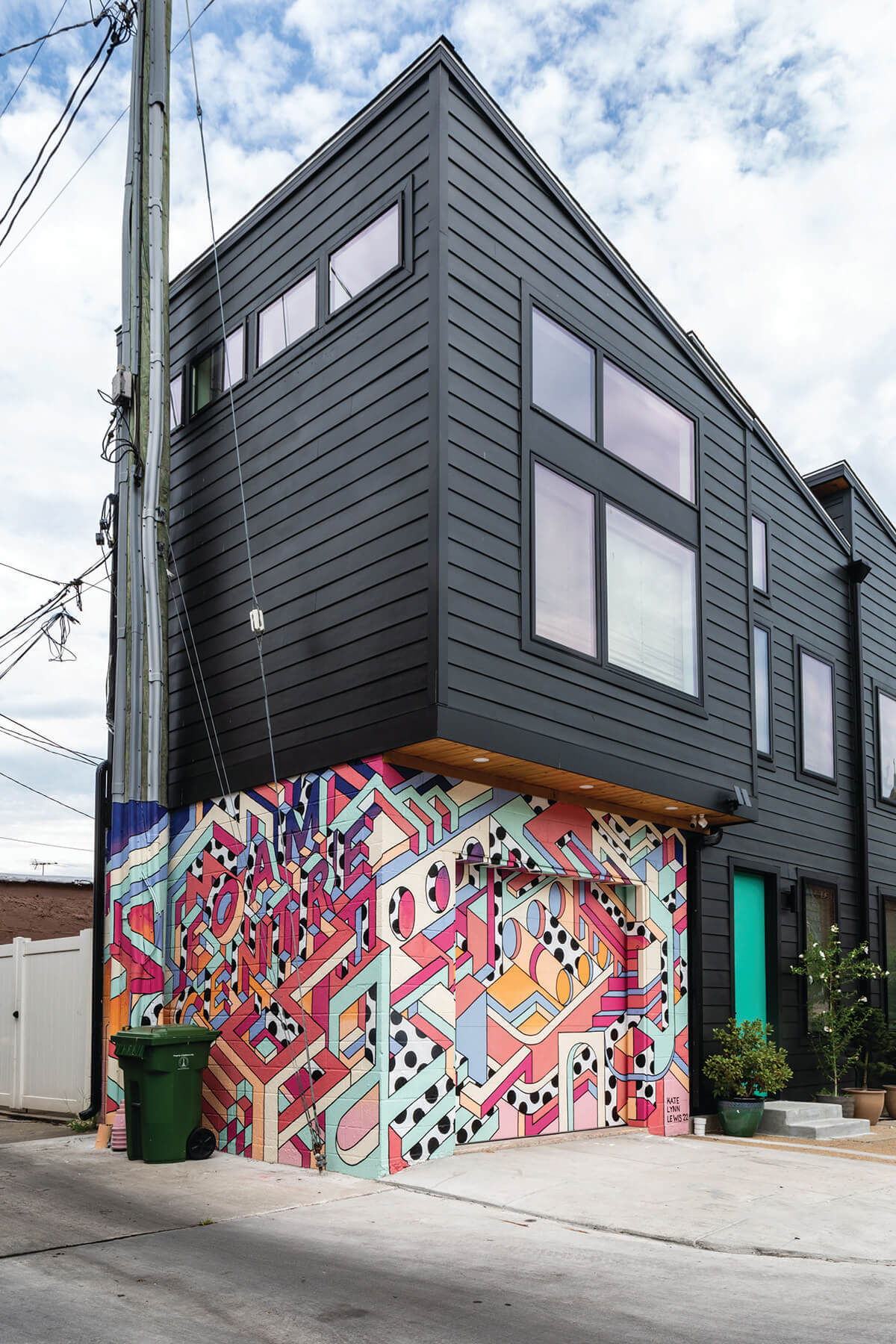
This two-unit residential renovation is on the former site of The Foam Center, an East Baltimore institution selling “Everything from Flypaper to Flying Machines” that had been in operation since 1934. EastWing Architects angled the industrial-inspired roof south, mimicking the rhythm of adjacent rowhomes. To return the original storefront to its former glory, new windows were installed and the soffit was replaced. The clients honored the history of the building with a striking mural by Chicago artist Kate Lynn Lewis. “Love the color,” says Kenworthy. “It’s a vibrant addition to the street.”
Anchor Pictures
Landscape Design | Large Space
Form Garden Design
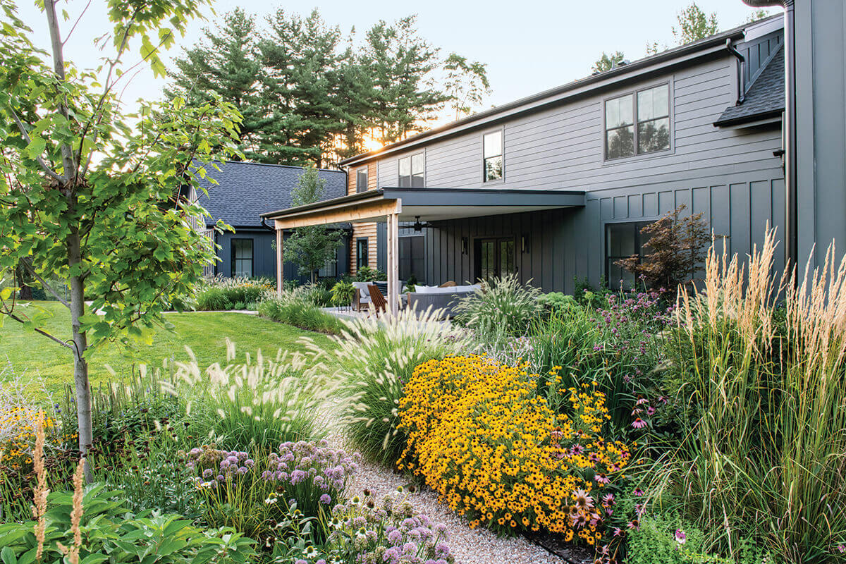
Wild Pines, the name inspired by the existing pine trees edging the perimeter of the property, was envisioned as a modern mountain retreat for a young, adventurous family. The landscape was a true collaboration between the clients—an interior designer and custom home builder—who set the vision, and the garden designer, Baltimore-based FORM Garden Design, who gave form and texture to that vision. The primary goal for the landscape was to stitch the house to the land utilizing the garden as a transition from the meticulous interiors of the house to the surrounding natural beauty of the site. This was achieved using primarily native flowering plants, which were carefully selected to provide four-season interest and create habitats for pollinators such as bees, birds, and butterflies.
Traut Landscape Studio
Landscape Design | Small Space
Traut Landscape Studio
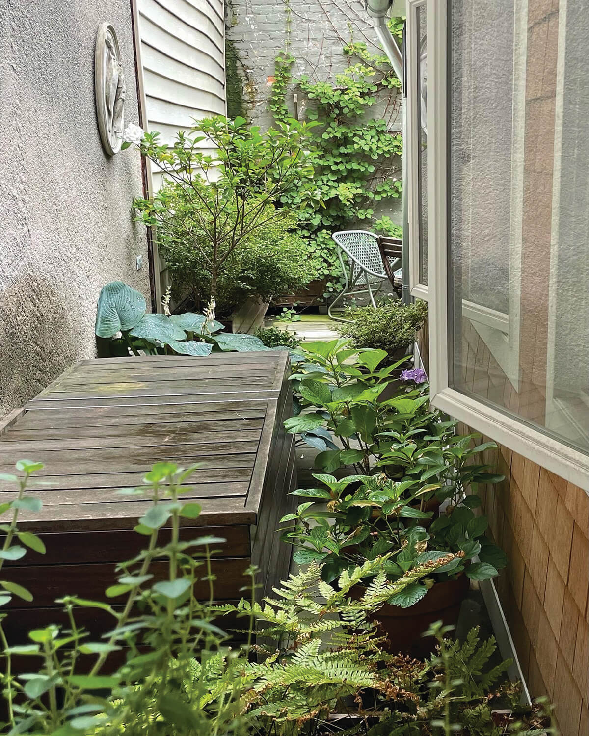
This project—a contemporary terrace in Federal Hill—solved several issues posed by urban living. All elements of the garden were required to be multifunctional to make the most efficient use of space: Two planter boxes are connected by a long bench for extra seating, and a cover for the A/C unit extends to create a storage box for gardening tools while also providing surface area for drinks and platters. The small space—150 square feet with a limited amount of sunlight—meant a restricted plant selection with a simplified color palette of white and greens in varying shades and textures. Baltimore’s Traut Landscape Studio replaced vinyl siding with cedar shingles and added two new windows to create a seamless blend between interior and exterior.
Colin Burke
Use of Color
One Source Contracting
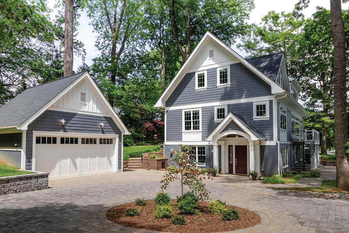
This stunning waterfront property in Annapolis was built to fulfill a newly retired couple’s vision of a dream home. After a complete gut from the ground up, Baltimore’s One Source Contracting finished a custom design and rebuild of this three-story home including a detached two-car garage. One of the main challenges facing this project is that the house—located within the Chesapeake Bay watershed—has many design and build restrictions. The clients chose Sherwin-Williams’ Snowbound paint for the exterior trim color and James Hardie siding in Night Gray to complement the waterfront views.
Adam Kane Macchia
Outdoor Living
Delbert Adams Construction Group
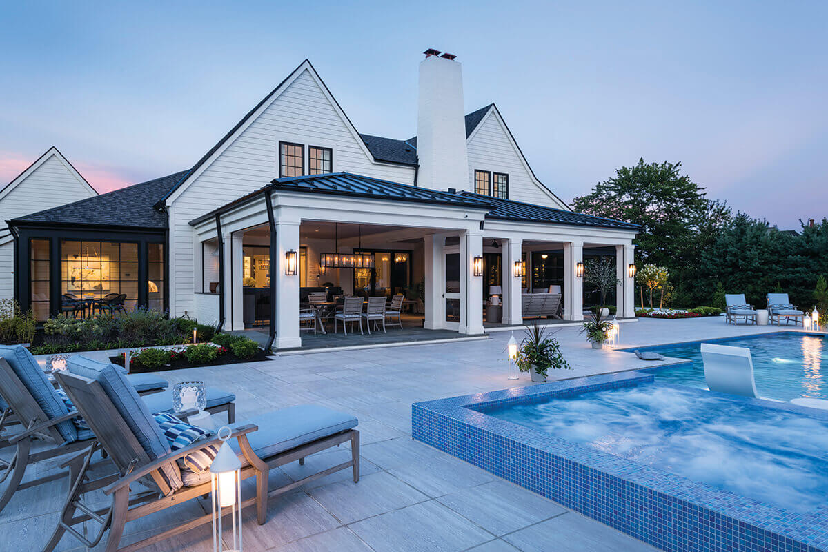
This new home build, located in Owings Mills, was constructed by Baltimore-based Delbert Adams Construction Group to give a newly empty nester couple the party/entertaining house of their dreams with a true indoor-outdoor experience. The home was designed for entertaining with floor-to-ceiling pocket doors that open from the living room onto the outdoor areas. The outdoor kitchen, living, and dining rooms all have automatic shades and energy-efficient infrared heaters, allowing the client to use the spaces year-round. The pool has a waterfall, a hidden grotto with jumping off points, a large and luxurious spa with built-in lounge seating, and a nearly seven-foot-tall curving slide. “It’s a great layout,” says Kenworthy. “And a good choice of a neutral palette for the outdoor furniture.”

Turner Photography Studio
Remodel
Inplace Design
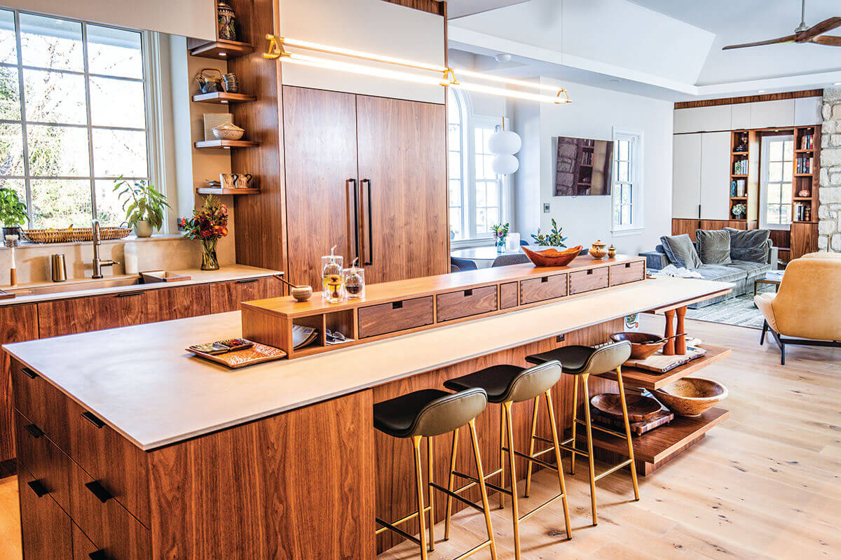
The owners of this dark and chopped-up 1892 farmhouse in Lutherville-Timonium wanted Baltimore-based inPLACE Design to create an open floor plan, bring more natural light into the spaces, and provide a contemporary experience. The architecture, planning, and design studio’s solution was to develop the kitchen as the hub where the great room, dining room, and outdoor patio would radiate, flow, and feel connected. The utilization of wood materials and a palette of white and grey, while maximizing natural light, generates an open and airy ambiance. Kenworthy adored the island. “Very chic,” she noted. And Wetmore agreed. “It’s a nice development of the multi-use island.”
Durston Saylor
Architecture
Purple Cherry Architects
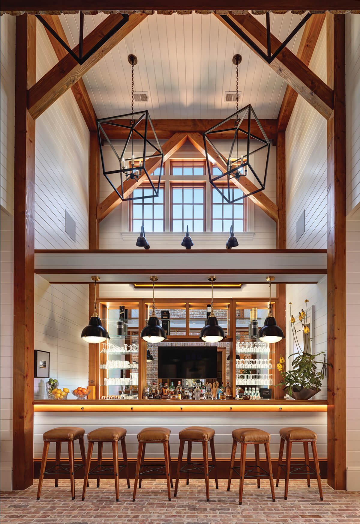
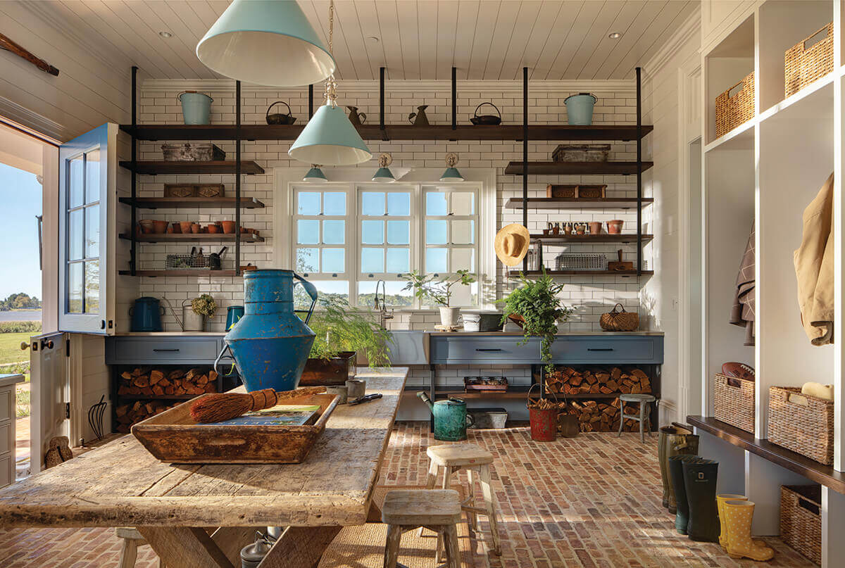
Some of the amazing spaces inside this Eastern Shore home include a 40-foot-long dining room with wine cellar, two floating stairs with three-story custom chandeliers, and a two-story bar with Douglas fir trusses. “It’s simply stunning,” says Kenworthy. There’s also a prep kitchen with a wood-fired pizza oven, library, eight ensuite bedrooms, and two bunk rooms. “The proportion and scale are nicely done for this massive estate,” says Rossomando. “The outbuildings have a more modern aesthetic and are some of the best images included.” Purple Cherry proves that “less is definitely not more,” says Cooper. “They are a pristine example of what artistic achievement occurs when more is the motive.”
Durston Saylor
Interior Design
Purple Cherry Architects
The Purple Cherry Architects team provided all interior design and furnishings services for this Eastern Shore estate, including custom millwork, tile patterns, trim details, light and plumbing fixtures, colors, wallpaper selections, furnishings, bedding, and some accessories. The owners supplemented with an abundance of their own antique and vintage pieces, sculpture, and fine art. “Very nice spaces,” says Wetmore. “I especially liked the pairing of the furniture selections with the architectural materials.” Judge Lee Starke, project manager and interior designer for Cline Design Associates, was also blown away. “Amazing,” she says.
Tommy Sheldon Photography
Accessibility
Home Methods
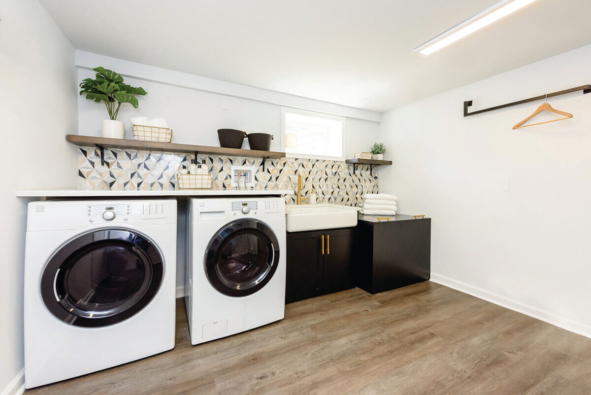
This laundry room was part of a larger renovation project for a client in a wheelchair that focused on making the house more functional. Previously, the laundry room included a washer, dryer, utility sink, and sump pump cover. Baltimore’s Home Methods began figuring out how to cover the sump pump in a more functional way. When the top panel is on, the sump pump cover becomes a folding station at a height the client can access from her wheelchair. Home Methods replaced the utility sink with an ADA-compliant sink and used frontload washers and dryers for the client to access from a seated position. Opposite the washer/dryer, they added a tall storage cabinet that contains a wheelchairheight, fold-out ironing board. “It’s so sleek and clean,” says Kenworthy.
Adam Kane Macchia
Design | Build
Delbert Adams Construction Group
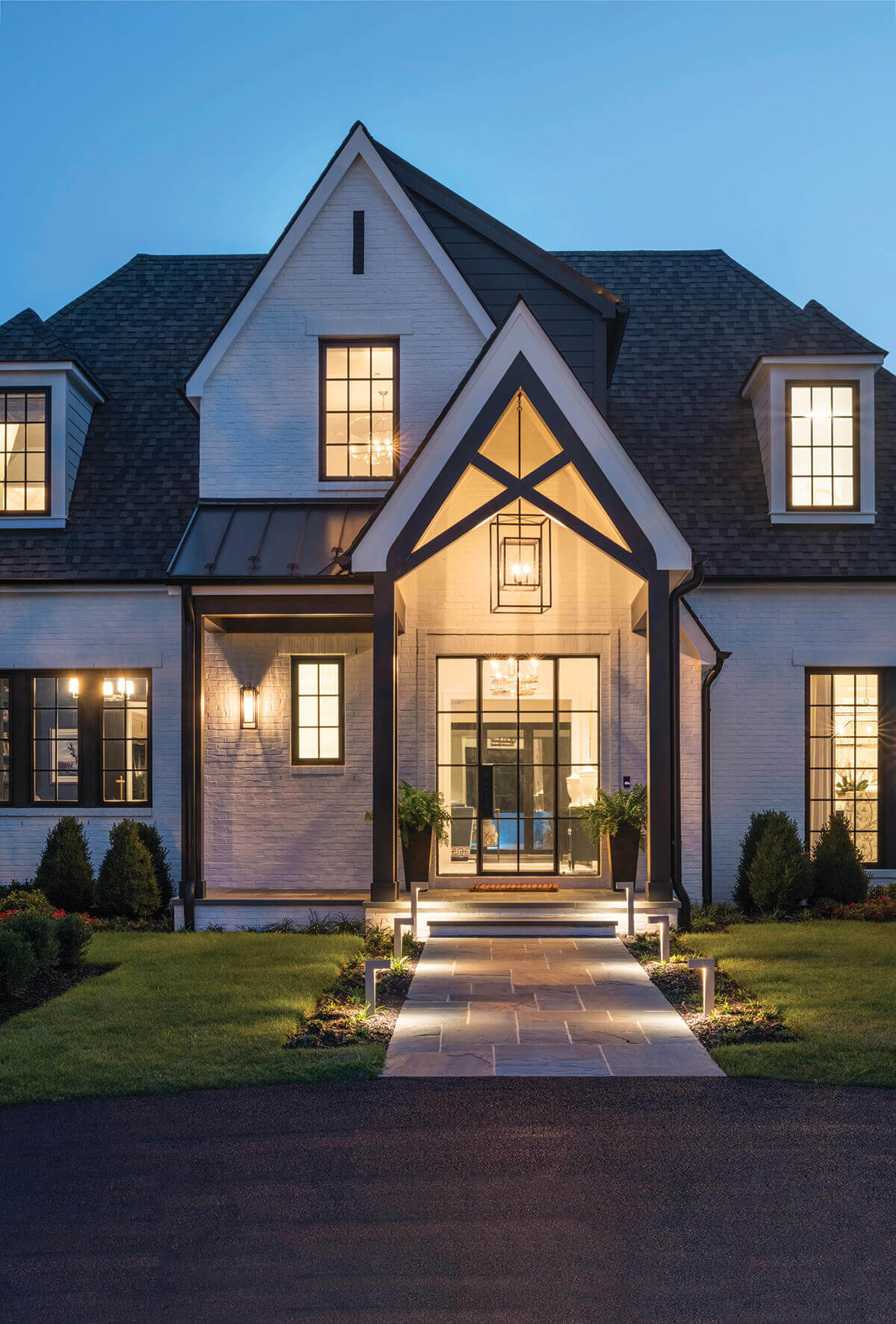
This new home build—designed by J.E. Schram Architect and built by Delbert Adams Construction Group—was created to reflect the client’s goal: a party and entertaining house that allowed for a truly indoor-outdoor experience. The couple knew they wanted the highest quality materials and to incorporate the power of smart home technology and many local materials were sourced to reduce the environmental burden. “There are so many gems,” noted Kenworthy. “But I particularly love that glass and steel door.”
Derek & Vee
Rowhome Revitalization
Eastwing Architects
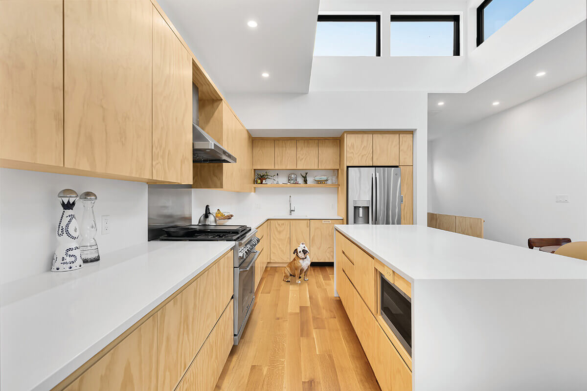
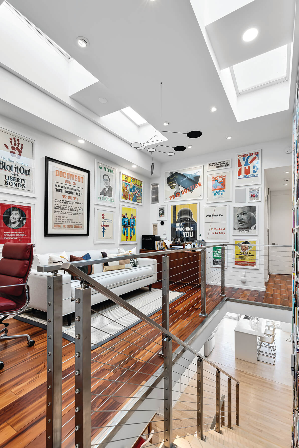
This project pushes the boundary of what is possible within the constraints of a quintessential Baltimore rowhome. At less than 12-feet wide and 50-feet deep with an east-west orientation, natural light was scarce in this compact home. To achieve brightness, the firm created a new opening in the rear masonry wall to accommodate a nine-foot folding door, raised the previously low ceiling, and added reflective surfaces wherever possible—high gloss cabinetry and terrazzo tile—to draw even more light into the space. “Excellent use of strong design from concept to execution with the stair as the spine of the house for circulation and as the storyteller of the personality of the homeowners,” says Rossomando. She was impressed by the “creative ways to bring light into every level from the skylights to the garage door at the indoor-outdoor living space level.” The crisp, minimal finishes, white walls, and clean edges create a museum-like atmosphere that complements the owner’s vintage poster collection.
Tom Holdsworth Photography
Midcentury Modern Renovation
Place Architecture: Design
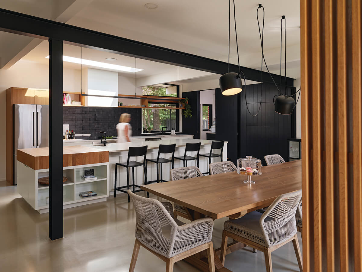
This renovation reimagines a timeless design while staying true to the original style of this 1960s midcentury modern house. The clients, who had a love for modern design and minimalist aesthetics, wanted to expand their living space by connecting the kitchen and dining areas. To accomplish the client’s goal of an open floor plan, it was necessary to install a steel beam for structural support, which added an industrial element to the new living space. “This project is very nicely done, bringing modern elements while highlighting the midcentury elements of the original house,” noted Rossomando. “The neutral palette of materials and fun lighting choices bring warmth and energy to the interiors.”
Durston Saylor
Apartment | Loft | Condo
Redhead Design
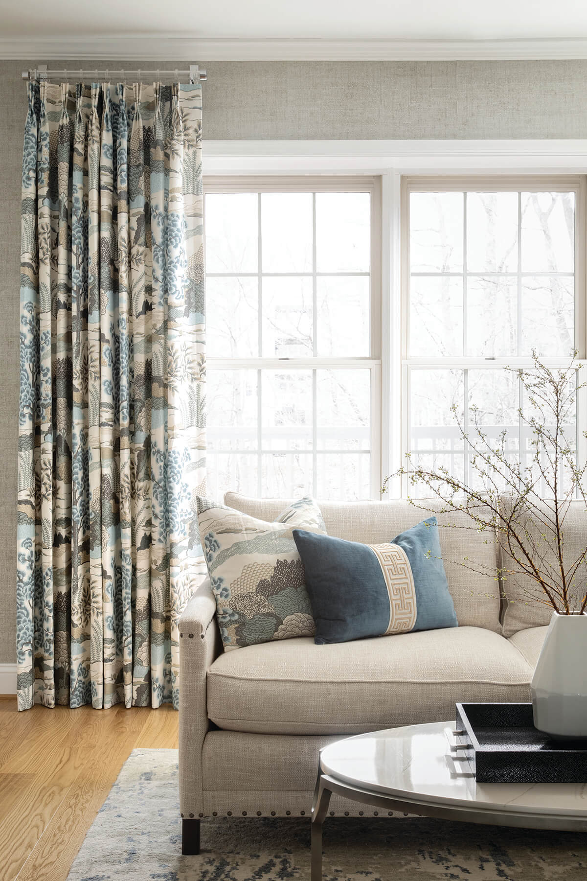
The goal was to create a practical and livable space that also felt welcoming and beautiful. Opening a wall between the kitchen and living rooms united them and created a better flow. “Fresh and airy is what comes to mind,” says Cooper. Baltimore-based Redhead Design then added texture with faux bois ottomans, exposed wood chairs, luxurious rugs and linen, and velvet fabrics. Added Cooper, “This traditional space is classic and warm.”
Jenn Verrier Photography
Waterfront Home
Purple Cherry Architects
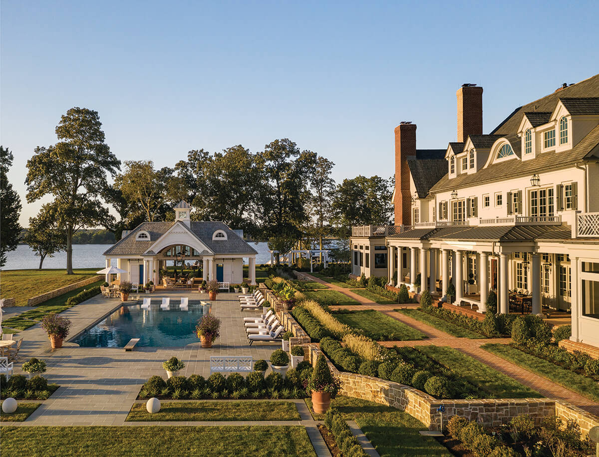
“Idyllic and whimsical, this waterfront creation has transported us to the countryside,” says Cooper of the 44,000 square feet of luxury on the Eastern Shore. Rossomando was captivated with the formal layout, manicured landscape, and dramatic water views. “The exterior living spaces take advantage of site and proximity to the waterfront—well done.” Wetmore was impressed with the nicely proportioned spaces inside and out. “The compound massing lends a feeling of grandeur and provides for a very nice arrival sequence to the main house.” And Kenworthy was amazed by the stunning gardens and views. “Perfection,” she noted.
Stephen Posko
Historic Renovation
Carballo Architecture
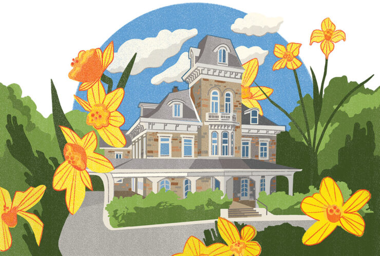
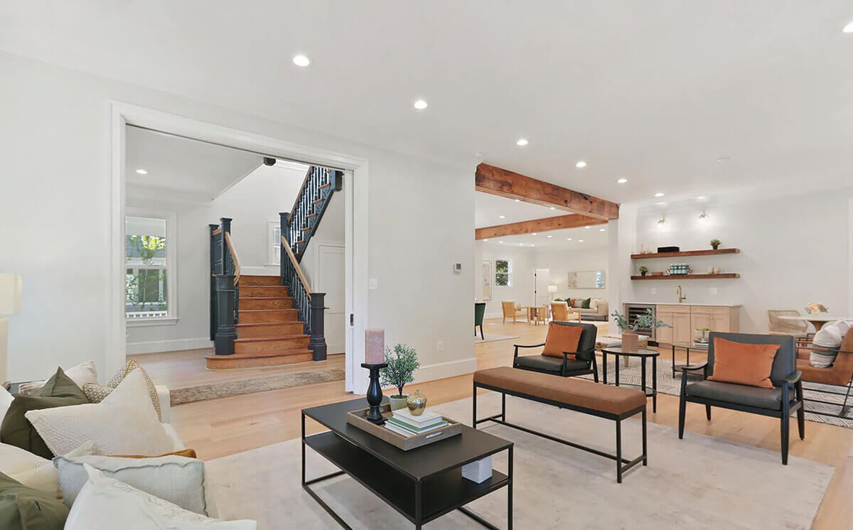
This three-story, 4,232-square-foot former convent in Roland Park now boasts modern luxurious single-family living. Prior to renovation, the 19th-century Victorian home was choppy and closed off. Baltimore’s Carballo Architecture’s intent was to preserve some of the historical elements in the home, while also opening and modernizing the space. The expansive first floor now includes an open concept living area that was designed around the existing elevator, a dining room featuring custom wood beams, and a large chef’s kitchen that opens to a living space, perfect for entertaining. Originally 10 small bedrooms, the second and third floors were transformed to five spacious bedroom suites.

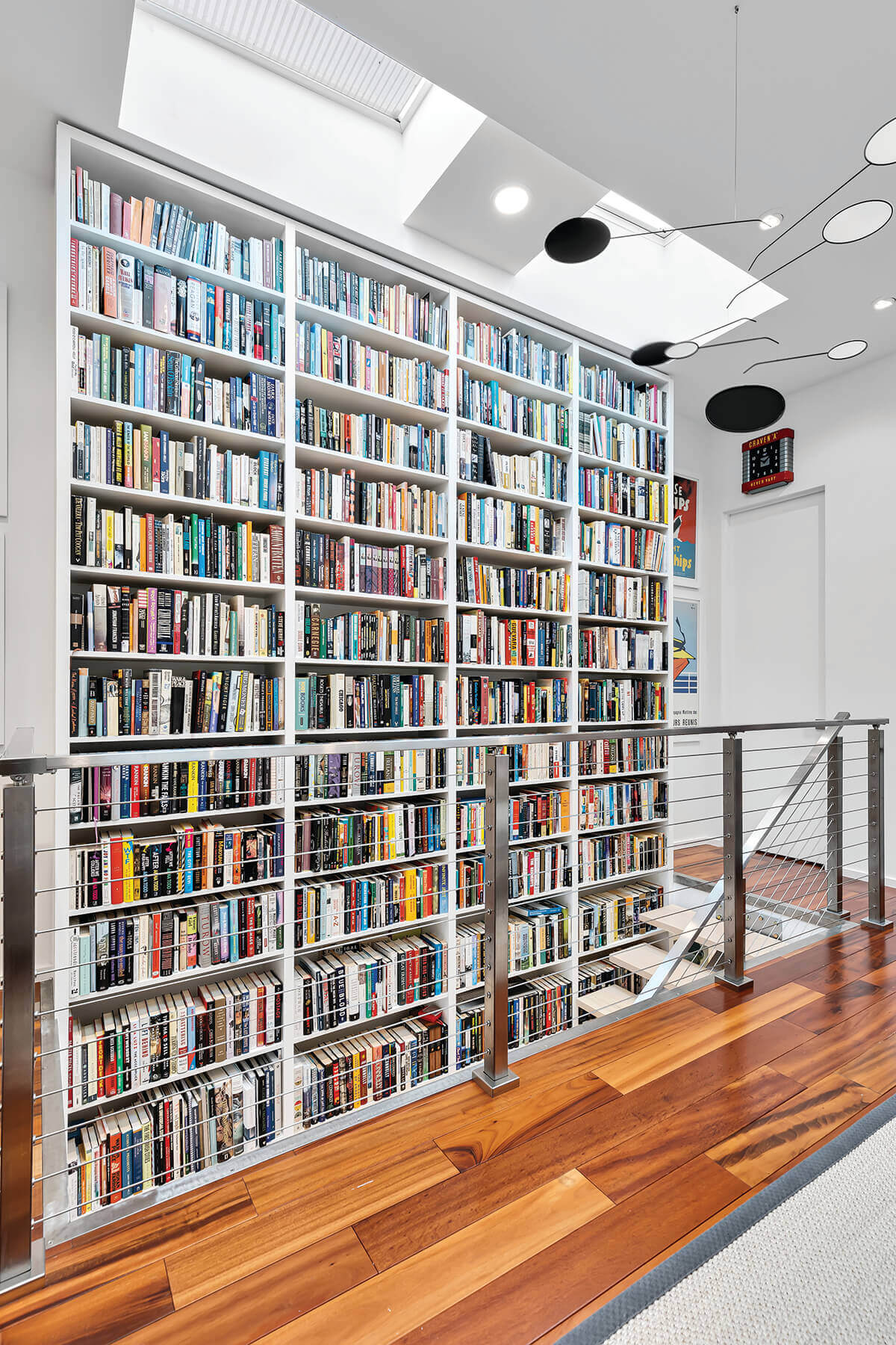
Derek & Vee
Library
Eastwing Architects
The client challenged EastWing Architects to create a bright, gallery-inspired home organized around a central library for their impressive book collection. The new spine of the home, a bookshelf over 30 feet tall, emphasizes the unique verticality of the property—a perspective rarely possible in a narrow rowhome. “I like the interaction between the stairs and books,” says Wetmore. “Multiple dramatic elements work together rather than fighting for the focal point,” notes Rossomando. “A palette of neutral interiors works as a backdrop to the colorful collection of books and artwork.”
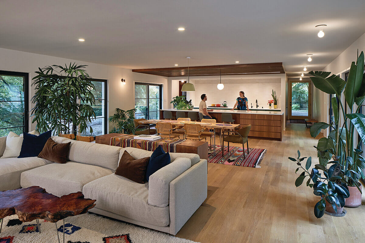
Tom Holdsworth Photography
Open Floor Plan
Place Architecture: Design
The clients, a painter and photographer, brought to the table very distinct and creative ideas. The collective objective was to reimagine the tired, traditional interior and exterior of the existing home with a whole-house renovation that provided an open floor plan, ample natural light, energy-efficient systems, and updated finishes with a modern aesthetic. Walnut elements were used to add warmth and definition to the entry, kitchen, and living room, complementing the wide-plank, white oak floors. The wood slatted ceiling was hung to define and add texture to the kitchen and at the entry, floor-toceiling walnut-paneled walls with flush hidden doors conceal the walk-in pantry, powder room, and closet.
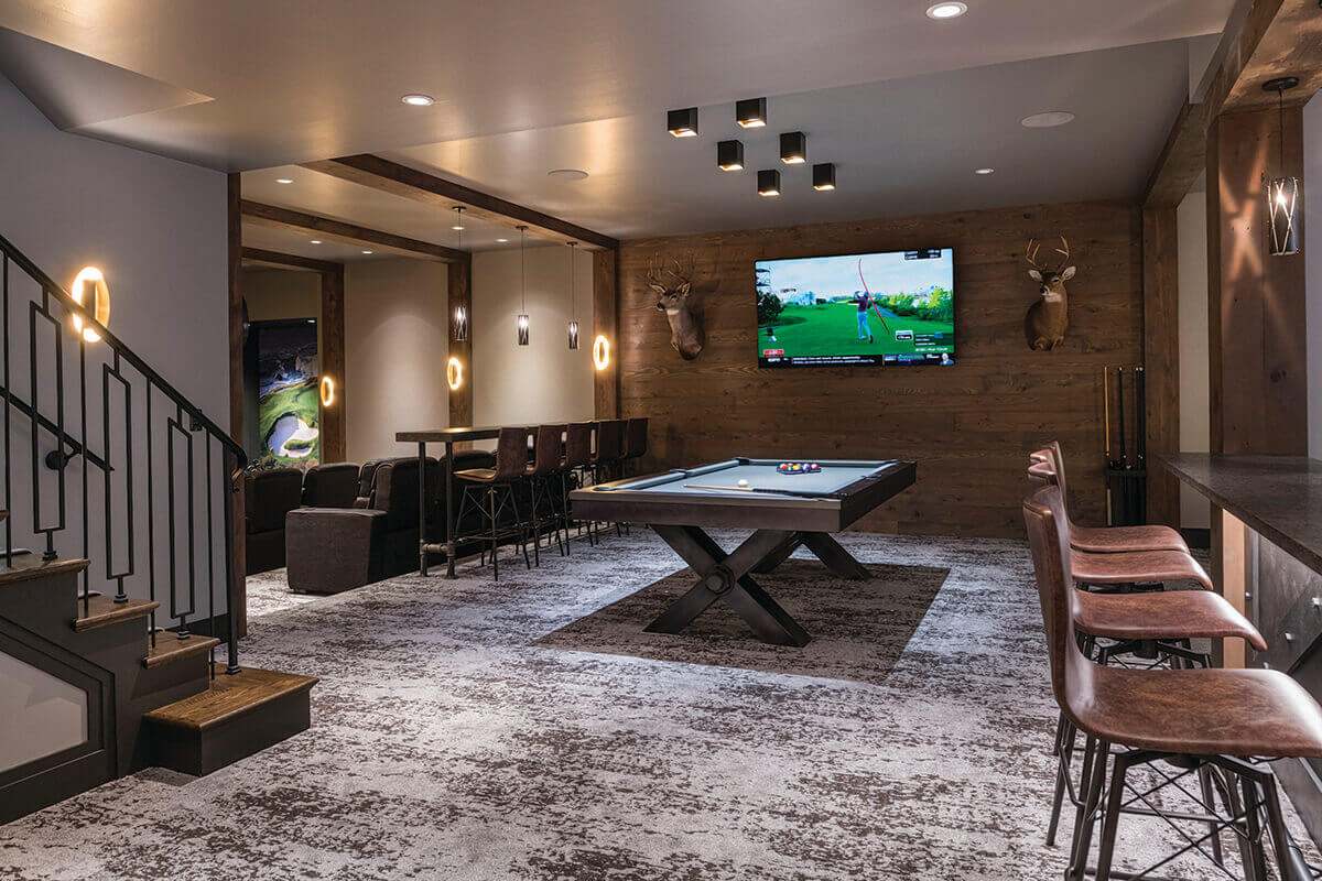
Adam Kane Macchia
Speciality Room
Delbert Adams Construction Group
This home was designed for entertaining. The lower level boasts a game room with retro pinball machines, a full bar, pool table, theater room, and a professional-grade golf simulator. “This home truly has every amenity,” says Cooper. Added Rossomando, “I love the use of color and textures in this design to create a mood in each space. Excellent use of lighting and artwork unique to each space to push the design concept. Well done.”
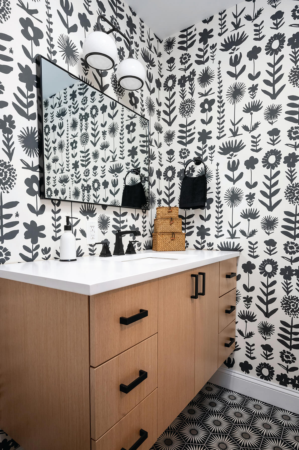
Whitney Wasson
Wall Treatment
Millbrook Circle Interior Design
The clients, a painter and photographer, brought to the table very distinct and creative Black and white color palettes can sometimes be intimidating to clients, but this bathroom remodel for a teenager seemed to be the perfect space for Baltimore-based Millbrook Circle Interior Design to explore using a vibrant print wallpaper. In the bathroom, the graphic design was further enhanced with the bold flooring choice. The use of a contrasting warm, wood vanity as a visual landing spot added balance, while the neutral shower tiles and black fixtures further complement the aesthetic. While the pattern of the paper is lively, it was successfully used throughout this large space because of the simplicity of the color scheme. The contrast between the white space and negative space makes for a fantastic visual experience.
Alyea Photography
Lighting
Marren Architects
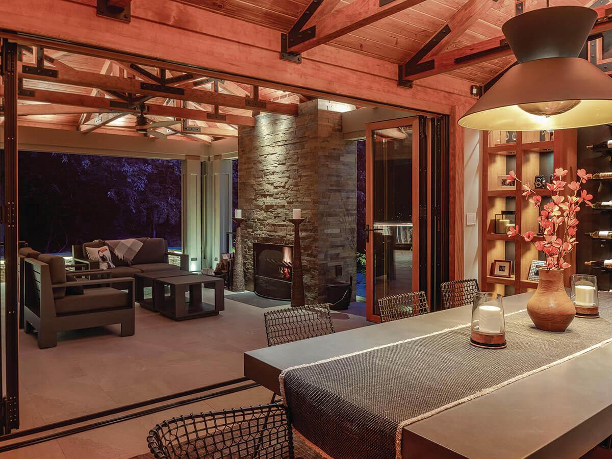
This lighting concept takes its cues from the contemporary architectural style of the renovation and seeks to reinforce the goal of encouraging interior and exterior flow, social gathering, and celebrating the materials. The lighting was designed by Baltimore-based Marren Architects to be concealed or otherwise inconspicuous. This was achieved on the interior and exterior with concealed fixtures under cabinets, under interior and exterior countertops, and within custom millwork. “I love the natural finishes,” noted Kenworthy. The firm created ambient lighting by utilizing indirect cove and ceiling mounted up-lighting that revealed the texture and warm color of the Douglas fir wood ceilings.
Alyea Photography
Kitchen
Smithouse Design + Build
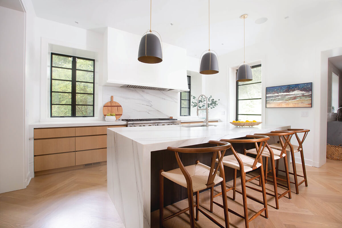
A quintessential 1920s stone estate house needed better functionality and modernization while still maintaining some of its historic charm. To provide the family with a better flow for functionality and entertaining, Cockeysville-based Smithouse Design + Build reconfigured the first floor, moving the kitchen to the existing dining room space and building an addition to serve as the new dining room. The kitchen features a stunning, oversized island with Calacatta Lincoln marble and waterfall edges. Kenworthy noted that all appliances, including the range hood, are hidden with custom cabinetry panels to capture a more contemporary aesthetic. “It’s so modern and sleek.”
Tom Holdsworth Photography
Living Room | Great Room
Place Architecture: Design
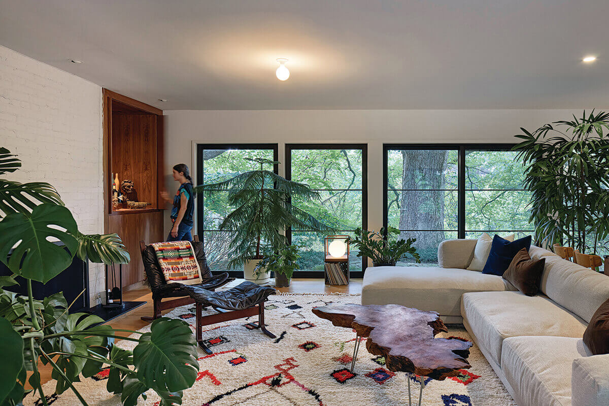
Built in 1952, this one-story brick courtyard house is perched on a wooded plateau, overlooking 4.5 acres of specimen trees and flowering gardens. The house sits on the site, shielding the courtyard from the driveway. The result was a circuitous path from the driveway through the courtyard to a formal entrance. This inward focus turned the courtyard into the front yard. The biggest challenge for Place Architecture: Design was changing the experience upon entering the home. Flipping the front door and porch to face the street, they established an outward presence embracing the neighborhood. The U-shaped footprint creates a tranquil outdoor private garden, easily accessible from the main living space. Lined with floor-to-ceiling glass, the rooms blur the line between indoor and outdoor space.
Alan Gilbert Photography
Dining Room
Marren Architects
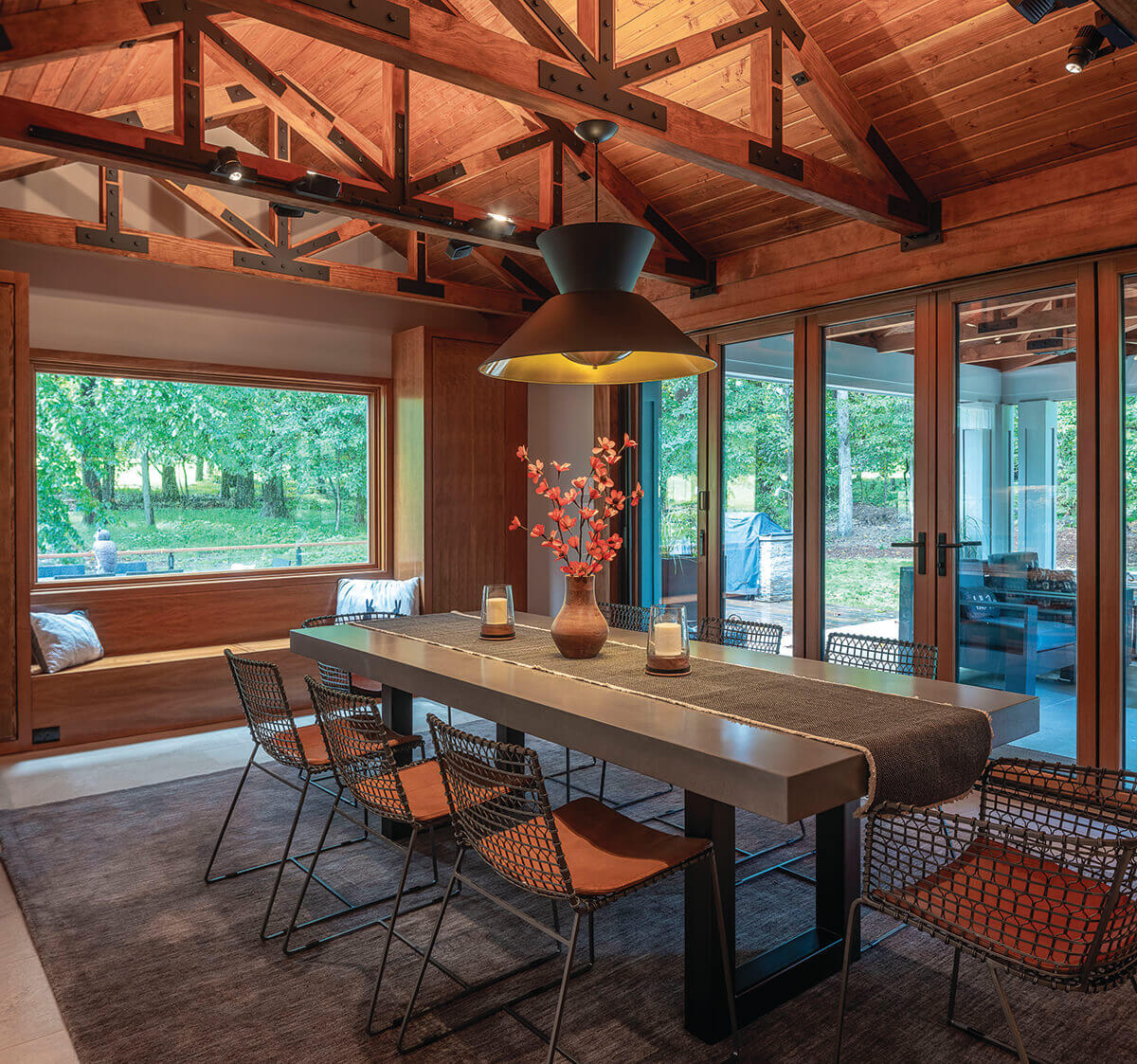
A couple with a young daughter wanted to update their kitchen and add a family dining room adjacent to it. The dining room designed by Marren Architects, in Baltimore, features a large glass picture window and a folding glass wall out to the patio for seamless indoor-outdoor living and entertaining. This indoor-outdoor connection is reinforced by the large-scale stone floor tile that is continuous from the kitchen through the dining room and out to the patio, where natural material, including a vaulted ceiling of vertical-grain Douglas-fir wood roof trusses, trim, decking, and cabinetry is used.
Anu Iyer
Use of Color
Surrounded by Color
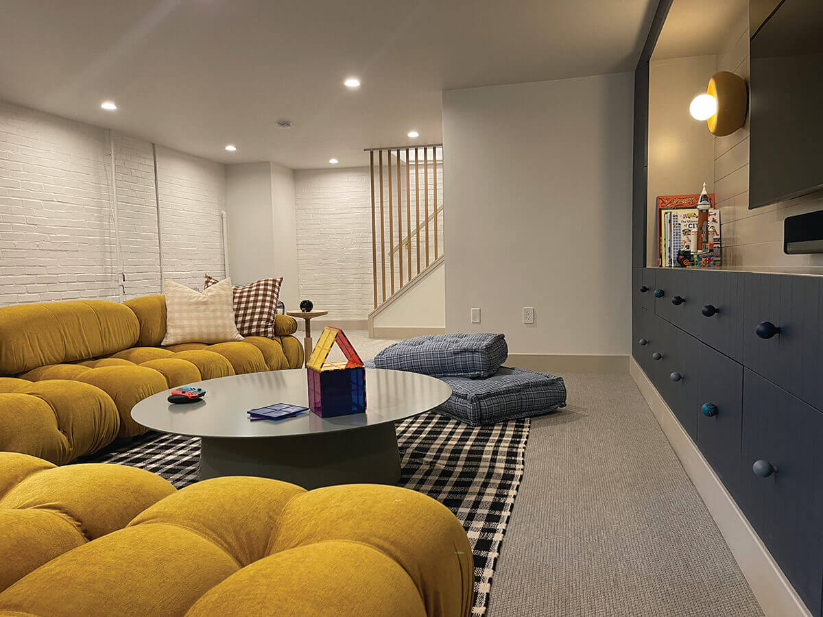
This basement project had the issues of many basements that lead to remodeling—old asbestos tile flooring, drop panel ceiling, poor lighting, and inefficient utilities taking up the space. Baltimore-based interior design firm Surrounded By Color chose a relatively conservative blue-and-tan color palette, knowing they would play around with fun art and furniture. “Nice use of simple forms and colors provide for an inviting room,” says Wetmore. The media wall is made up of IKEA frames with doors from Semihandmade, plus multicolored hand-painted wooden knobs, and one-of-a-kind ceramic sconces by Los Angeles artist Eny Lee Parker.
Lauren Nievod Photography
Bathroom
Home Methods
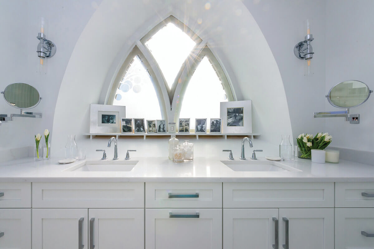
This project focused on updating the client’s bathroom inside a converted church. So to maximize space, Home Methods built a slightly shallower than standard vanity the length of the wall to enable using the windows as backdrop. “Excellent creativity and use of space to highlight and keep historic elements,” noted Rossomando. From a material standpoint, the goal was to keep the space timeless and bright. They achieved that, she said, and was impressed by the “simple palette of materials and colors.”
Tommy Sheldon Photography
Bedroom
Bob Ward Trademark Homes
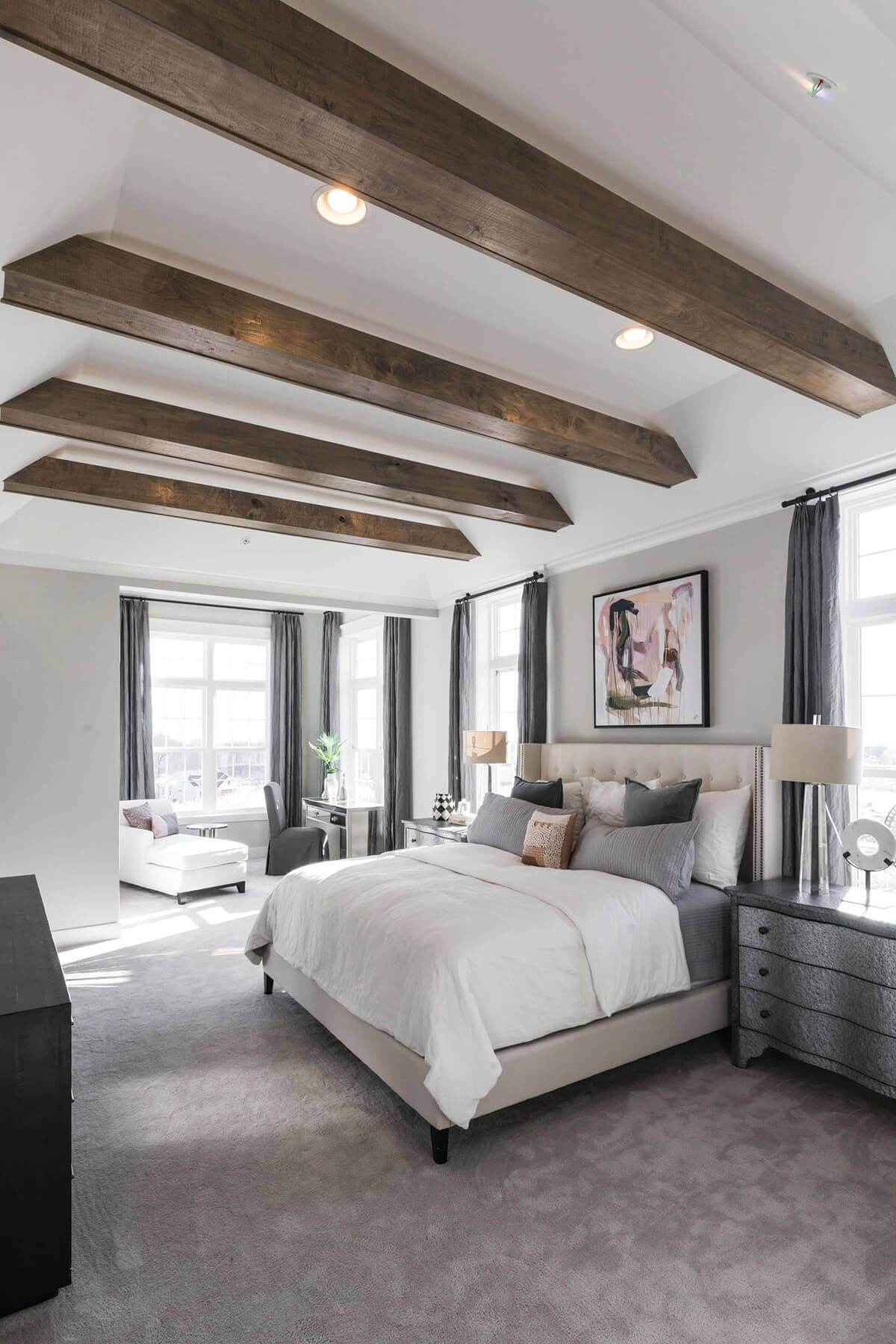
This tranquil primary suite designed by Havre de Grace-based Bob Ward Trademark Homes boasts an oversized bed framed by elongated windows with added transoms where natural light fills the room. A cozy sitting room extends this space for reading a book or relaxing on the chaise. This sleepy sanctuary is topped with angled trey ceiling with floating wood beams above the bed to fully take advantage of those extra high 11-foot ceilings. A walk-in closet with electronic, retractable shelving is just steps from the sleeping area.
Alyea Photography
Custom Cabinetry
Smithouse Design + Build
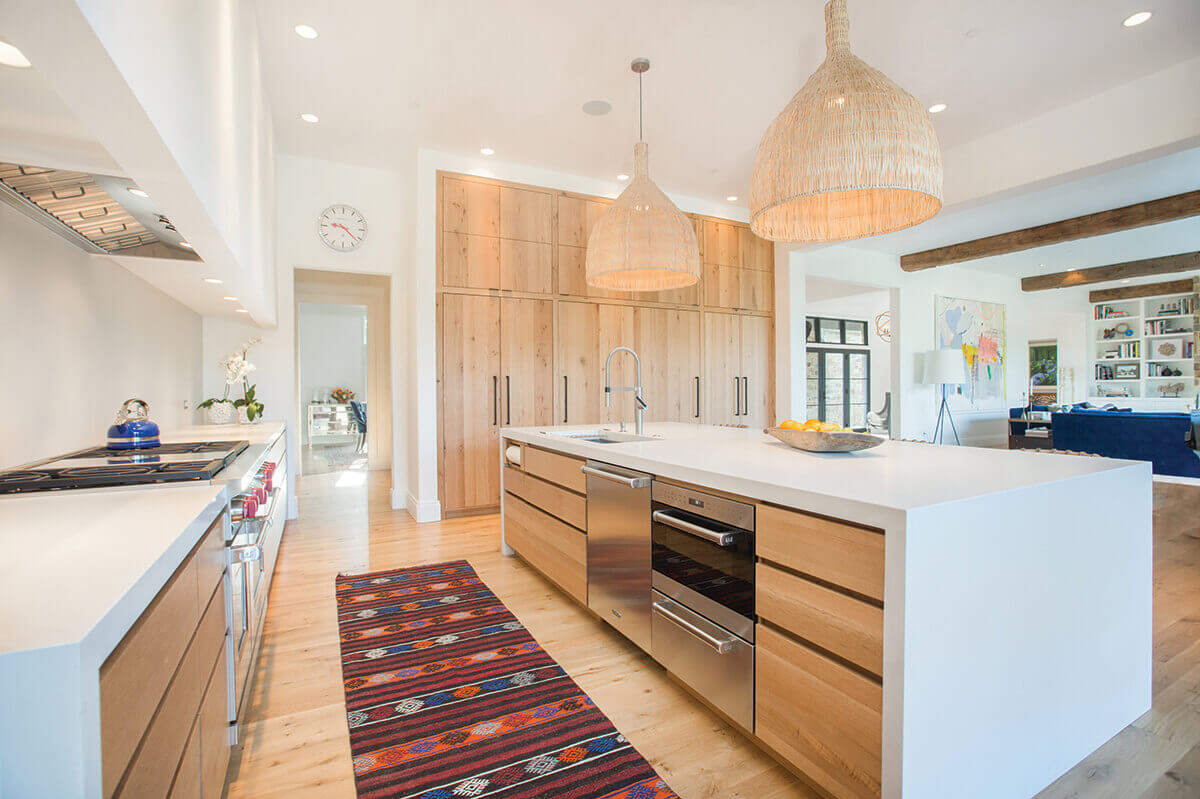
These Brooklandville clients were looking for a unique kitchen that reflected a level of Scandinavian modernism with clean lines, minimalistic features, and warm wood tones. It was imperative that all the wood grains align on the cabinetry, which left little room for error. The white oak frameless cabinets by Crystal Cabinets are a show-stopping feature where eight-foot vertical panels line one side of the kitchen, hiding the appliances and pantry. The island and surrounding lower cabinets were designed with no hardware, meaning that all the reveals had to be perfectly flush, allowing the grains in the wood to serve as natural art.
Stephanie London
Use of Collection, Antiques, or Art
Redhead Design
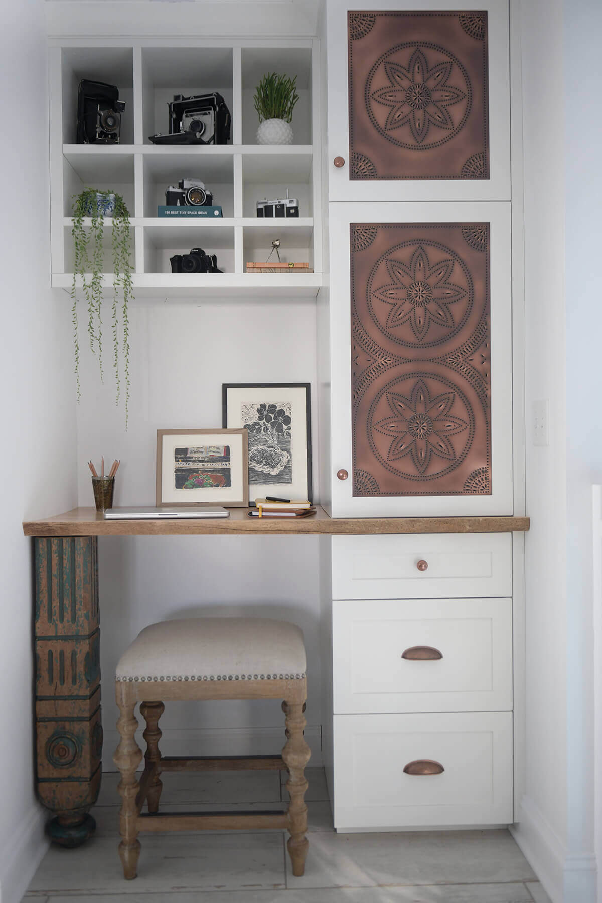
This little alcove was the perfect size for a tiny, built-in desk that is big on personality. The client is a collector of unique, vintage objects, so the goal was to design a functional desk that features some of her treasures. “It’s such a cute nook,” says Kenworthy. Wetmore agrees. “I like the use of this tight space. The display niches give personality to the space, as do the cabinet inserts”—custom-pierced tin panels inspired by the client’s love of pie chests.
Courtesy Of Smithouse Design + Build
Custom | Repurposed Furniture
Smithouse Design + Build
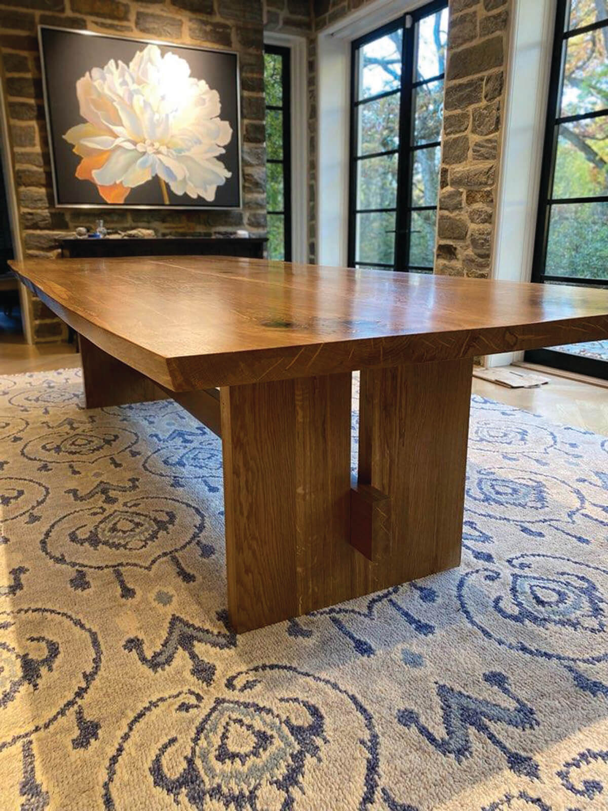
The owners of a recently renovated 1924 stone estate in Roland Park had a large, old white oak tree in their backyard that was recommended for removal. The clients decided they wanted to preserve the history of the tree by turning it into their new dining room table. The colossal log was transported to Edrich Lumber, where it rested for one year before it could be milled. A simple midcentury-style table was constructed that showcased all the knots, distinct color, and grain variations of their beloved tree.
