Home & Design Awards 2024
Baltimore magazine honors the top design visionaries in Charm City.
Edited by Janelle Erlichman Diamond

When it comes to architectural and interior design, the talent, ingenuity, and creativity in Baltimore is astounding. Here we don’t erase our historical areas—but try to improve on them. We embrace both quirkiness and luxury. We have the grandest homes nestled in the woods and iconic rowhomes on cobblestone streets. That’s why we’ve once again decided to highlight the best local interior designers, builders, artisans, residential architects, and landscape designers in our Home & Design Awards.
Chosen by a panel of nationally renowned design experts, these 32 winners—plus two picked by our editors and readers—enrich the design landscape from the city to the bay.
Meet the Judges

Bryan Anderson
Bryan Anderson, a principal at SALA Architects in Minneapolis, Minnesota, infuses projects with a combination of functional delight and environmental responsibility. He holds a Bachelor of Architecture from North Dakota State University and a Master of Arts degree from Saint Catherine University.

Brian Burtch
Brian Burtch, who earned his bachelor’s degree and Master of Architecture from The Ohio State University, is the founder and principal of NEON Architecture, an architecture and design studio located in Indianapolis.

Kayla Kamp
A residential architectural designer specializing in lakefront designs, Kayla Kamp has a portfolio rich in timeless family estates. Kamp, a project designer at Sears Architects in Michigan, designs with a focus on timber frame and a dedication to high-end lakefront residences.

Kate Wagner
Kate Wagner, a journalist based in Chicago and Ljubljana, Slovenia, is the architecture critic at The Nation. First known for her satirical blog McMansion Hell, Wagner has served as a columnist in the fields of architecture and culture at a number of publications.

Eric Weed
Eric Weed, who holds a Master of Architecture from Ball State University, is a project manager at Robert M. Gurney, FAIA Architect in Washington, D.C. He focuses his designs through a modern and contemporary lens, influencing the aesthetic and organization of his projects.

General Excellence | Architecture
PLACE ARCHITECTURE: DESIGN
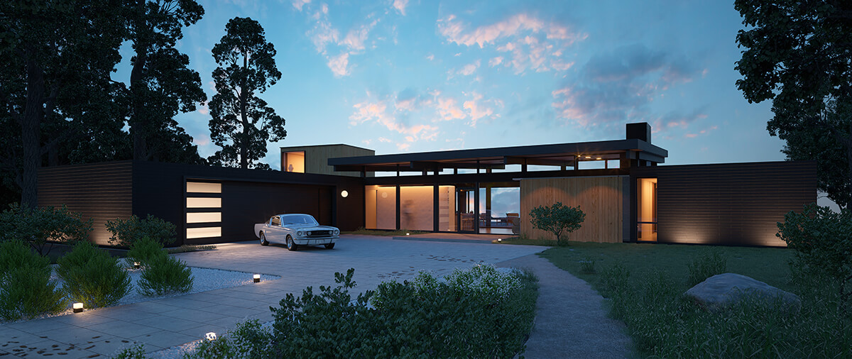
Since 2005, Brooklandville-based Place Architecture: Design has been creating thoughtful, relevant design solutions that foster meaningful connections between their clients and the spaces they inhabit. In the spirit of true midcentury architecture, they are big proponents of building less square footage without compromising the quality of life. They are also invested in reducing the carbon footprint by introducing renewable energy alternatives, tighter building envelopes, and sustainable and sustainably sourced materials.
“It’s a beautiful portfolio of well-designed, well-considered homes and spaces,” says judge Brian Burtch, a founder and principal of NEON Architecture, an architecture and design studio located in Indianapolis. “The tones, textures, and materials are thoughtful, bold, and cohesive.”
Judge Kayla Kamp, a residential architectural designer specializing in lakefront designs in Michigan, appreciated the thoughtfulness in how Place designed the transitions between spaces. “There is also a lot of detail in capturing how light is entering the space beyond just a basic window frame which makes the homes unique.”
Says judge Kate Wagner, architecture critic at The Nation, “Having seen so many oversized modern houses, it makes me appreciate when careful consideration is made to create a cohesive design that is both sleek and welcoming.”
General Excellence | BUILDER | CONTRACTOR
GUERILLA CONSTRUCTION
Baltimore-based Guerilla Construction is a local design/build firm with a unique approach that blends contemporary building techniques with contextual design to modernize 19th- and 20th-century properties for the 21st century, all while maintaining and enhancing their original personality and charm. Burtch was impressed by the “well-crafted, high-quality, unique projects.” And judge Bryan Anderson, a principal at SALA Architects in Minneapolis, Minnesota, agrees. “This contractor demonstrates a high level of design and construction quality across projects.”
General Excellence | INTERIOR DESIGN
PURPLE CHERRY ARCHITECTS
A well-established Annapolis-based firm, Purple Cherry Architects creates not just the physical form through architecture, but the emotional connections clients have with their homes through their interior design studio. That includes finishes, wall coverings, color selections, custom millwork including kitchen cabinetry, coffered ceilings, and built-in bookcases. Also, flooring, lighting and plumbing fixtures, furniture selection, upholstery, accessories, window coverings, and curation and placement of artwork.
“There is a lot of attention given to all of the surfaces and planes of each space, giving texture and trim details that add character and coziness,” says Kamp. “The spaces are filled with colors and textures that make the scale of the rooms feel more approachable.” Judge Eric Weed, a project manager at Robert M. Gurney, FAIA Architect in Washington, D.C., agrees: “A lot of thought and effort was put into the design and craft of these spaces.”
RISING STAR
SURROUNDED BY COLOR
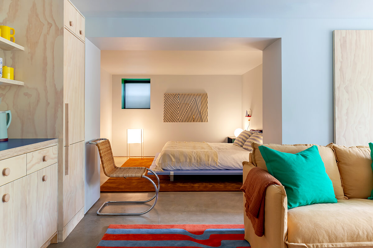
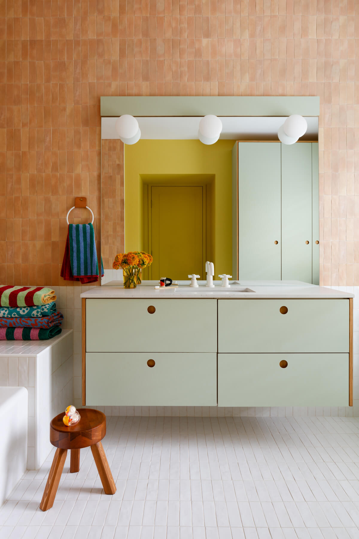
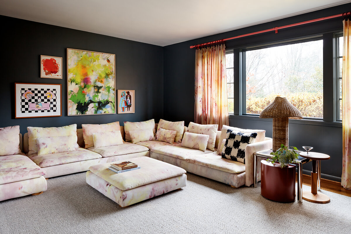
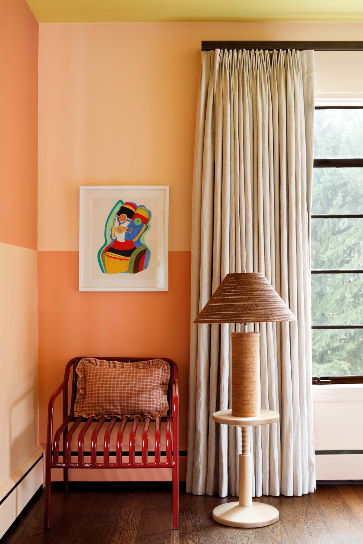
This Baltimore design firm, helmed by designers Robin Heller and Jen Levy, infuses all their projects with color and whimsy. Their aesthetic is playful and not too serious, saturating interiors with colors, pattern, and unexpected accessories. It’s done in a way that is “gentle on the eyes yet interesting,” says Kamp. “I can put myself in these spaces and imagine I’ll be in a happy mood.” Anderson concurs: “The work is bright and playful and exceptional for creating delight without extravagance.”
Surrounded By Color also partners with Maryland artists on all their projects to further their commitment to the local design community while still being true to their own creativity. “They strive for fun and playfulness—which I believe they have achieved in many of their projects,” says Weed.
REMODEL
KIMMEL STUDIO ARCHITECTS
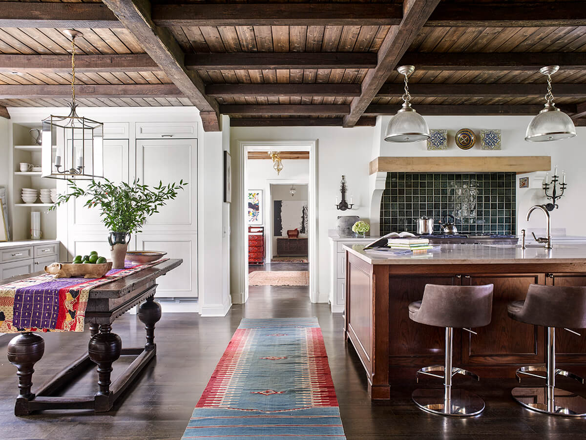
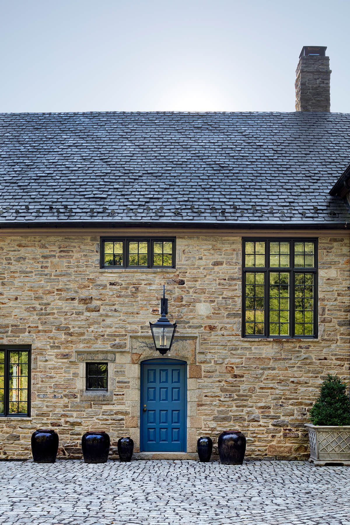
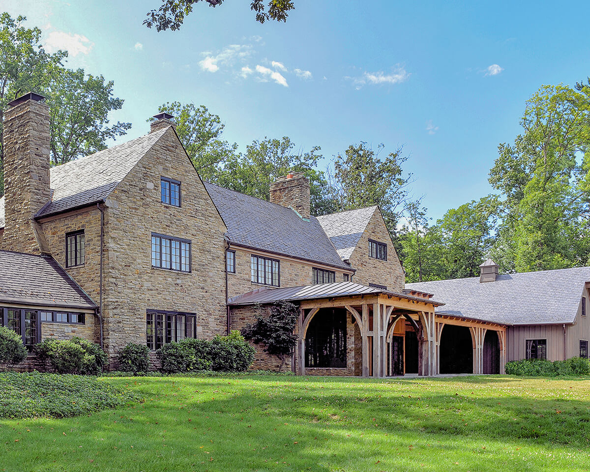
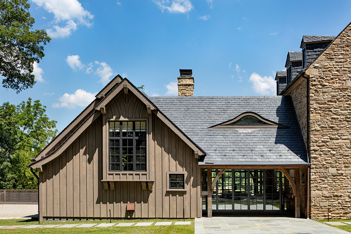
Nestled on four-and-a-half acres of semi-forested serenity, this Tudor-style residence, built by architect Laurence Hall Fowler in 1928, has undergone a remarkable metamorphosis thanks to Annapolis-based Kimmel Studio Architects. Initiated by the family’s desire for a less formal atmosphere, the project breathed new life into every nook and cranny. This included an enlarged kitchen that boasts new flooring, custom cabinets, millwork, and white oak timber ceilings. There’s also a central fireplace crafted from the original carriage house’s stone—a nod to history and innovation. Breathing new life into a historic home is an art, says Anderson. “And the skill evident in this project is exceptional.”
WATERFRONT HOME
DELBERT ADAMS CONSTRUCTION GROUP
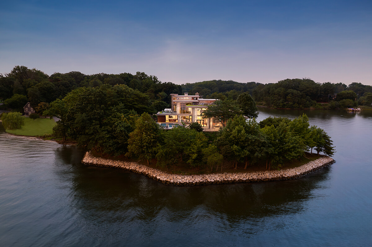
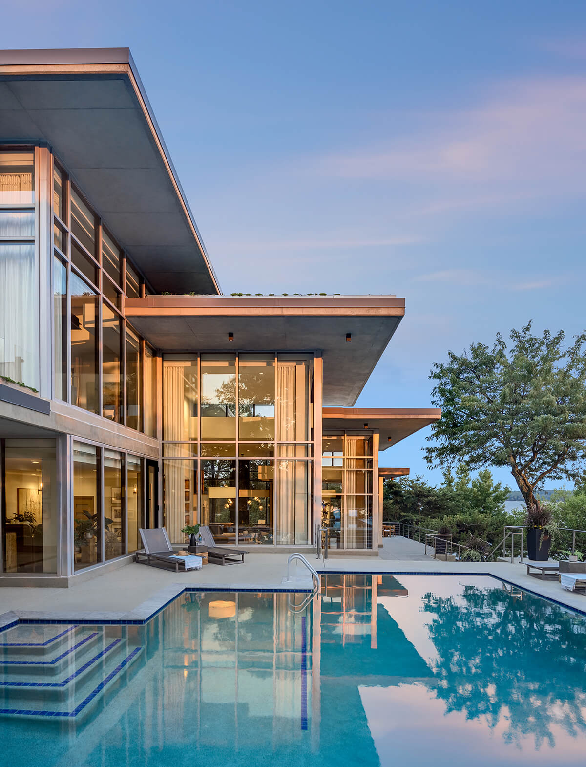
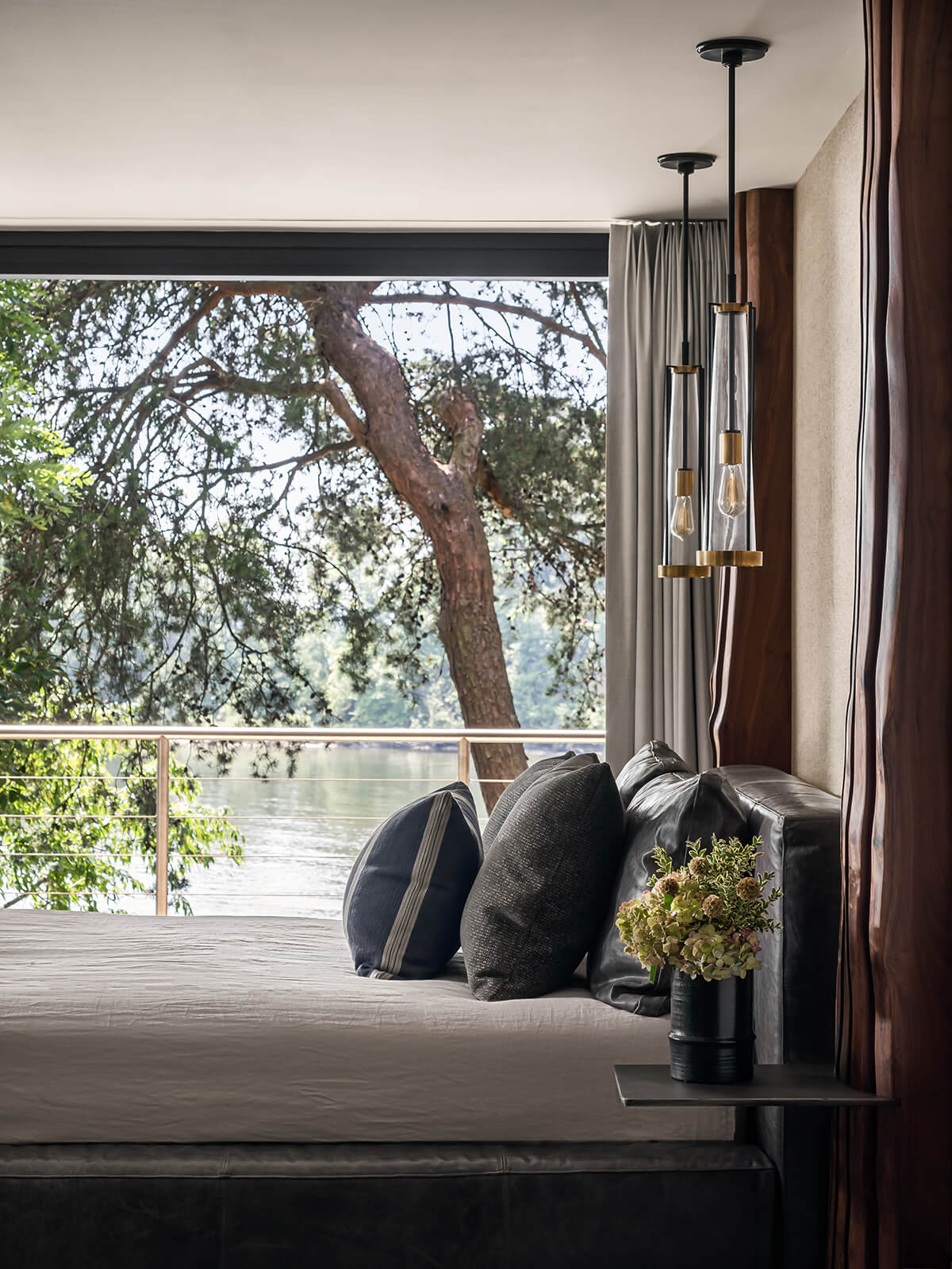
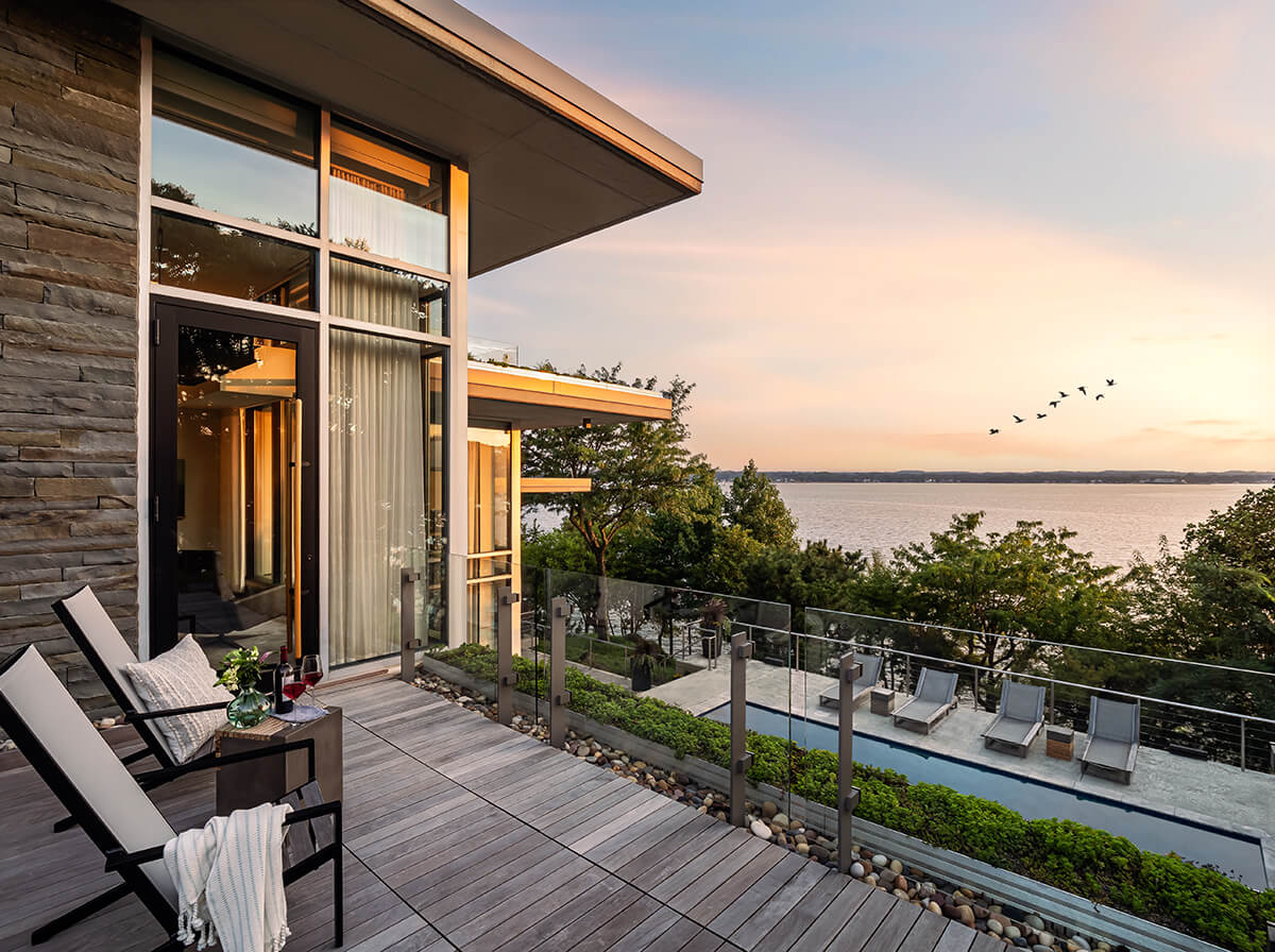
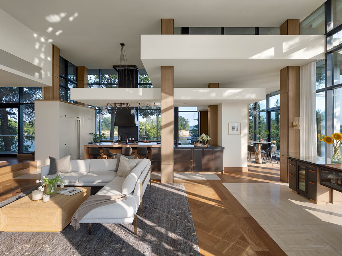
Ensconced on a private peninsula in the Magothy River, this 9,700-square-foot house is known for its striking glass walls and towering profile, a captivating spectacle, especially when illuminated at night. Boasting eight roofs, over two dozen glass walls, and a nearly 360-degree view of the water, this project by Baltimore-based Delbert Adams Construction Group manages to effortlessly blend contemporary design with the tranquil embrace of waterfront living. Strategically placed trees surround the bluff, ensuring unimpeded views from within the house while providing privacy from the water. Burtch was very impressed. “This design is dramatic and impactful, standing out against the water and the surrounding landscape.” He also noted, “The views are intentional and very successful, giving the residents an incredibly strong and beautiful relationship to the site beyond.”
ARCHITECTURE
MCINTURFF ARCHITECTS
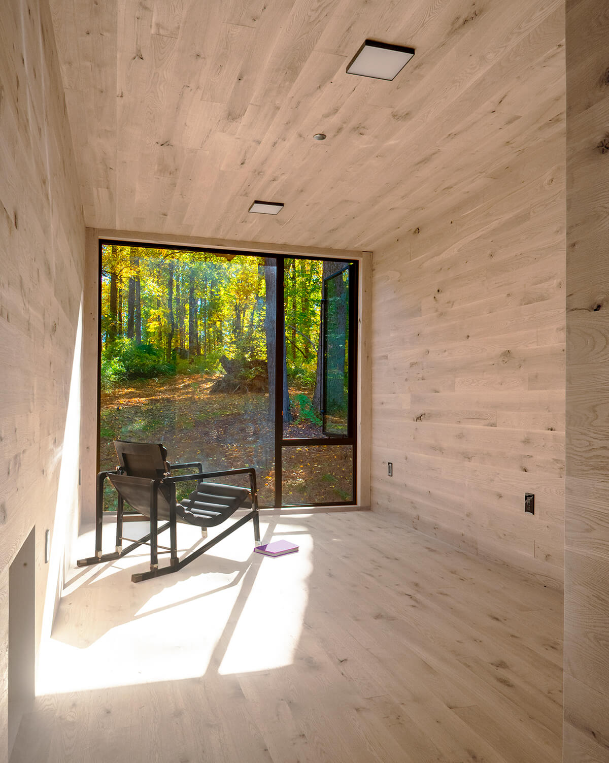
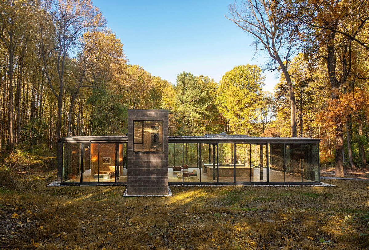
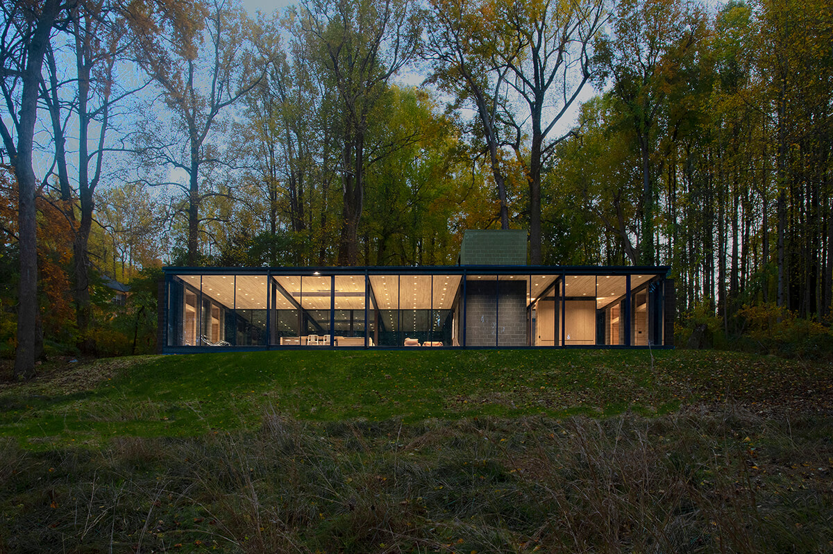
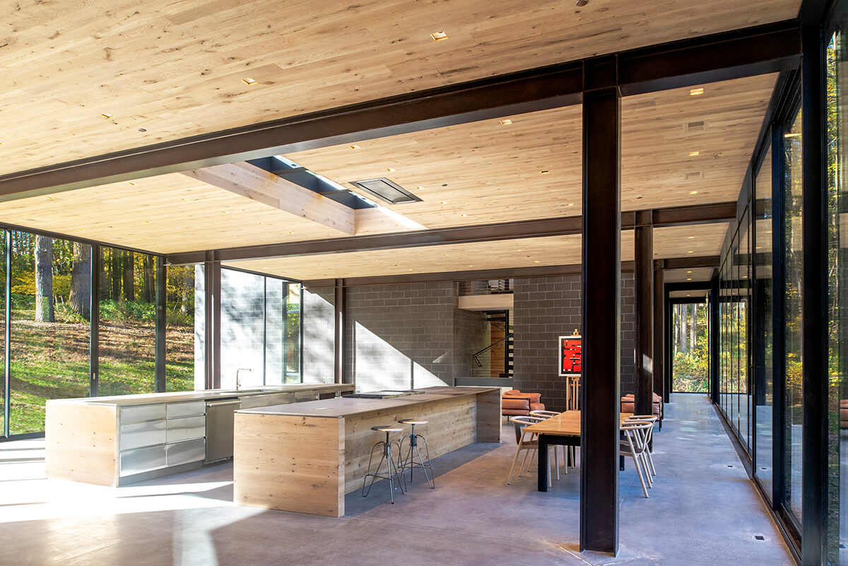
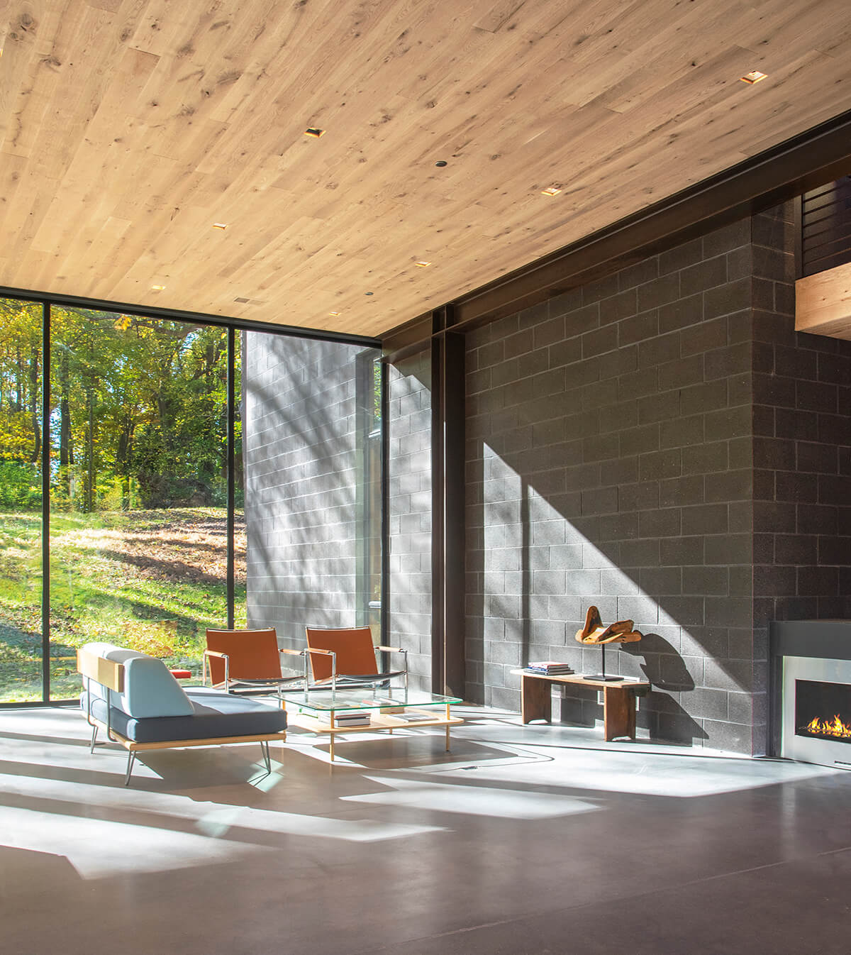
Located on a gently sloping clearing in an Owings Mills forest, this transparent house, built by Bethesda-based McInturff Architects, is intended as a filter through which everything flows. The main spaces—living, dining, kitchen, and workspaces—occupy one end of the platform while a bedroom and gym occupy the other. Separating the two is a masonry core containing bathrooms, stairs, and mechanical spaces, as well as two small wood-lined rooms on a minimal second floor. Steel, wood, concrete, concrete masonry, and glass are the only materials used inside and out. There is no drywall and virtually no paint. “It’s a testament to truth of materials and simplicity,” says Weed.
ROWHOUSE REVITALIZATION
EASTWING ARCHITECTS
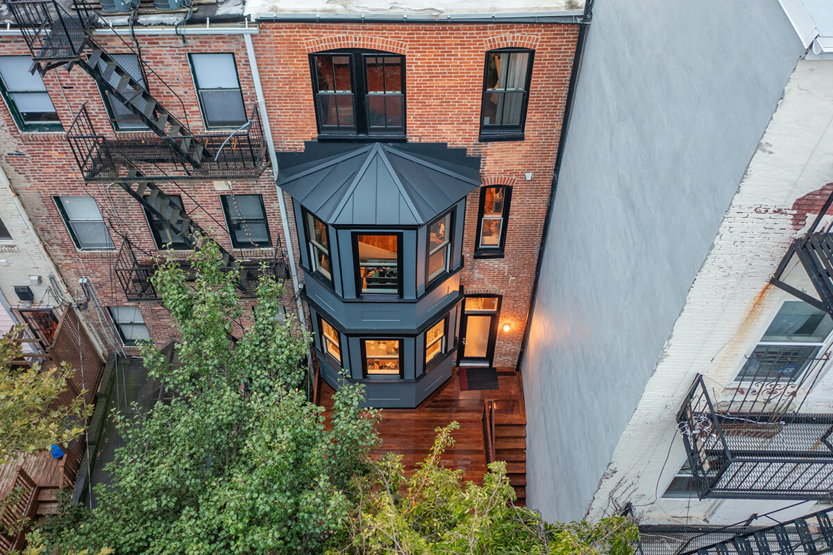
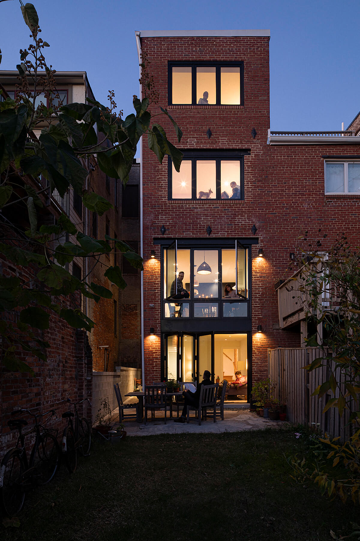
Located one block from Patterson Park at the top of Baltimore’s Butchers Hill neighborhood, this handsome four-story rowhome initially featured panoramic views of Canton and the harbor—so long as you were in the bathroom. The clients craved natural light, longed to restore lost views, and dreamed of a home that blurred the lines between the interior and the city beyond. Baltimore’s EastWing Architects achieved that by transforming the rear wall from an imposing monolith of brick to a delicate glass tower, flooding the once-cavernous interior with bright southern light.
Wagner was impressed by the rear façade, as well, but wrote: “I think my favorite part of the house however is the staircase and landing whose softness and charm really bring out all there is to love in the architecture of Baltimore’s narrow little rowhouses.” Burtch was happy they removed the back deck and stairs, “creating a dynamic relationship between inside and out, all while maintaining and respecting the original character of the home.”
DESIGN | BUILD
REVOLVE DESIGN SHOP
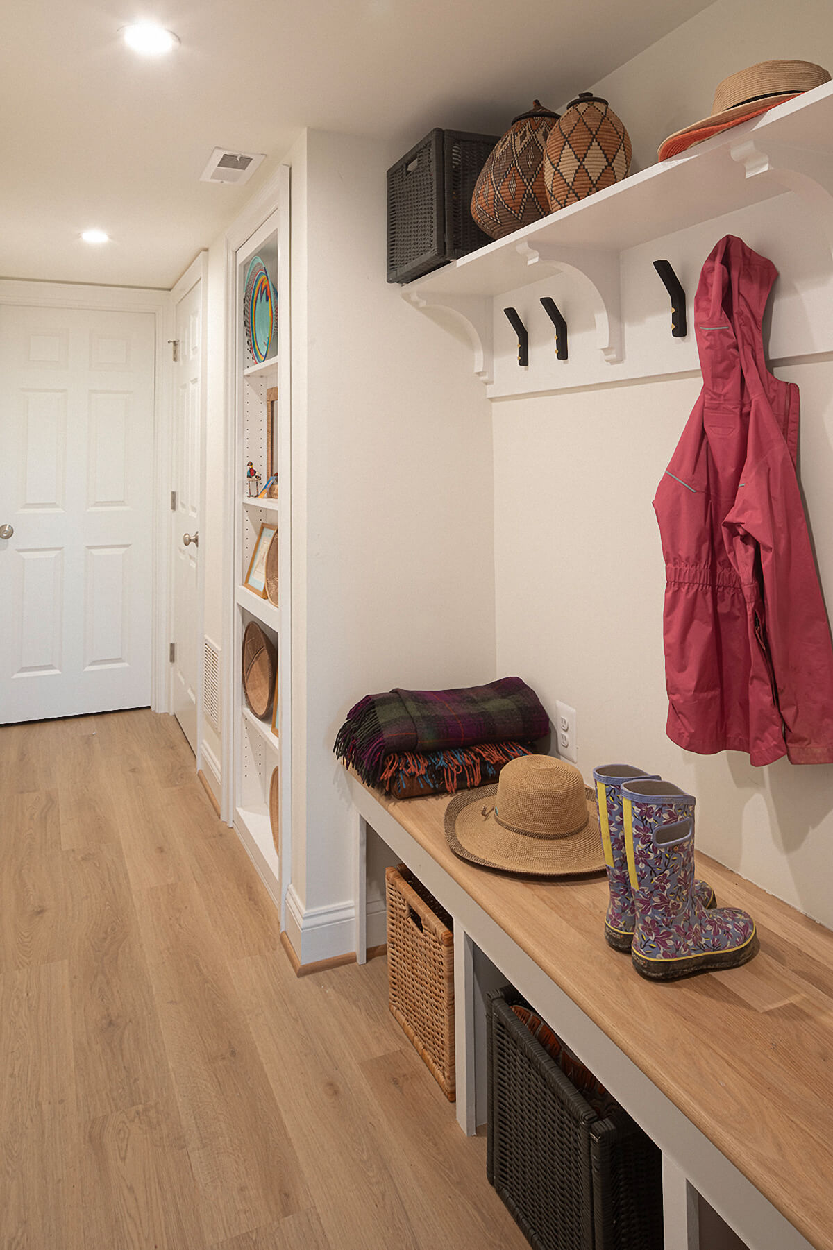
This traditional 1940s brick colonial house needed better functionality and modernization while still maintaining some of its historic charm. To provide the family with a better flow for daily life as well as entertaining, Baltimore-based Revolve Design Shop reconfigured the first floor by moving the kitchen to the existing formal dining room space and enclosing an existing outdoor breezeway to serve as the mudroom. Demolishing an existing wall allowed the homeowners to take full advantage of the windows and connection to the backyard. “This project is clearly transformational to everyday living,” says Anderson. “The level of custom craft is evident in every detail.”
INTERIOR DESIGN
PURPLE CHERRY ARCHITECTS
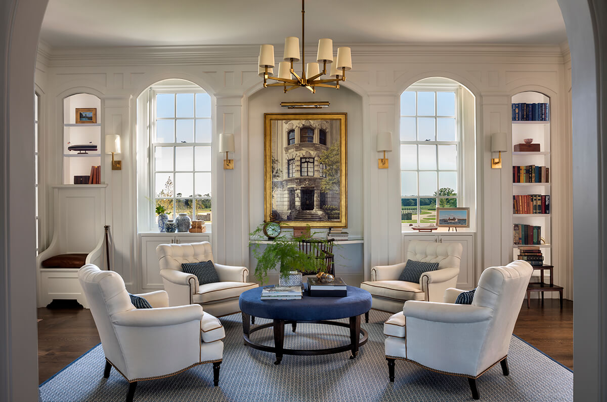
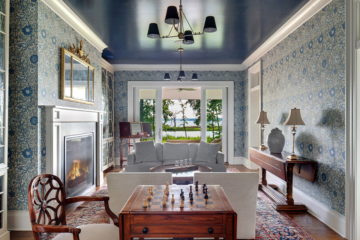
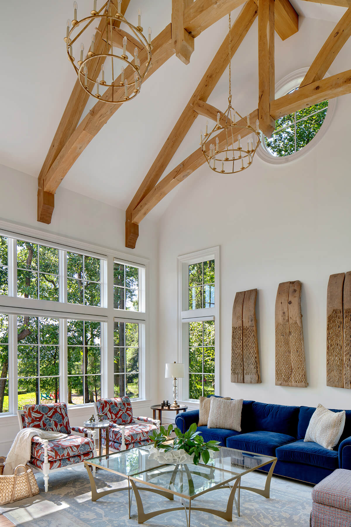
Nestled amidst the serene beauty of a waterfront location, this brand-new retreat seamlessly blends modern comfort with the timeless charm of low-country aesthetic. Inside the home, Purple Cherry Architects designed the great room, with its timber-frame vaulted ceiling and expansive windows, to truly embrace the nature surrounding the home. A waterfront library boasts a moody blue lacquered ceiling and whimsical wallpaper. The versatile space, designed primarily for smaller gatherings, effortlessly transforms into a grand dining room when hosting larger groups.
“I think it is very difficult to get both transitional interiors and eclecticism right at the same time,” says Wagner. “These interiors do an appreciable job of it, made easier by fine choice in textiles, especially rugs, and letting the furniture speak for itself.” Wagner also loved the wallpaper in the bathroom. “Usually, big wallpaper feels very 2013 to me, but the bathroom does well by making that the only big choice made in the room.”
ACCESSIBILITY
HOME METHODS
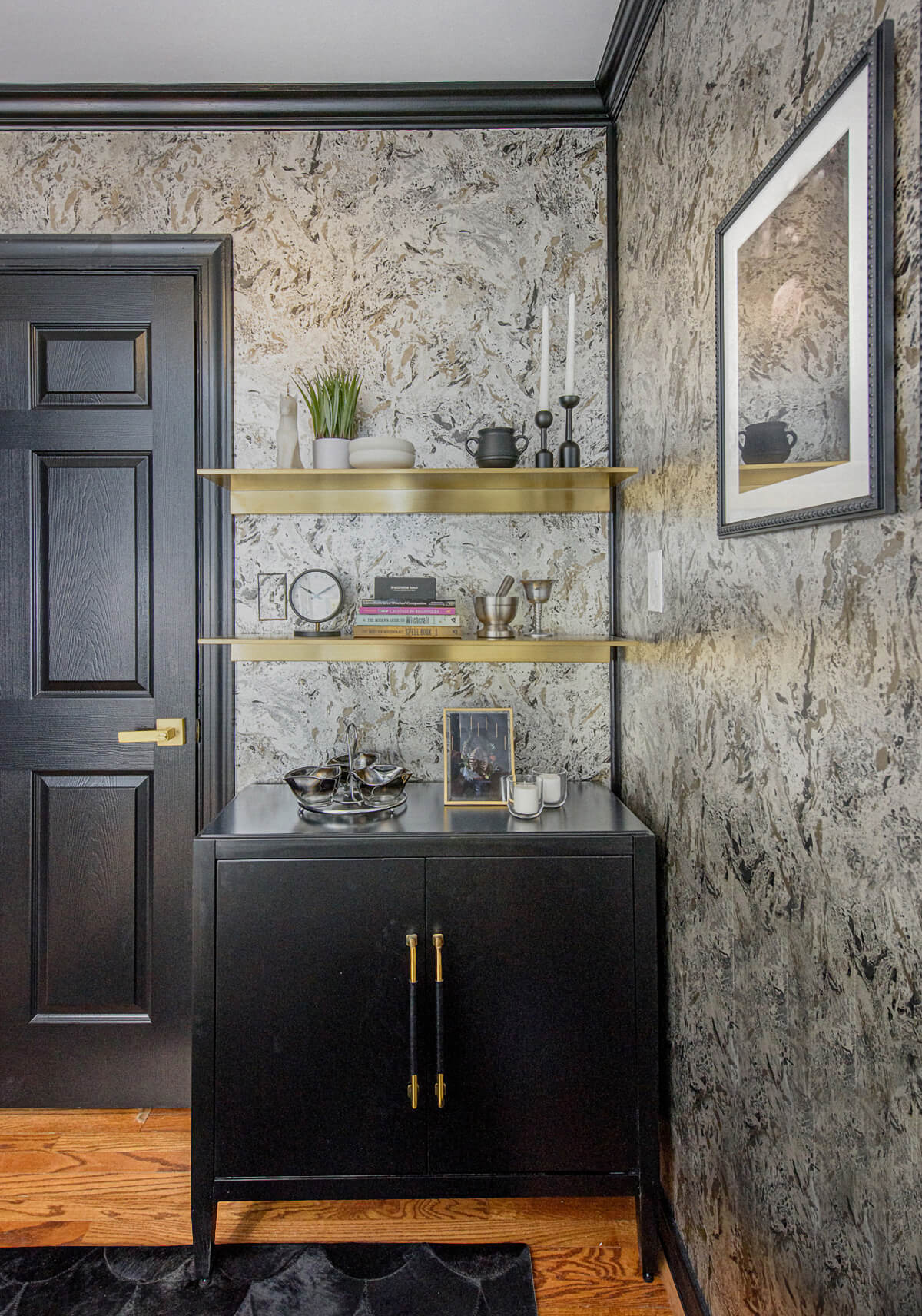
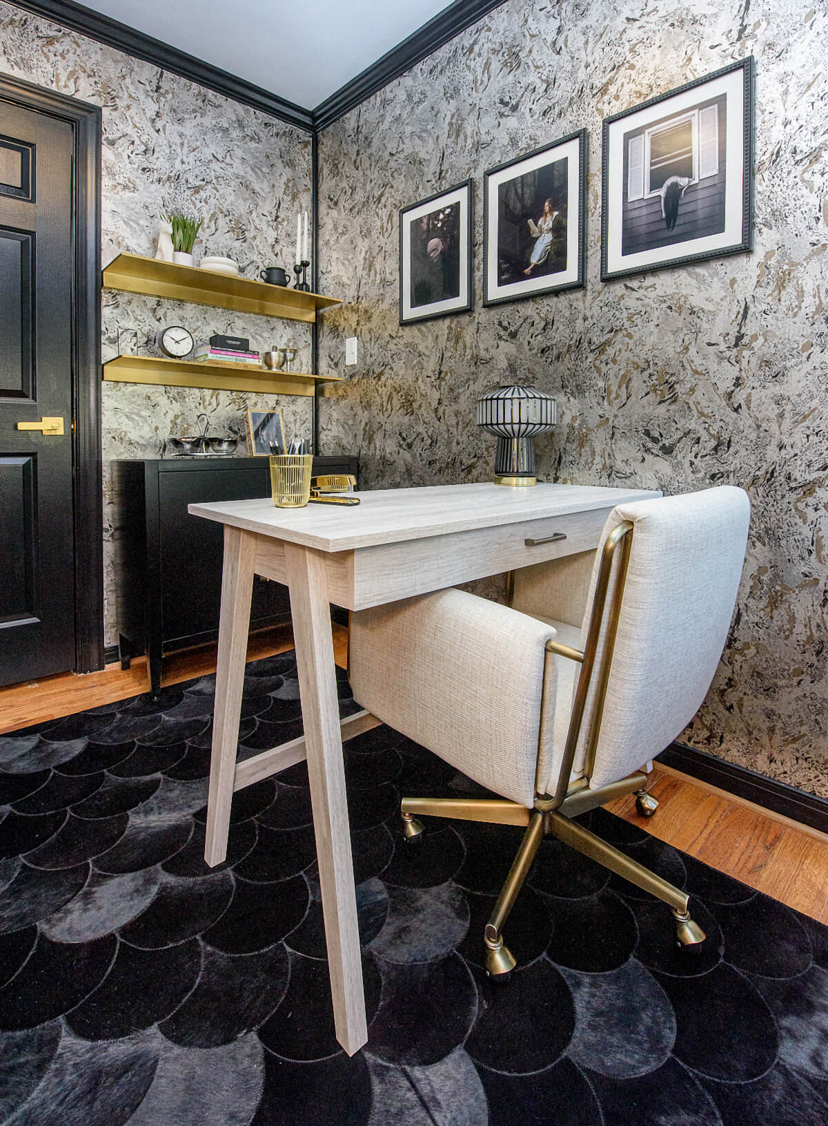
The client’s home office was impacted during a larger renovation including the installation of an elevator. Since the homeowner is in a wheelchair, her office needed to offer storage and a workspace but also allow her to easily move around in her chair. To accommodate that, Baltimore-based Home Methods kept the furniture on one side of the room, which gave her a clear throughway down the other side. Having the desk facing the door allowed her to wheel behind it if she wanted or to get up and use her cane to walk to the desk chair. From a design standpoint, the low-pile rug provides an attractive textural element that can easily be wheeled onto.
HISTORIC RENOVATION
ONE SOURCE CONTRACTING
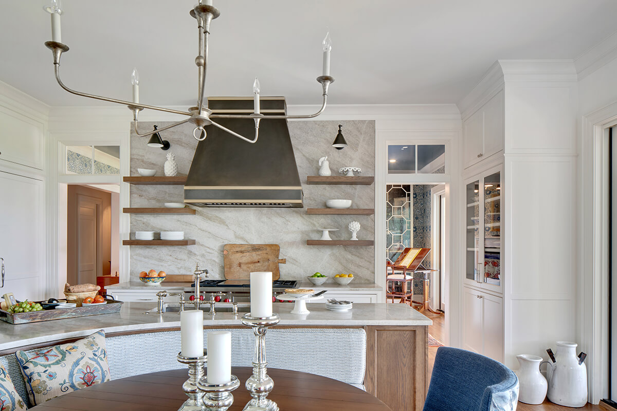
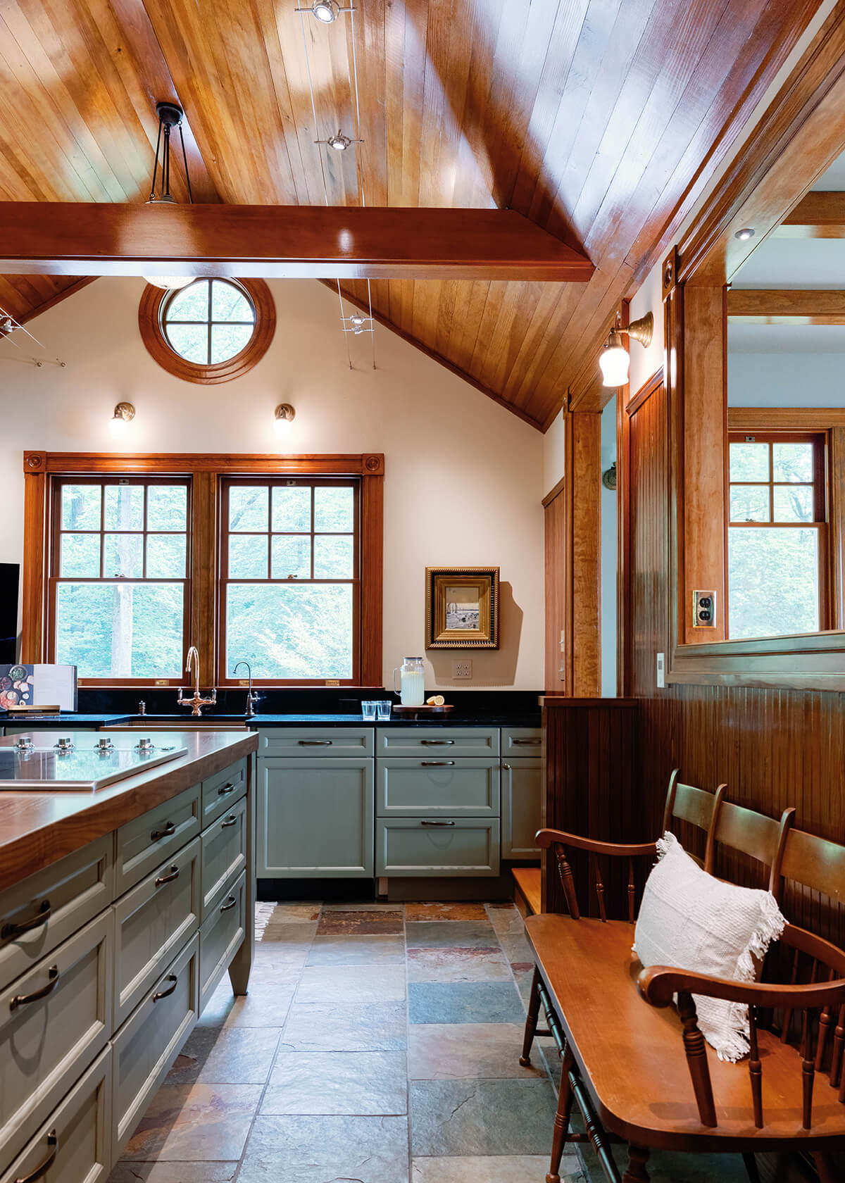
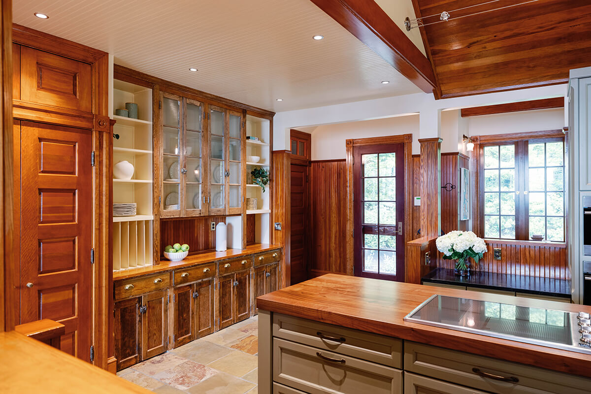
Since this Annapolis home was built in the 19th century, the homeowners wanted to restore the original kitchen cabinets to match the new kitchen aesthetic and design. Baltimore’s One Source Contracting added new features, such as custom cabinetry from Kenwood Kitchens in split pea and an island with an elegant sapwood butcher block, a Wolf oven, and custom paneled Sub-Zero refrigerator to bring this traditional kitchen to modern day standards. Holding true to the historic nature of the house, One Source worked to integrate and restore a section of original perimeter cabinetry into the overall design, and it is not only functional but a conversation piece to showcase the expert renovation required for restoration work of this level.
MID CENTURY MODERN RENOVATION
PLACE ARCHITECTURE: DESIGN
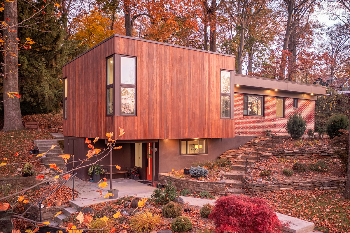
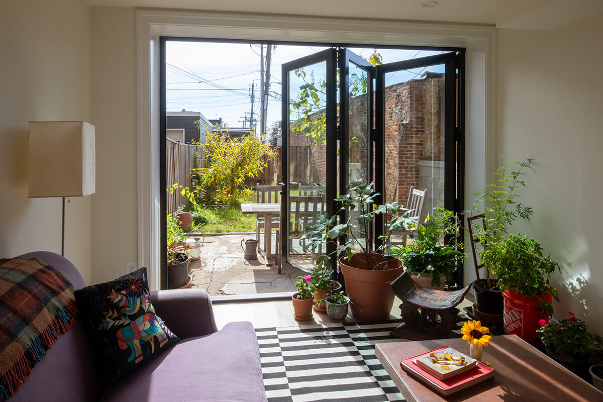
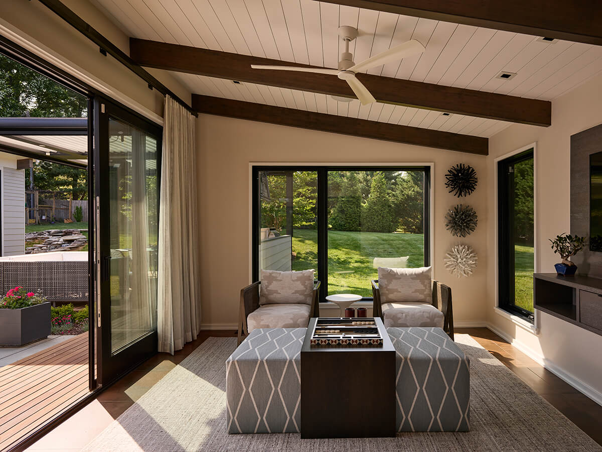
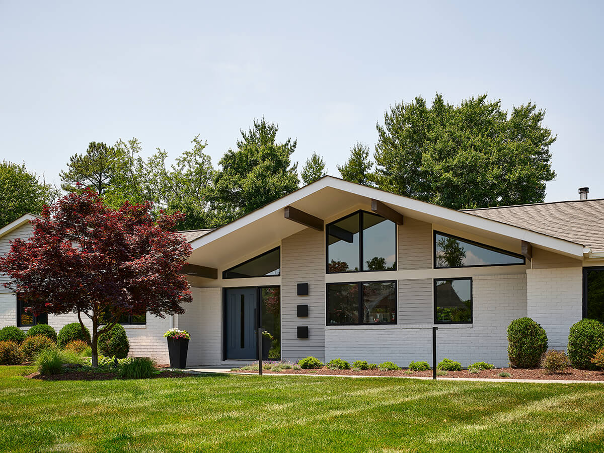
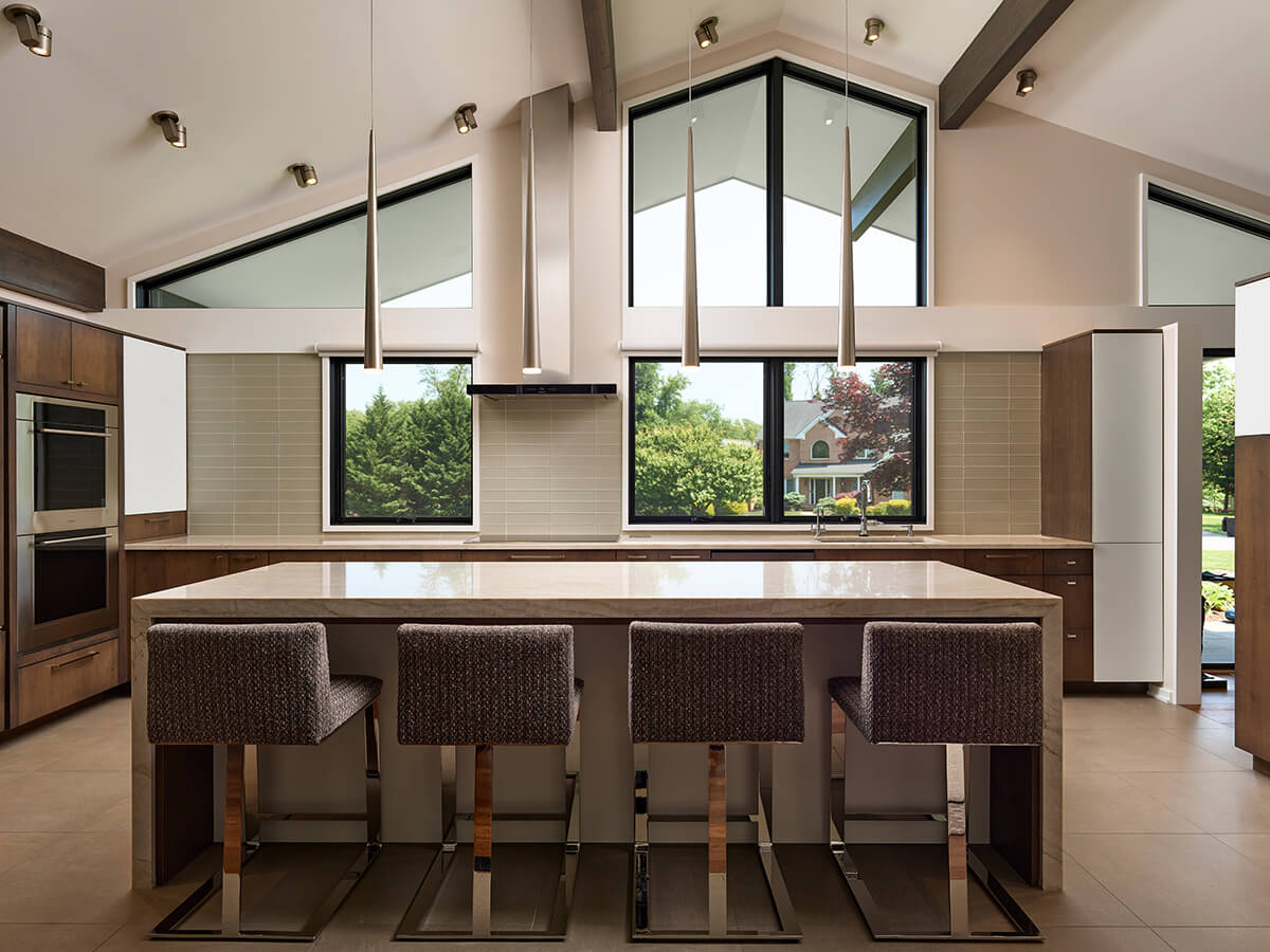
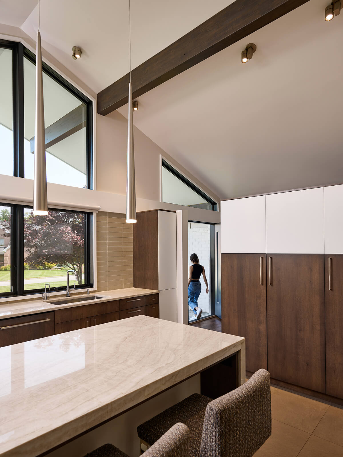
This whole house renovation transformed a 1960s one-story brick home and reinvented its midcentury aesthetic. Located in a suburban Baltimore enclave known for its abundance of midcentury homes, this one-level ranch had little architectural interest or detail and lacked daylight and views. To achieve the client’s new vision, Place Architecture: Design had to reimagine the existing house using a completely new experiential framework that all the judges loved. On the rear, two “wings” were added, each housing spaces to engender a new way of living. The west wing housed a primary bedroom and bathroom suite and an east wing provided much-needed support space—mudroom, laundry, and sunroom. To enhance the spatial dynamics, a tall center gable roof was added to the front of the house, increasing volume, and thus bringing in more natural light.
READERS’ CHOICE
J. E. SCHRAM ARCHITECT
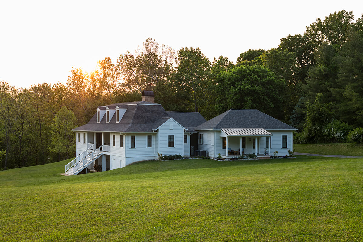
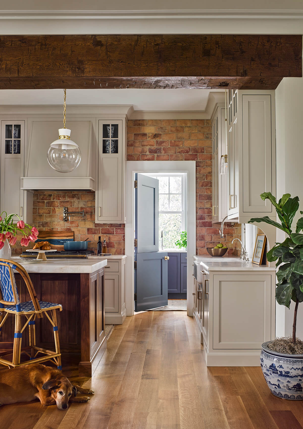
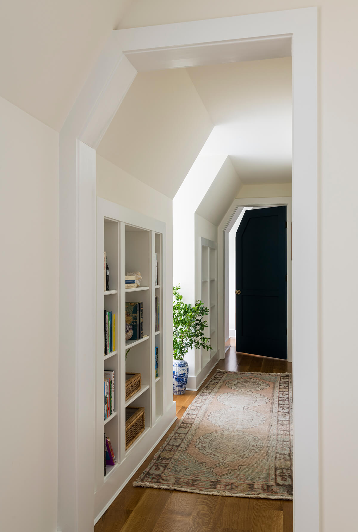
Readers loved Sycamore Hollow, a “new old house” built by Baltimore-based J.E. Schram Architecture in the countryside, that functions as a multi-generational home with a main house and cottage. Though internally connected, they exist as two distinct and private dwellings. The dwelling is designed around the theory of vernacular progression—the idea that the house has evolved over time. It is intended to appear to have been built in stages. Even the great room opening to the kitchen is done so with a large, antique beam, implying that a pre-existing wall has come down.
LEGACY
LAURA MELVILLE THOMAS, MELVILLE THOMAS ARCHITECTS
Laura Melville Thomas prides herself on being an observer, an illustrator, a creative, a traveler, a planner, and a collaborative partner. “My architecture, my planning, my design sensibilities all flow from a keen interest in looking hard at the world around me,” says the dual French and American citizen.
All these elements have contributed to her work as a successful architect for more than 40 years. Thomas studies and knows the historical narratives of her homes but is also willing to use bold solutions when needed and take risks. Along with her husband, George Thomas, she’s completed over 400 projects, many for repeat clients. There’s a trust there.
“They know me and what I bring to the table in terms of design and delivery,” she says. “But I also have new clients who want more from their architect and understand the demands that good design takes in all of its forms—commitment, cost, caring, patience, and teamwork.” This dedication made her a natural pick for the second annual Legacy Award, as chosen by the Baltimore Home editors.
DINING ROOM
PASCALE DE FOUCHIER INTERIORS
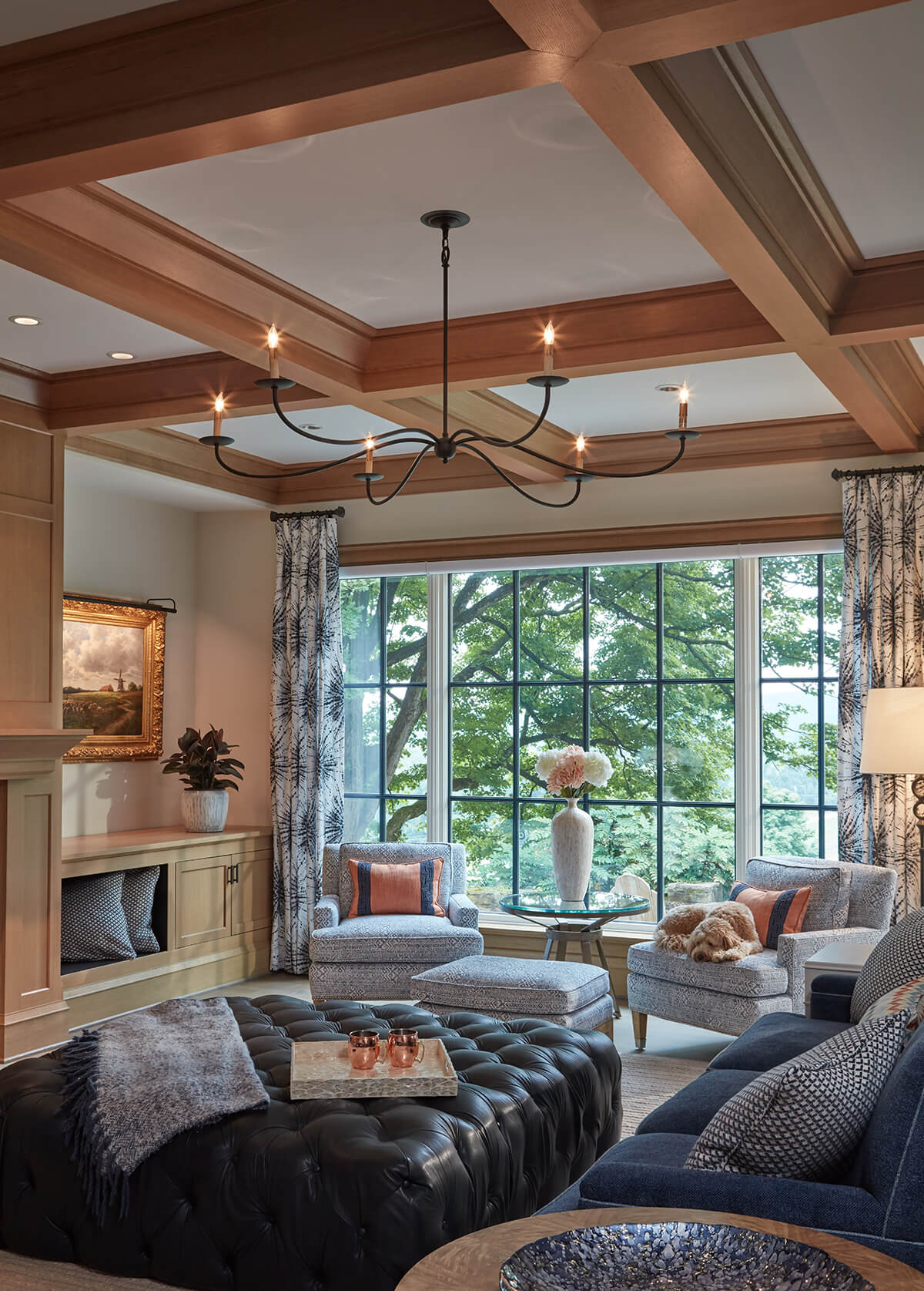
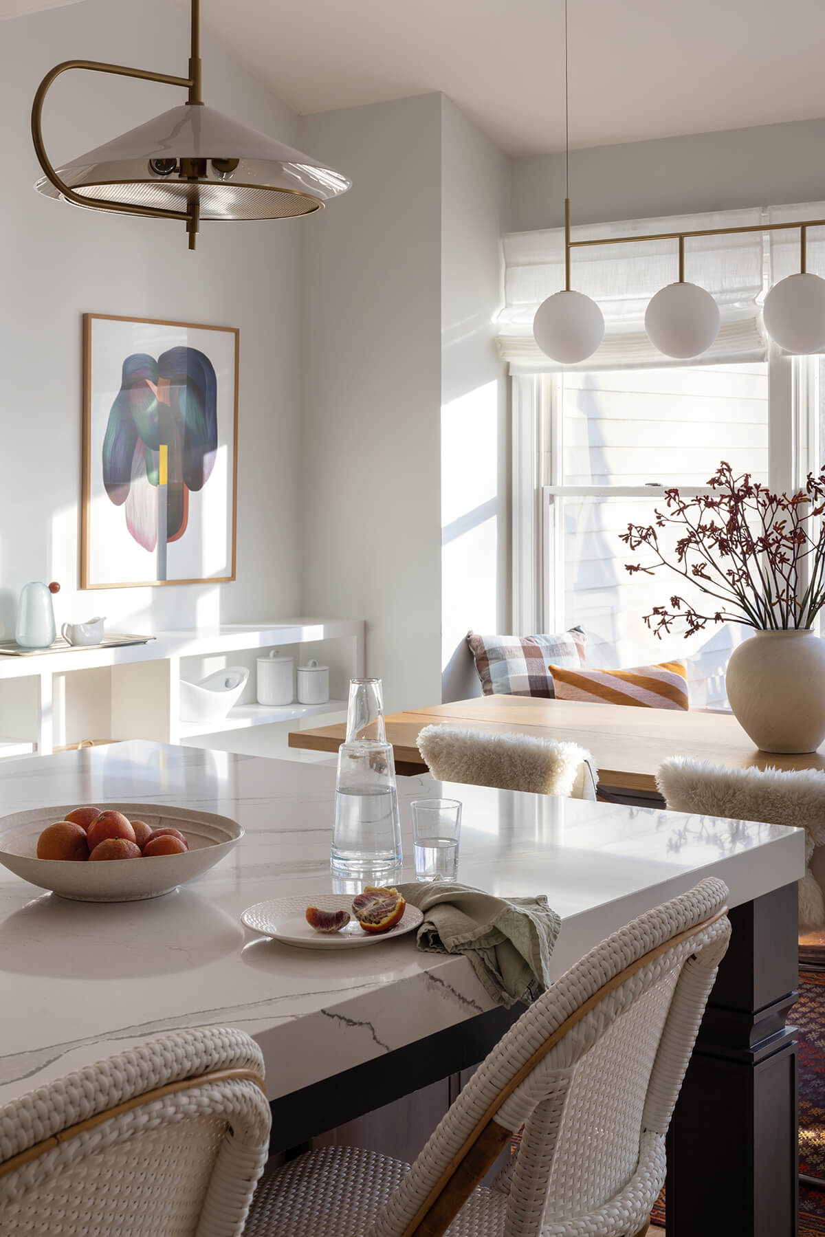
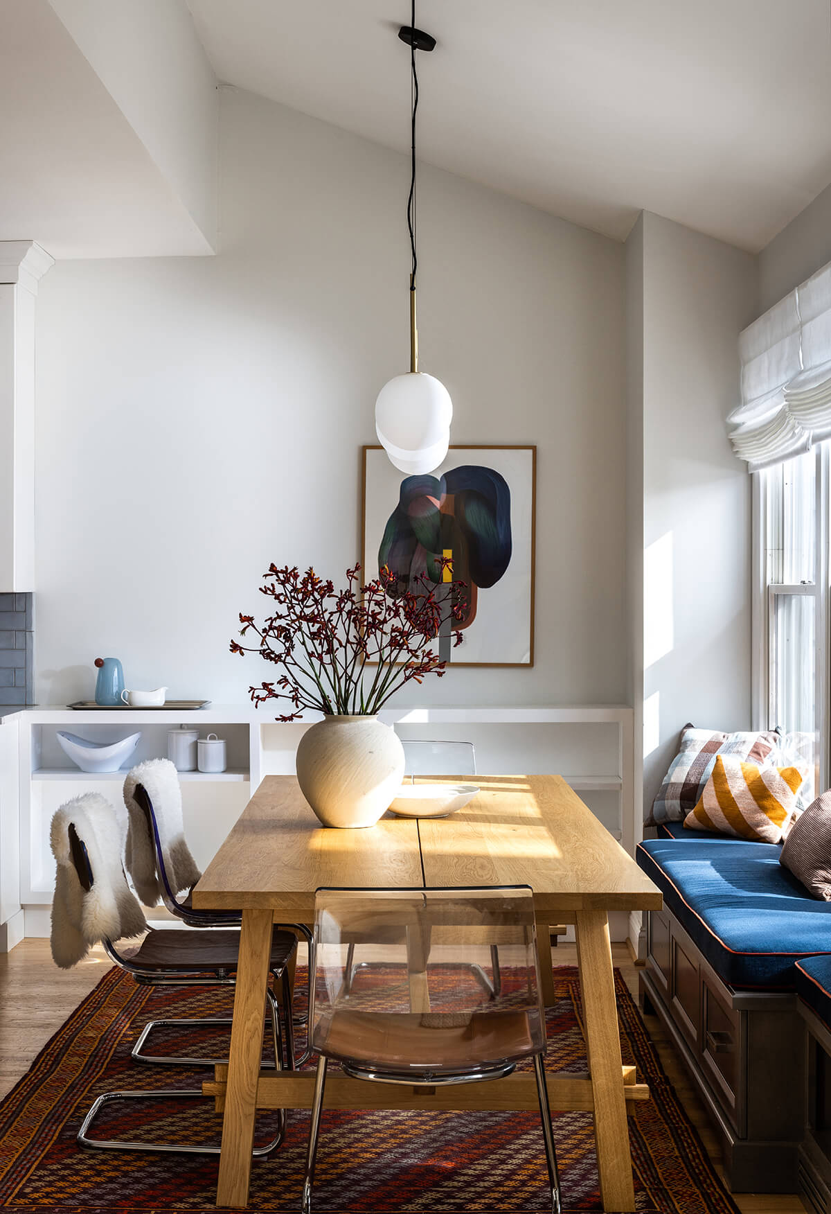
The family in this Cockeysville home wanted the eating side of their kitchen to balance the need for efficiency and practicality with a coherent palette, clean lines, and graceful details. Pascale de Fouchier Interiors used the huge window that faced the woods to nurture a natural and timeless aesthetic. They chose wood, leather, and heavy cotton to bring warmth and comfort to the space. Also, the counter height built-in shelves beautifully tie into the rest of the kitchen. The mix between modern lines and a rustic chic vibe offers a calming yet joyful place to reunite on a daily basis. “This project stood out to me as a place I would want to linger, whether to dine, read, or work,” says Anderson.
LIVING ROOM | GREAT ROOM
DELBERT ADAMS CONSTRUCTION GROUP
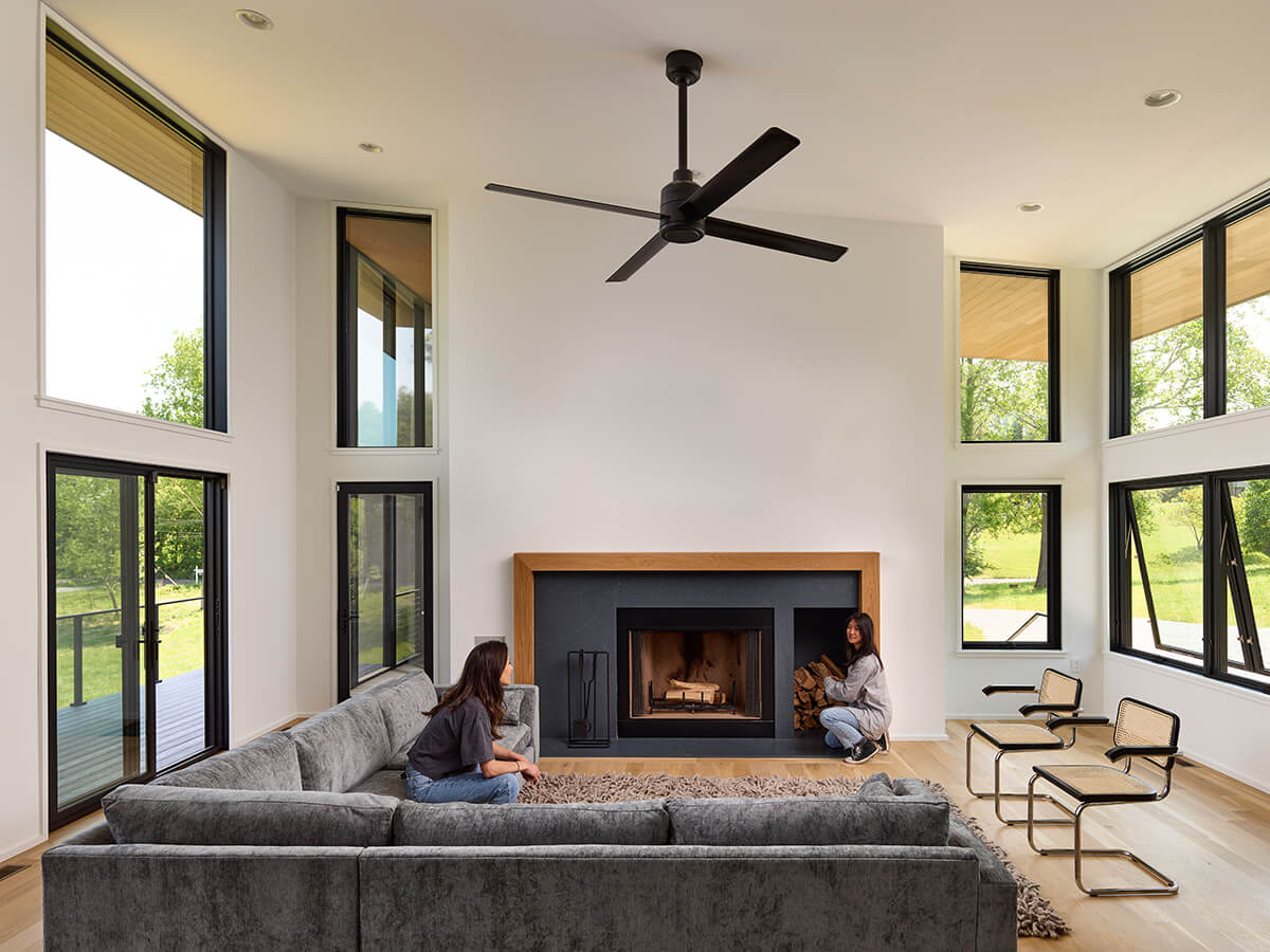
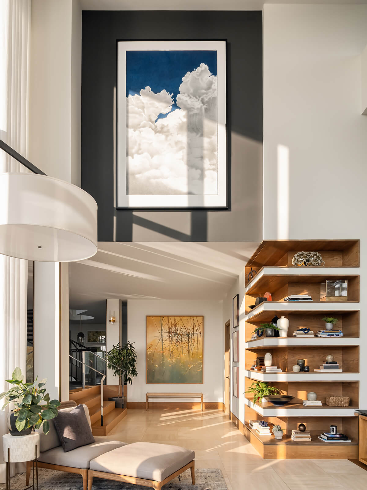
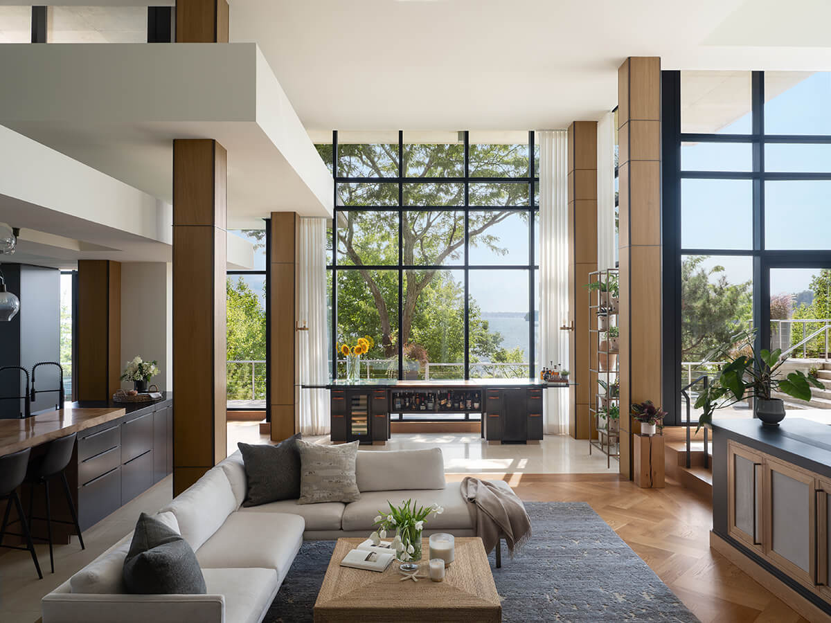
Crafted with a vision of modernity and warmth, this living room serves as an inviting haven for family gatherings. Smart design includes a hidden double-sided TV that rises from a custom piece of furniture. This thoughtful feature—among many others from Delbert Adams Construction Group—allows for entertainment from both the main living area and the slightly cozier lounge. The windows in the living room frame the captivating waterfront views, seamlessly integrating the indoors with the natural beauty outside. “This room truly shines with its dynamic light and abundant texture,” says Anderson. Overall, the marriage of modern design and cozy ambiance creates an environment that is architecturally remarkable.
WALL TREATMENT
HOME METHODS
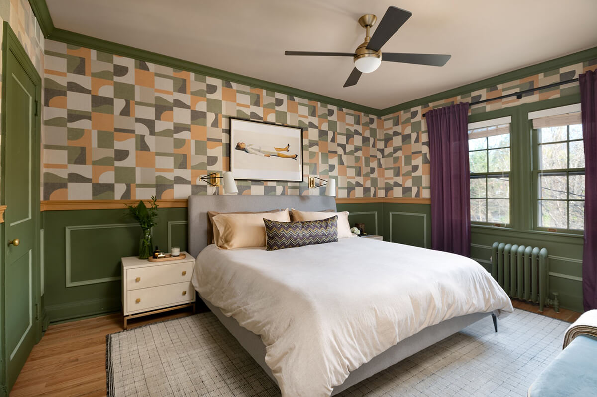
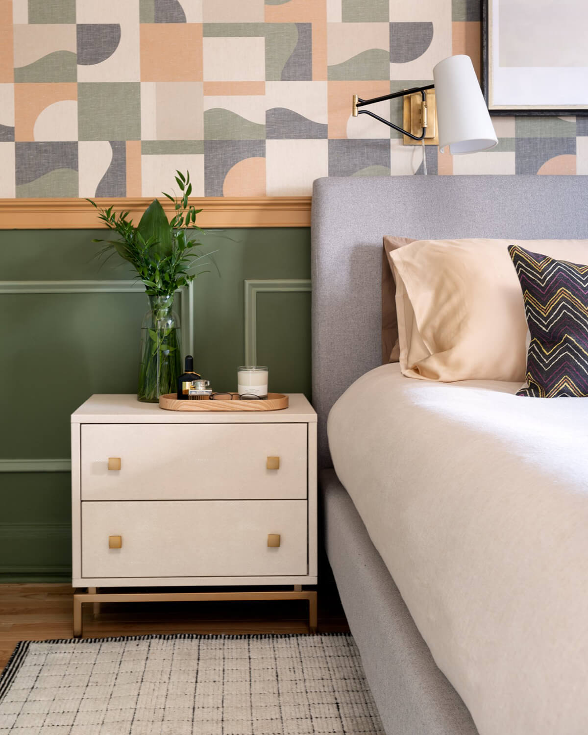
The homeowners wanted to transform their primary bedroom space to reflect both their personality and the style of their Roland Park home. The first thing Home Methods decided on was the wallpaper. After some conversations about budget, they decided to use wallpaper on the top portion of the wall and add a chair rail and panel molding to the painted lower portion of the wall. To lean into the boldness of the room, they selected colors that pulled from the wallpaper, with the orange chair rail as a clear divider between the wallpaper and green paint. They kept the furnishings neutral to allow the walls to be the focal point.
SPECIALITY ROOM
LAUREN HURLBRINK INTERIORS
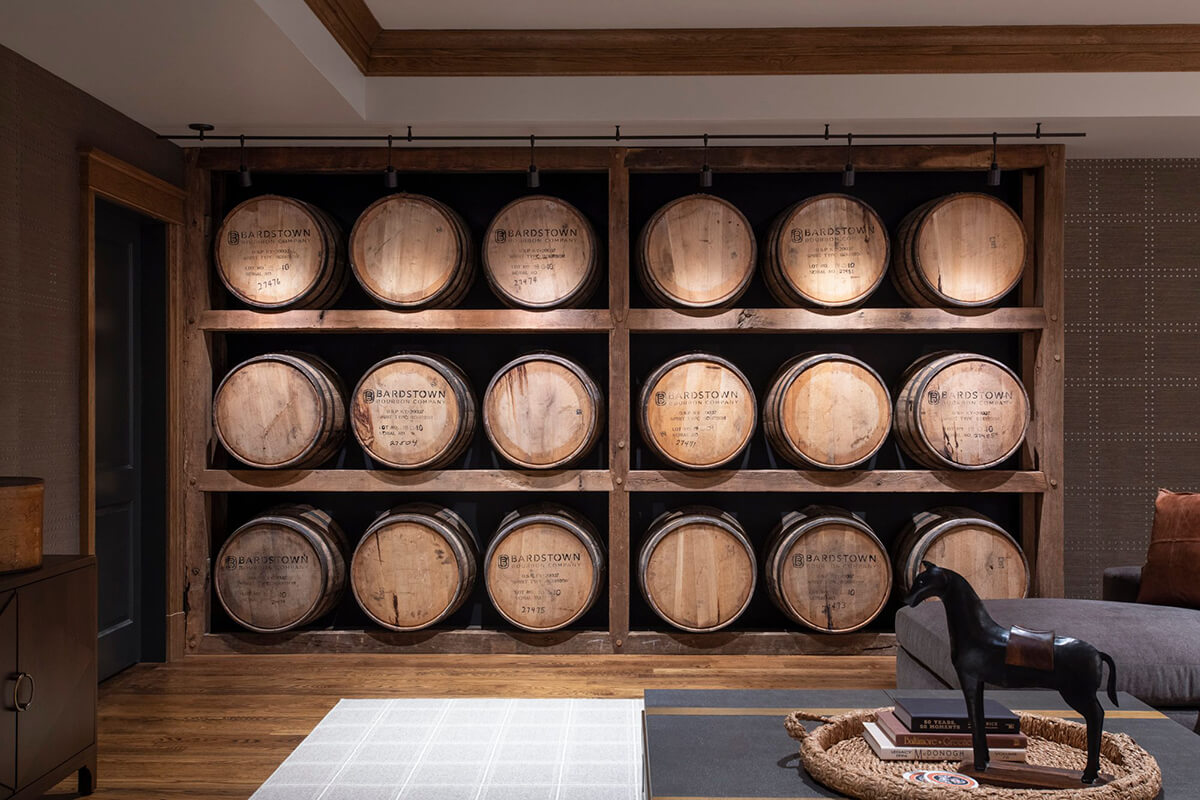
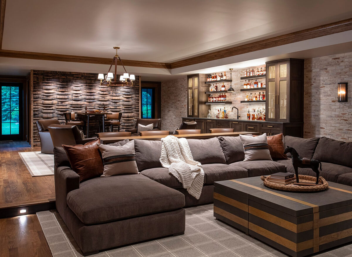
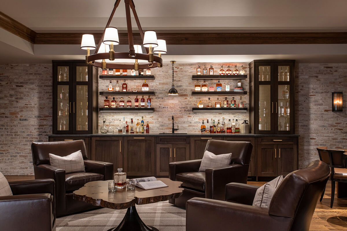
The lower level of this farmhouse in Baltimore County horse country was transformed into a warm and inviting bourbon bar. Lauren Hurlbrink Interiors, based in Timonium, worked with Case Builders to add architectural details like a brick wall and wood crown molding. Bourbon barrels were deconstructed to create two feature walls, something the owner of the home saw on a bourbon tour in Kentucky. Anderson called the wall “a playful delight.” A plaid rug unifies the space, adding warmth and texture. “This is a very texturally rich space,” says Weed. “The use and application of materials pairs well with the low and heavy furniture.”
FIREPLACE
TWOPOINT STUDIO
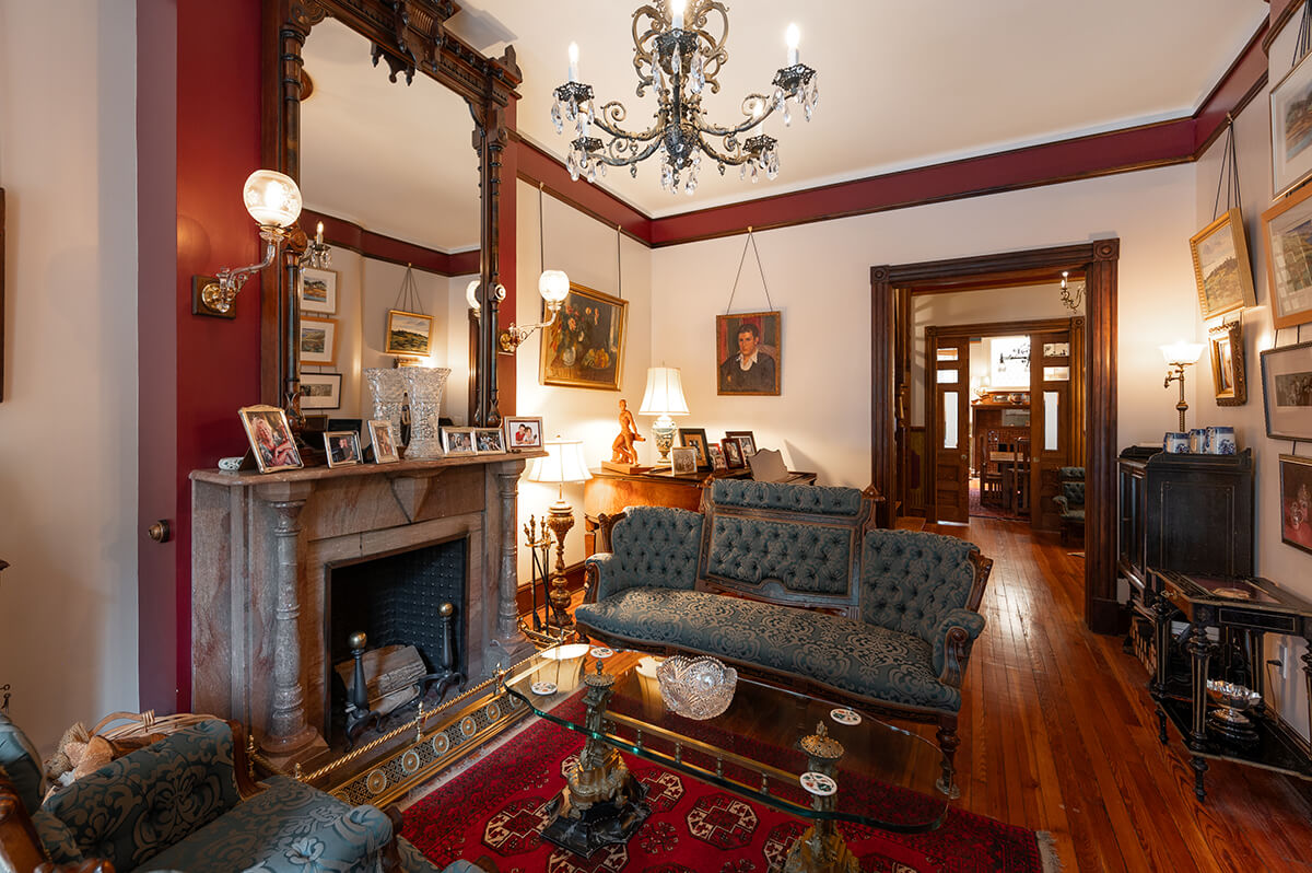
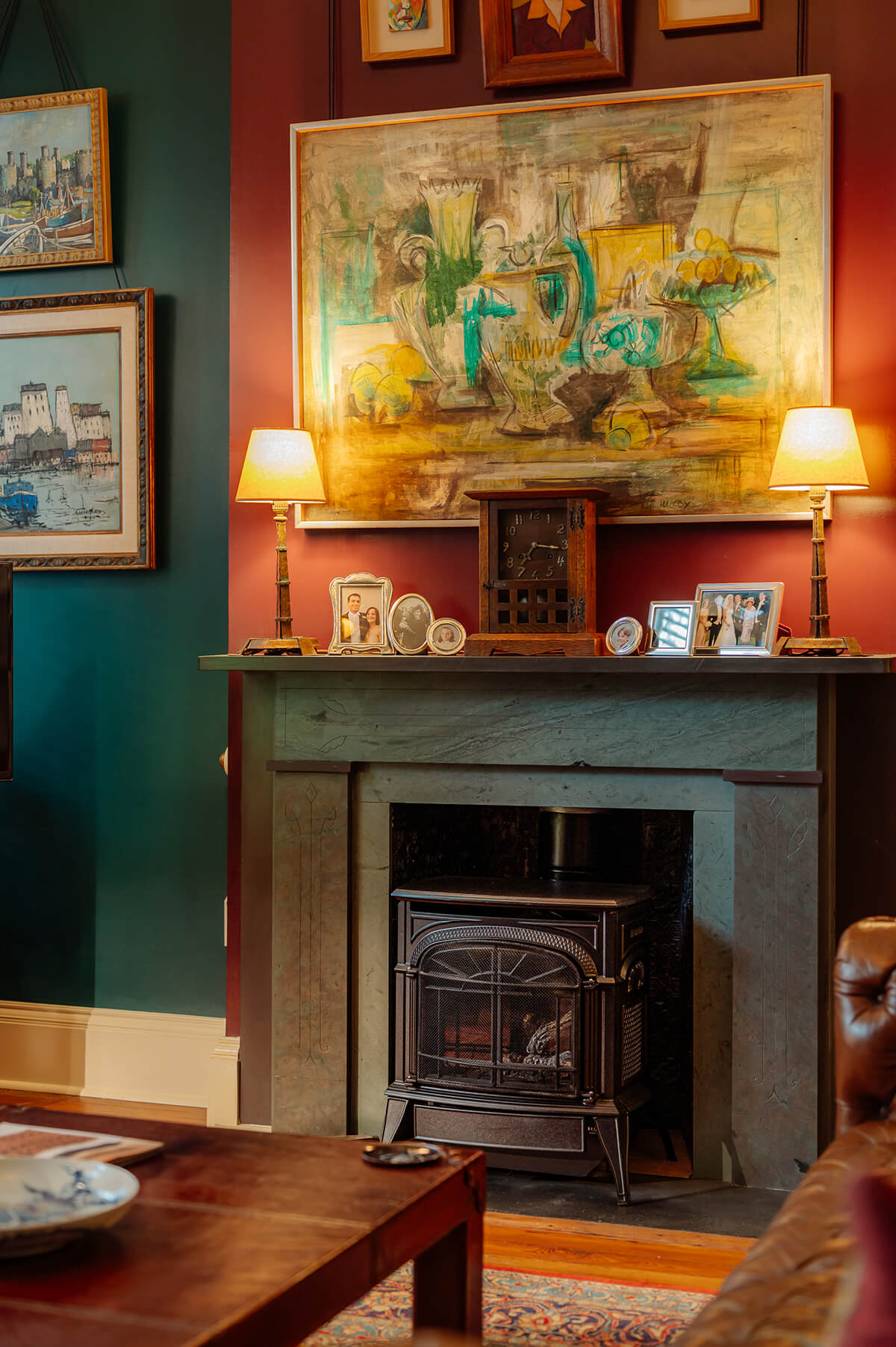
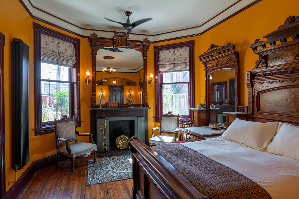
Twopoint Studio’s renovation of this 4,500-square-foot Mt. Vernon brownstone, built in 1883, required the restoration of 10 fireplaces. Some of the fireplaces had minor work needed, while others needed more extensive restoration, such as the repointing of mortar, addressing a crack in marble, and chimney repairs. “I like when a house gets a little bit weird, and I like it even more when it gets weird within the boundaries of a preexisting Victorian weirdness, as is the case here,” says Wagner. “Also, Baltimore is a weird city. It should lean into that more.”
KITCHEN
SUNNYFIELDS CABINETRY
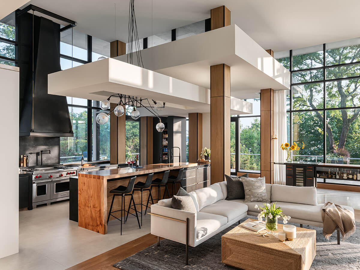
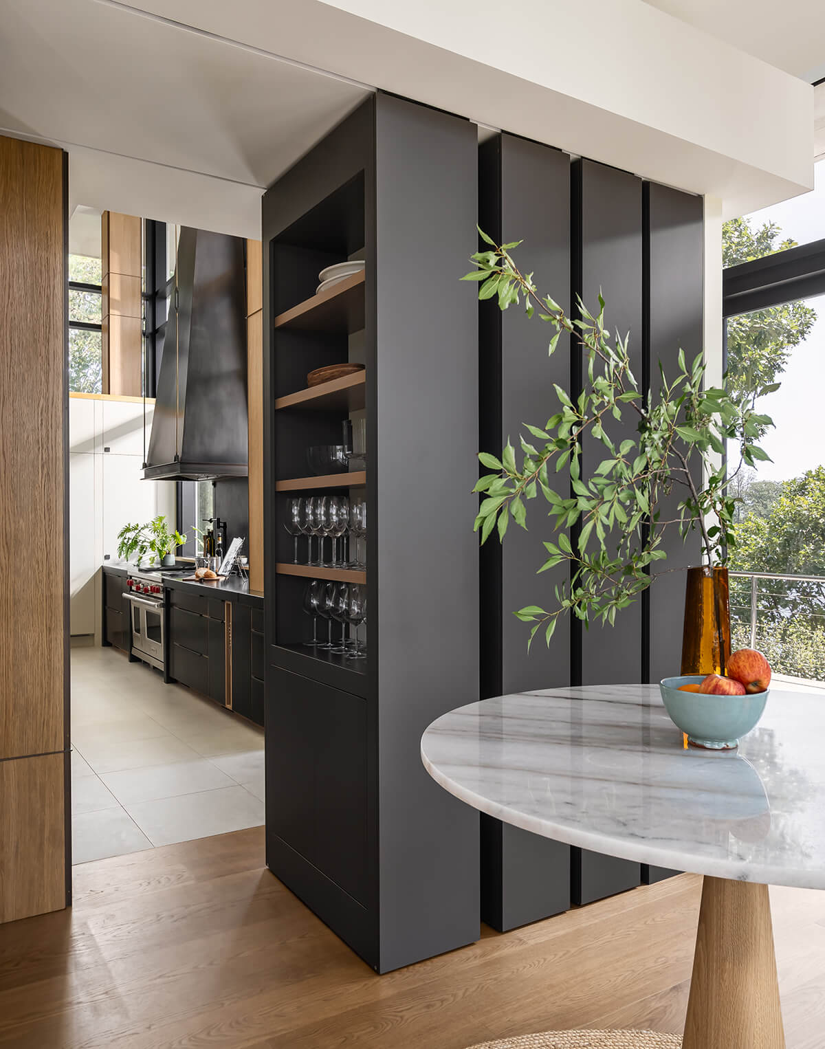
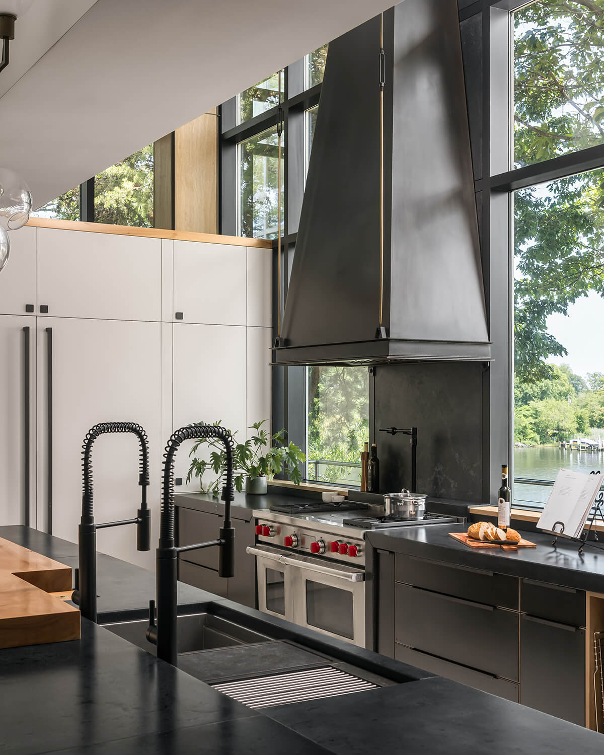
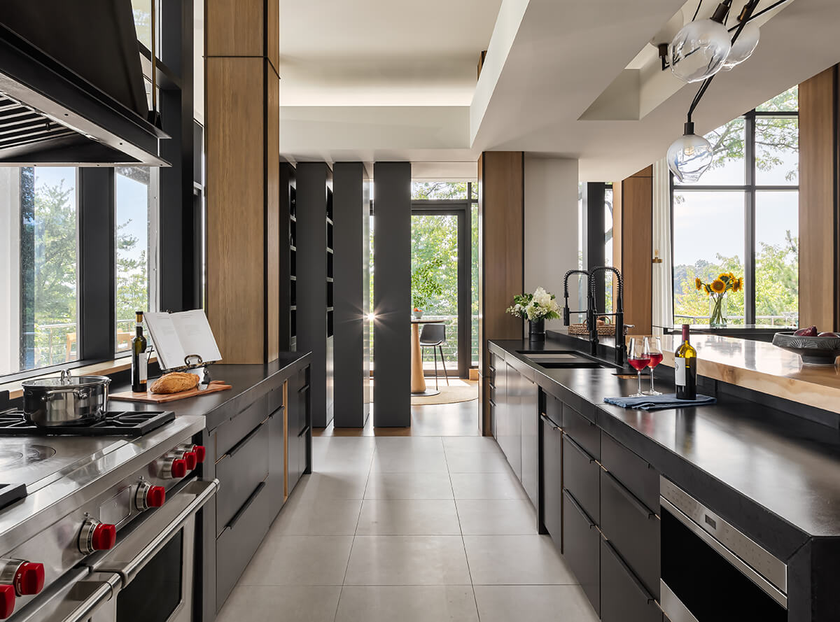
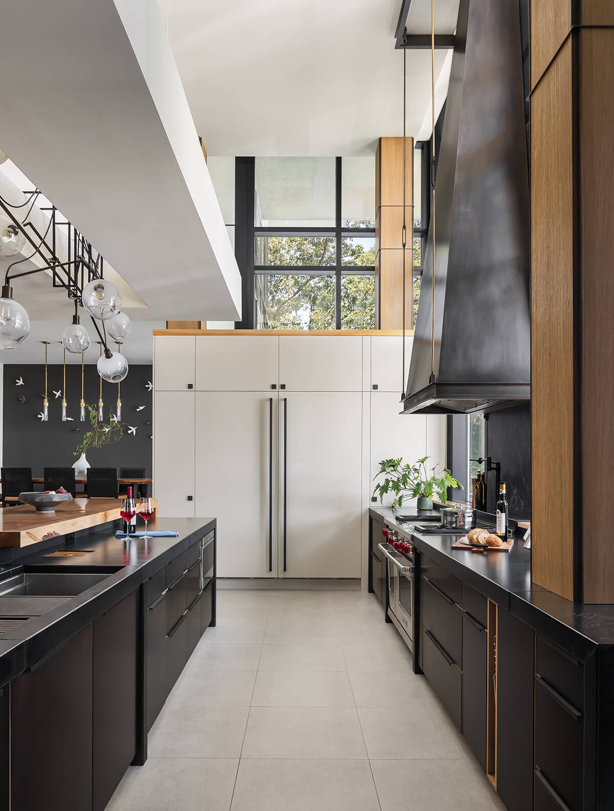
This sophisticated chef’s kitchen in Pasadena was designed for someone who loves to cook. Floating planes overhead define each unique space while adding captivating architectural interest. Unconventional window placements, from Baltimore-based kitchen designer Sunnyfields, replaced a traditional backsplash, affording the cook breathtaking waterfront views. Anchoring the space is an 11-foot, custom-made black patina hood above the stove, not just a functional element but a masterpiece of craftsmanship that adds a touch of beauty to the culinary focal point.
LIBRARY | STUDY | HOME OFFICE
PASCALE DE FOUCHIER INTERIORS
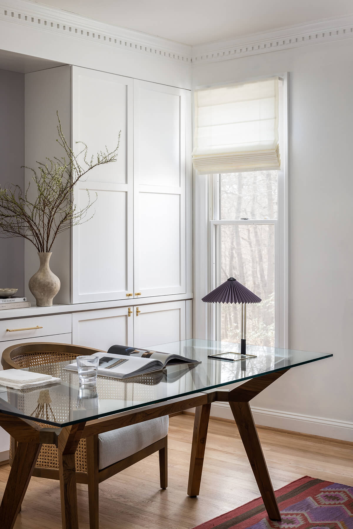
This home office was originally overly cluttered and opened into the hallway, making the space hard to use. The homeowners insisted their beloved rug remain but left the rest up to Pascale de Fouchier Interiors, based in Baltimore. Although budget was tight, they were able to achieve organization with custom-made built-ins, privacy with the addition of a French door, and better overall proportions by creating a wall-to-wall window bench. The glass table provides a wide workspace while enhancing the visual flow and, through color and texture, they were able to create a warm, serene, and elegant ambiance. “I love a kind of subtle eclecticism, driven by textiles and textures rather than really loud wallpapers or colors,” says Wagner.
USE OF COLLECTION, ANTIQUES, OR ART
HOME METHODS
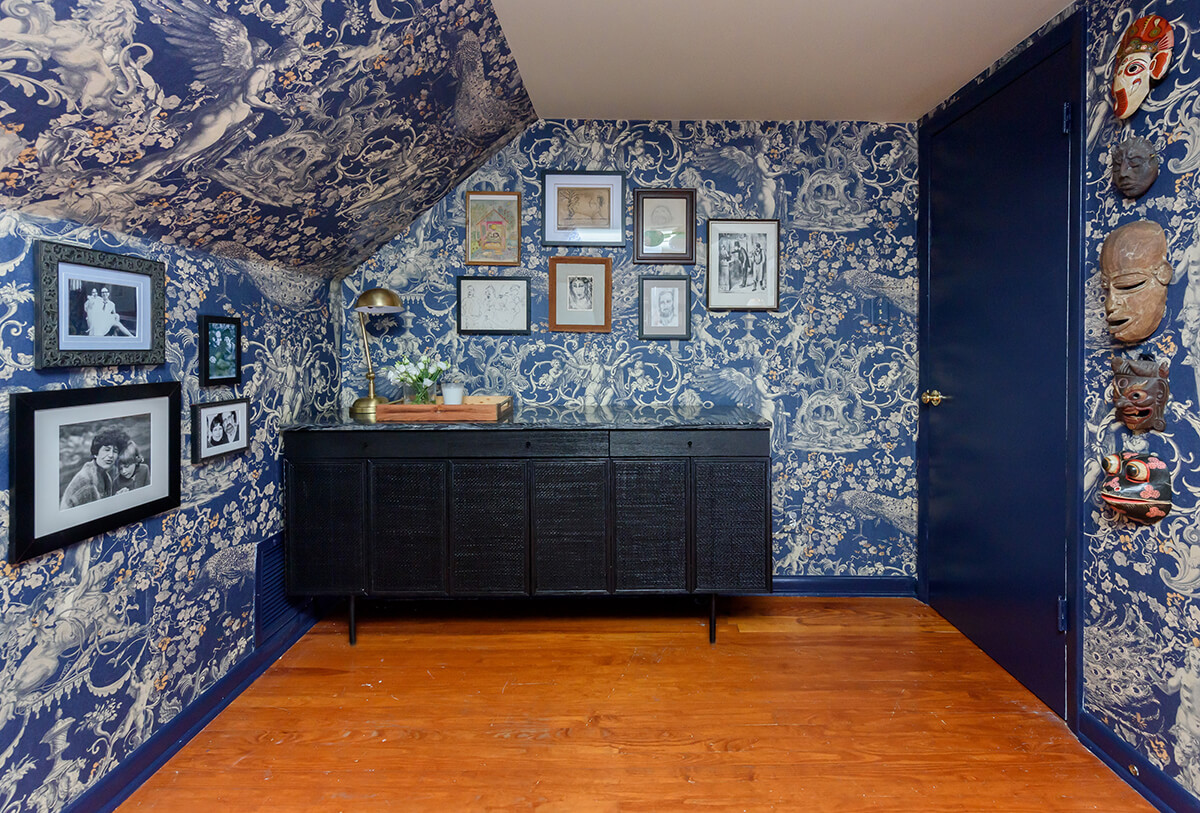
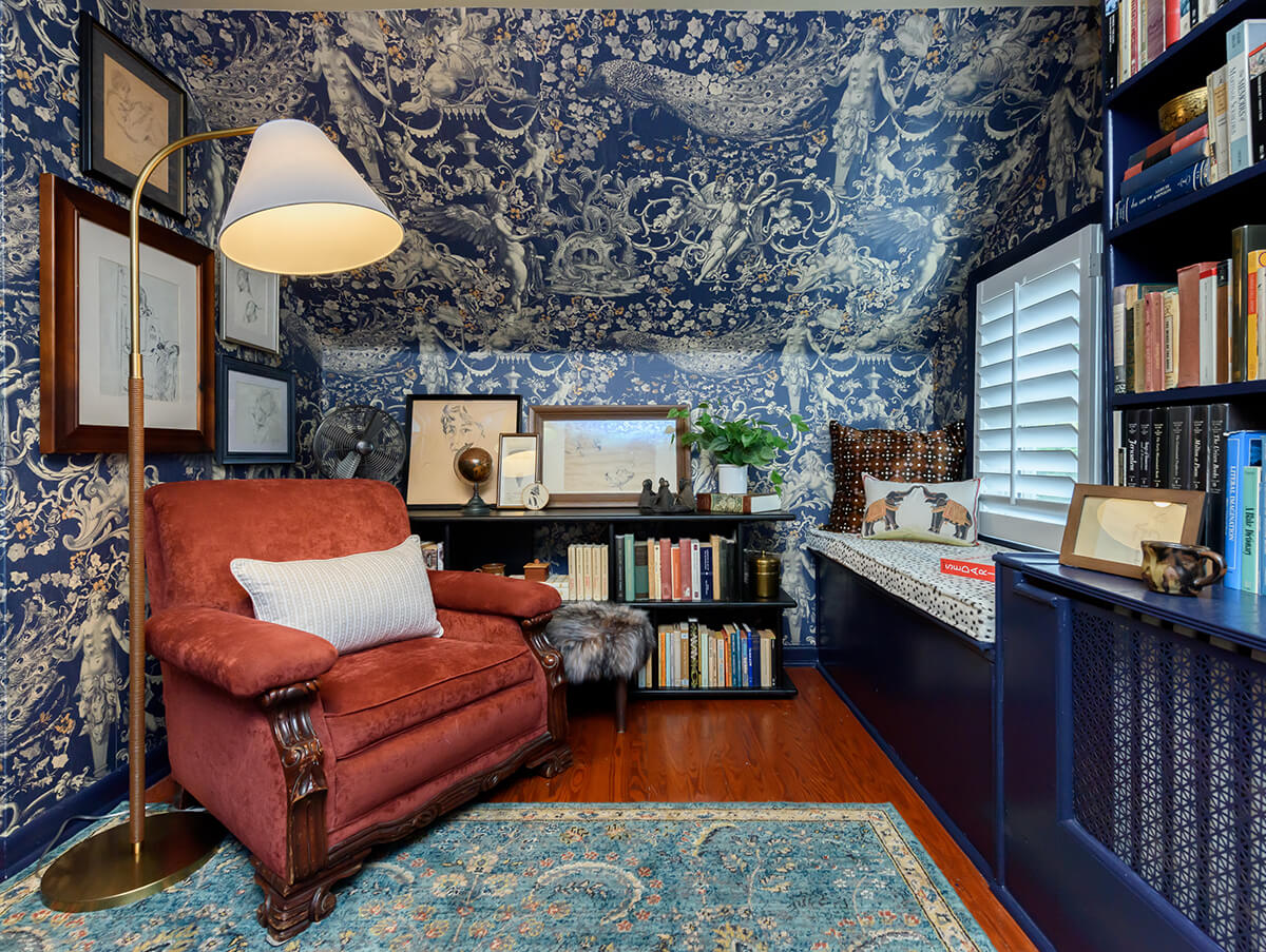
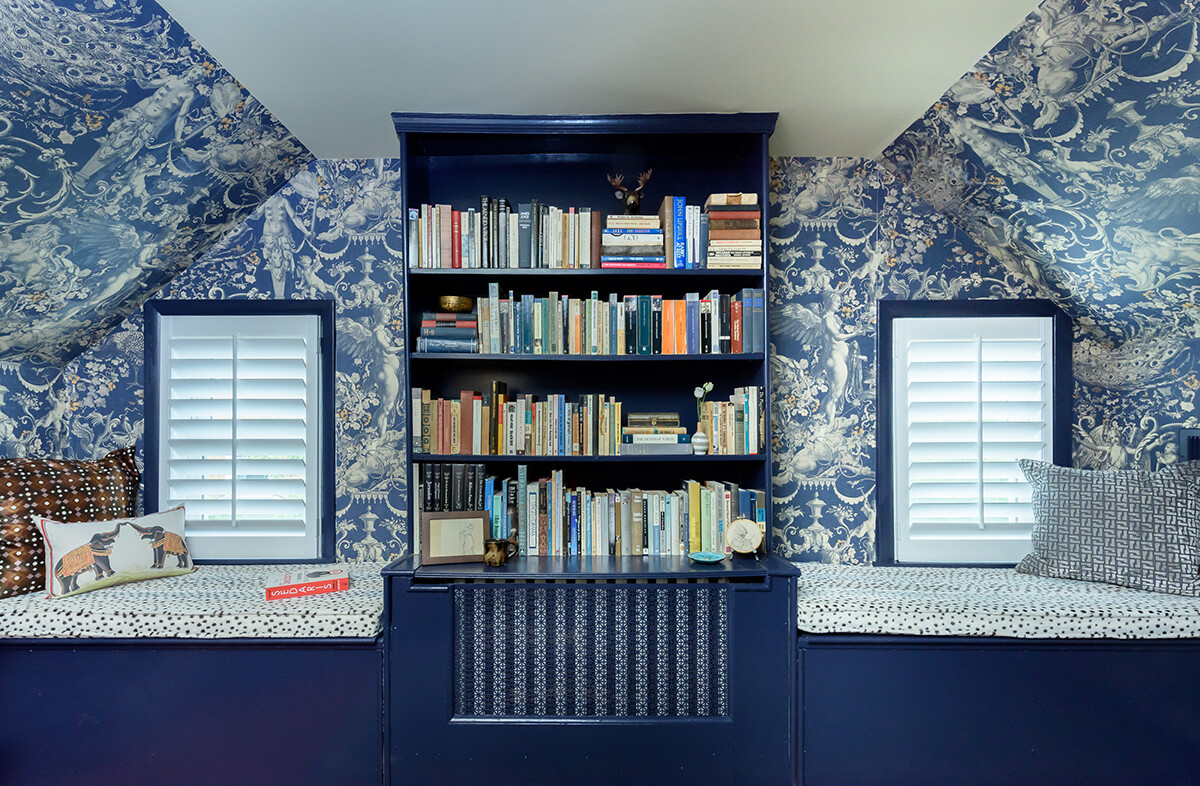
The directive in this Roland Park space was fun wallpaper, so that’s where Home Methods started. The homeowner also has a large book and art collection, so the other pieces that needed to be considered were storage-related. Home Methods needed to impose a structure, so they organized the client’s artwork based on theme, artist, or year, while also keeping large swaths of the wall blank so you could still appreciate the wallpaper. “The tones of the room and the wallpaper create a very intimate space, allowing for a sense of intimacy with a lot of texture and pattern,” says judge Brian Burtch.
OPEN FLOOR PLAN
TURNER DESIGN FIRM
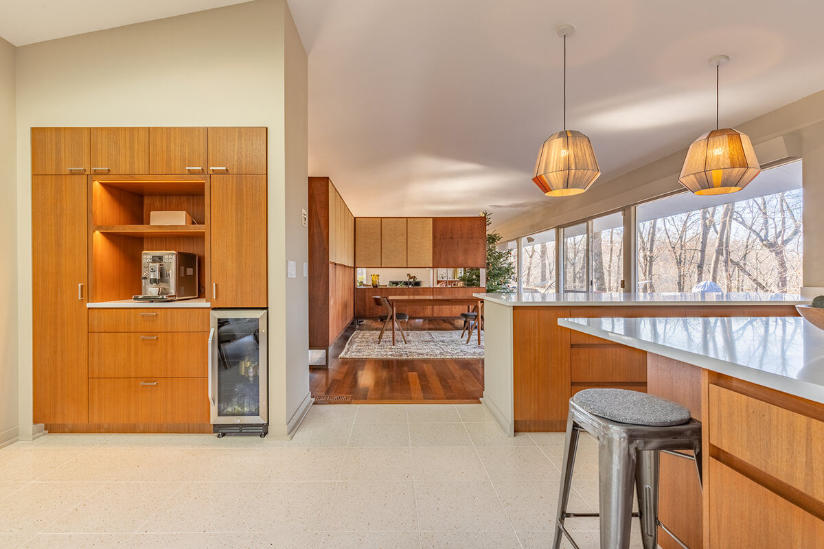
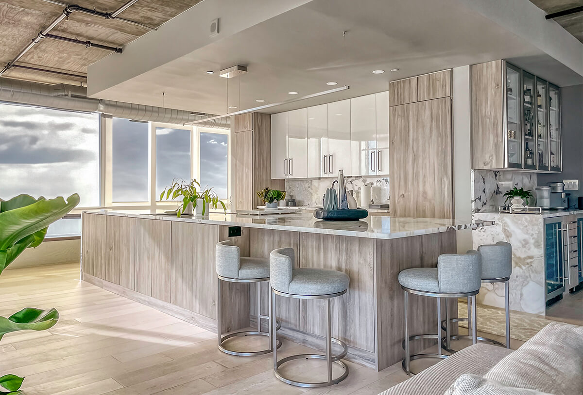
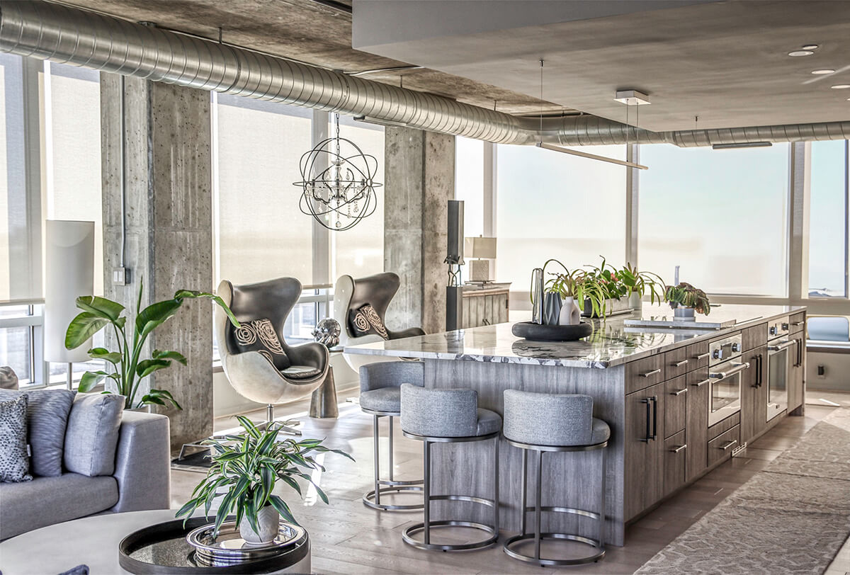
The stunning kitchen in this Silo Point luxury condominium is a testament to elegant design and optimized spatial planning. Jeanine Turner, the creative force behind Turner Design Firm, orchestrated this renovation with a clear vision—to harness and amplify the breathtaking views. Central to the renovation’s success was the removal of the walls that previously enclosed the refrigerator. This move enhanced the flow of the space, allowing for an uninterrupted visual connection from the kitchen through to the plush lounge and elegant dining area, and culminating in an awe-inspiring, unobstructed view of the harbor through the full-height windows. This transformation is a substantial upgrade to the space, says Weed. “Opening up the kitchen greatly lightens up the space and reinforces the industrial nature of the home.”
BATHROOM
PLACE ARCHITECTURE: DESIGN
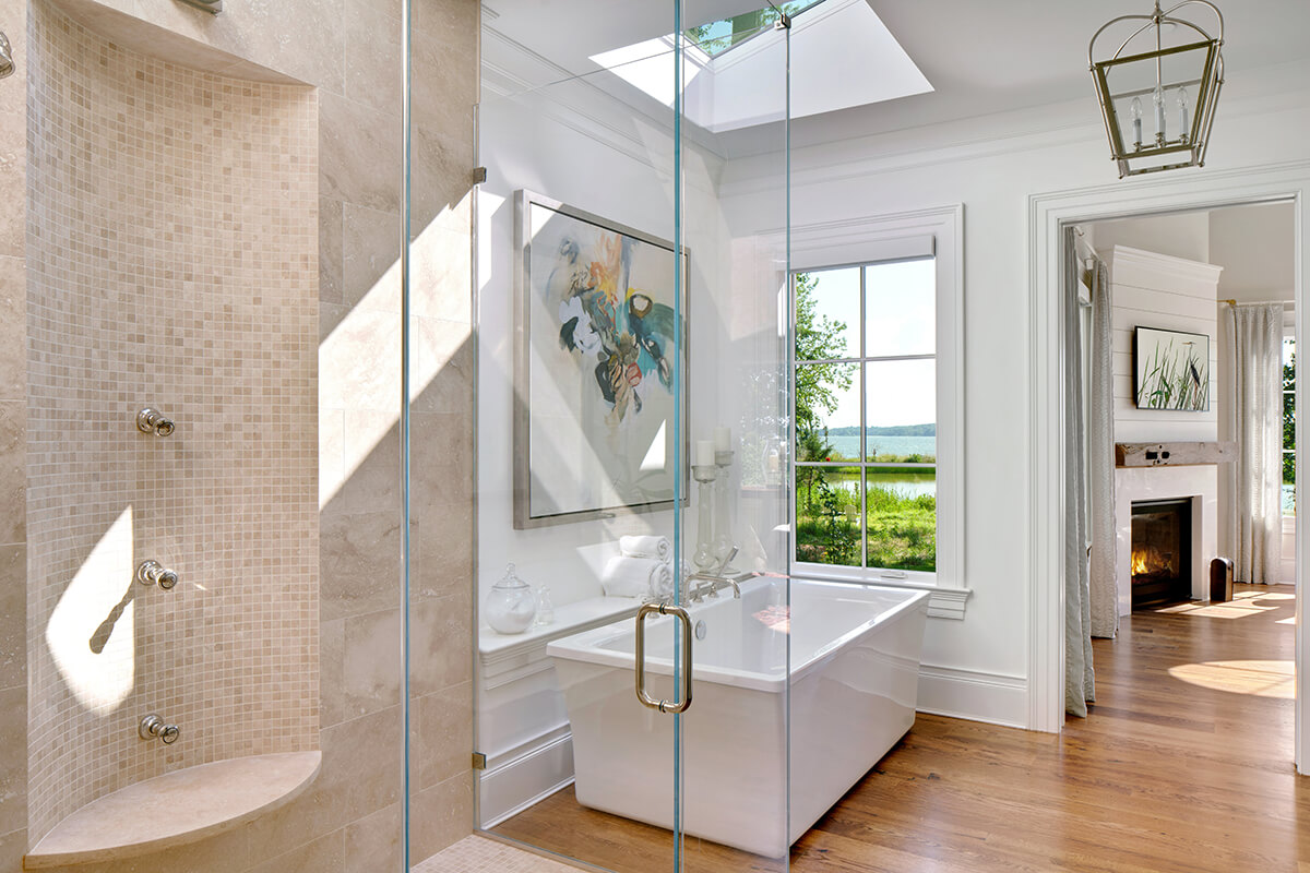
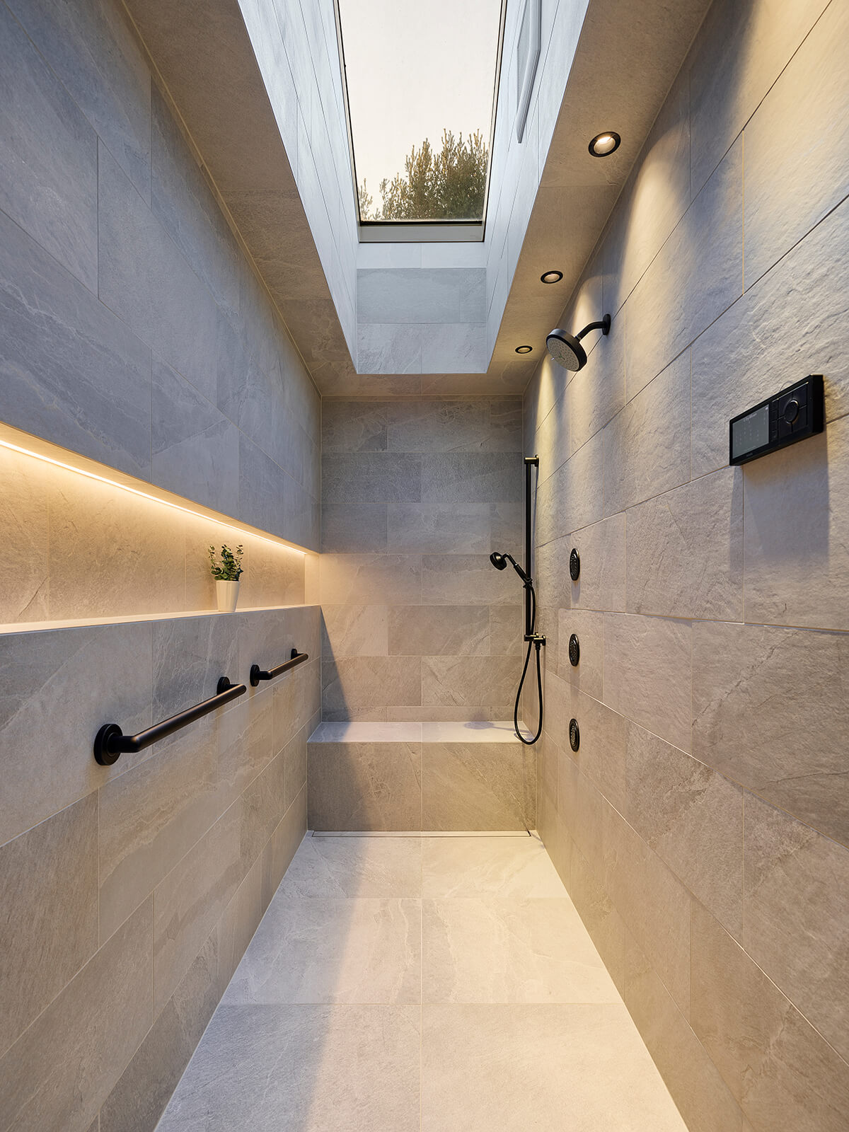
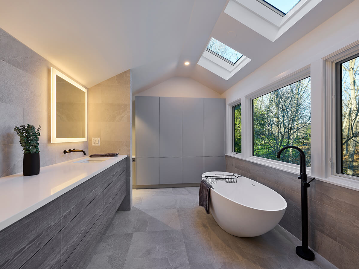
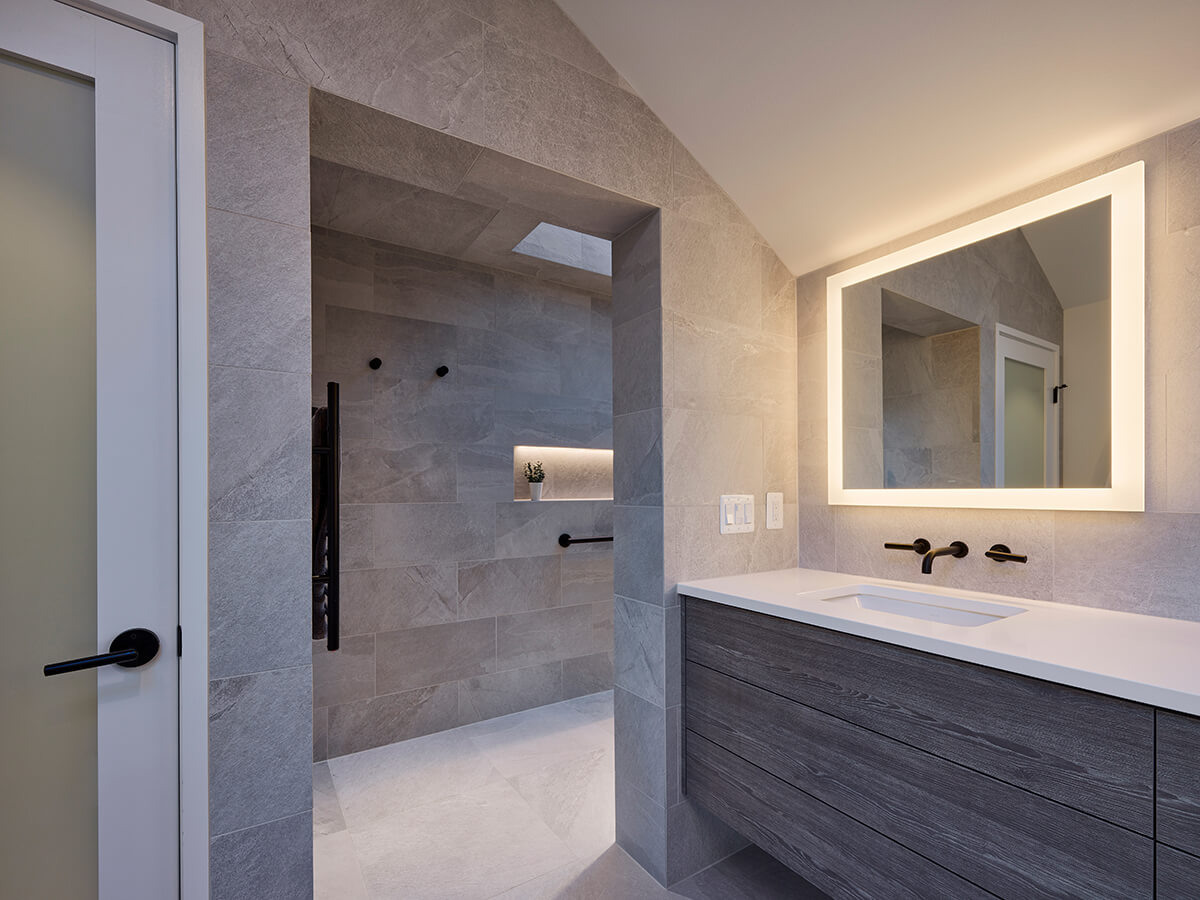
When a primary suite was redesigned by Brooklandville-based Place Architecture: Design, the existing closet area and bathroom were discovered to have an unconventional configuration—including a long narrow skylight inside the original closet. The new shower is designed around that skylight, creating a powerful linear connection to the outdoors. Large format porcelain tiles on the walls and floor create a monolithic appearance, blurring the lines between surfaces.
“The creative renovation and materiality of this bath makes it feel as if it were carved from its existing space,” says Anderson. The primary bath boasts a flush transition from the shower floor to the bathroom floor, a comfort height wall hung toilet with dual flushing, grab bars at strategic locations, a towel warmer, heated floor, built-in bench, and wall-mounted faucets and shower body sprays. “The skylights bring light into what would be dark and cavernous,” says Weed, noting that the whole space now feels light and airy.
BEDROOM
SURROUNDED BY COLOR
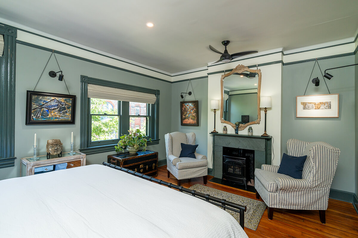
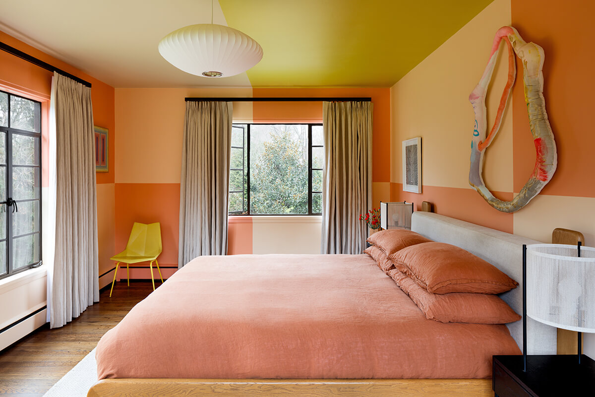
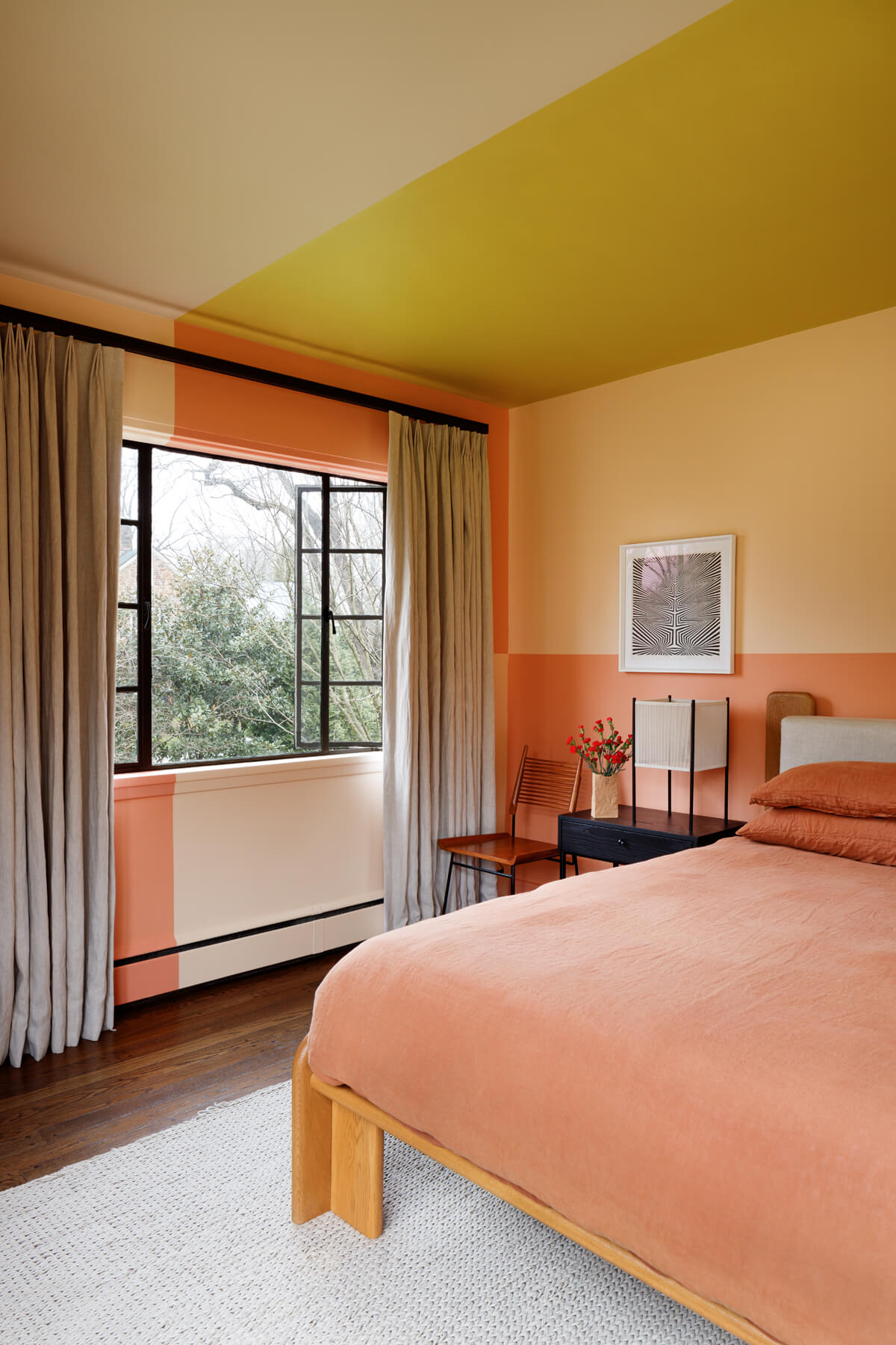
This bedroom design was risky—but paid off big time. Surrounded By Color saturated the walls and ceiling in four distinct colors to create a checkerboard pattern. “What I love most about this bedroom is the minimal budget required to pull off such a dramatic transformation,” says Burtch. “The primary renovation tool is paint. However, this project takes paint and turns this room into something magical. The simple division of walls and ceiling and the color choices create a beautiful, inviting, and calming space that matches the architecture of the home but also brings a boldness and newness to the space.” Says Wagner, “It’s a nice mix of postmodern light-heartedness and the more colorful side of midcentury. This room is so playful and sunny, a breath of fresh air from so many minimalist interiors. One of my go-to design questions is: Will this room make me happy on a rainy day? This one absolutely would.”
USE OF COLOR
HOME METHODS
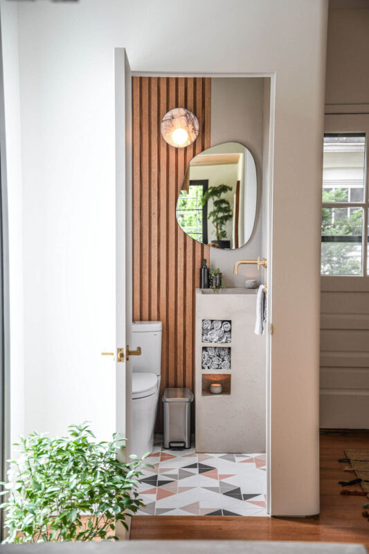
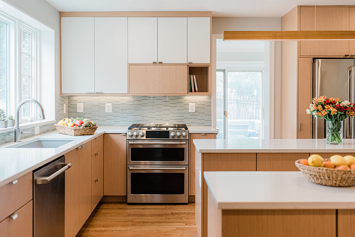
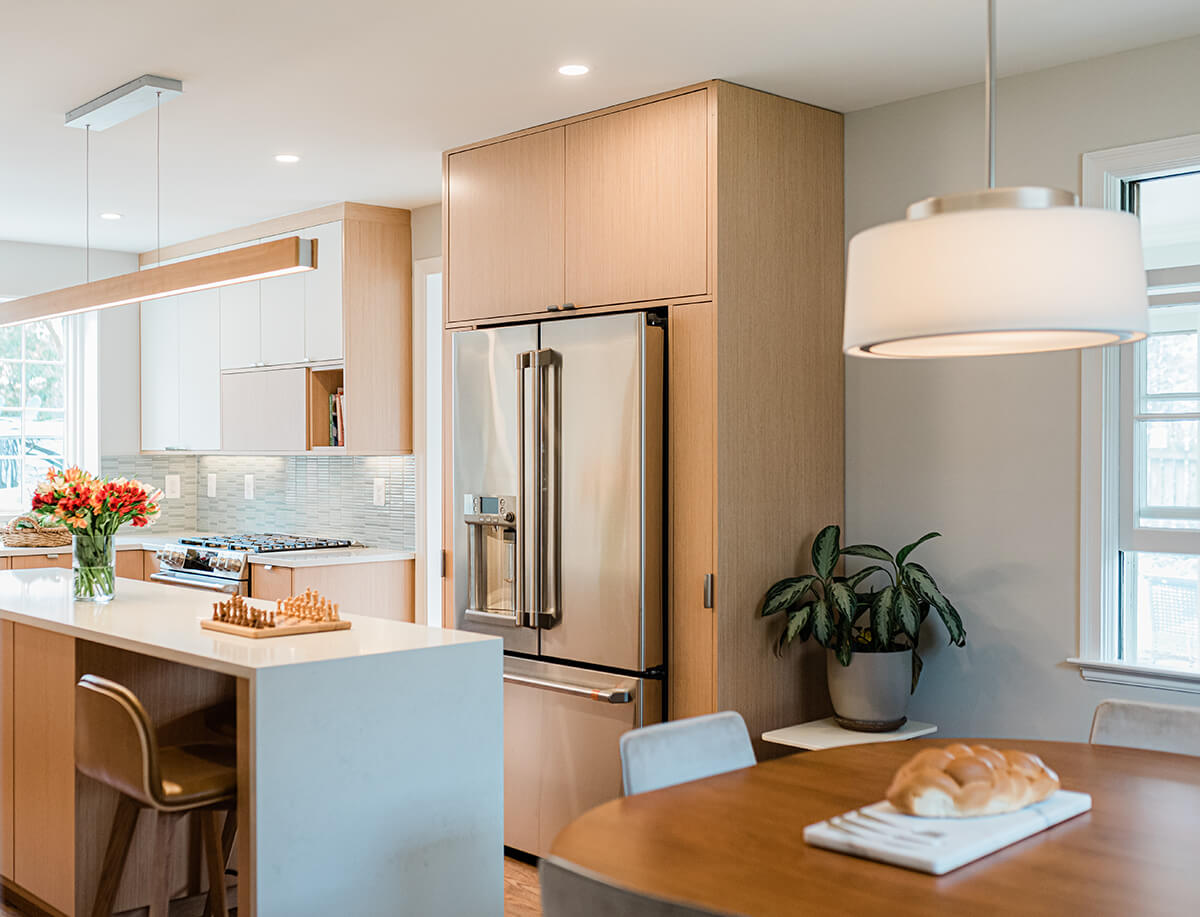
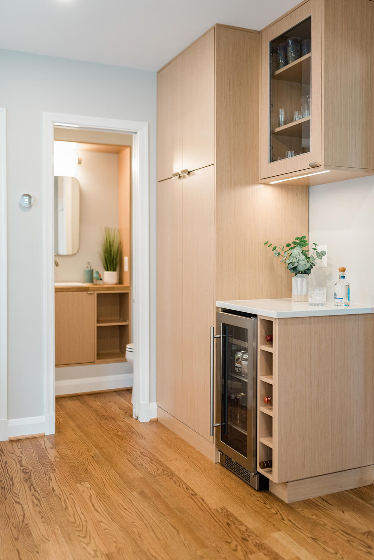
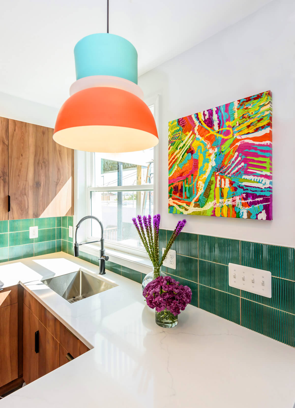
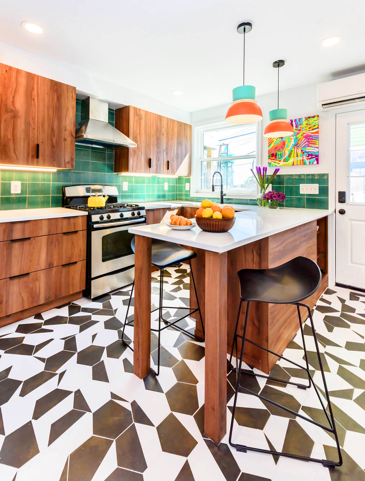
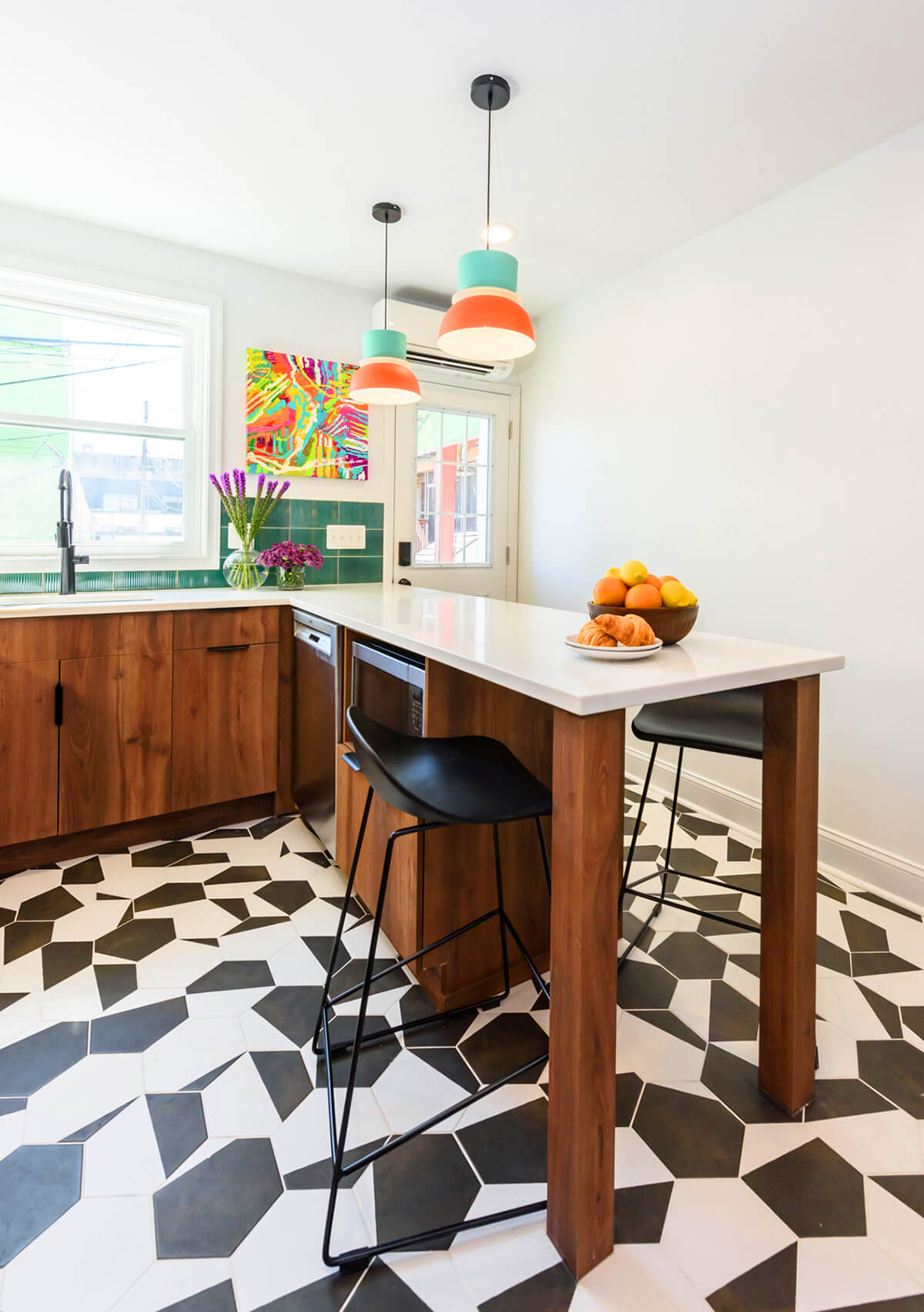
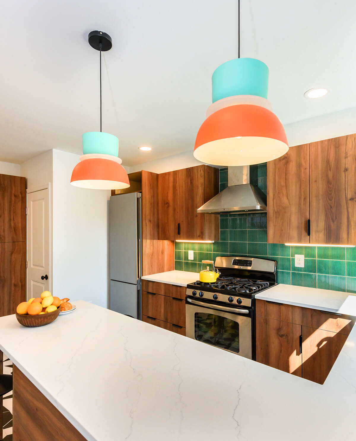
This Locust Point client wanted this kitchen renovation, which also had to accommodate a half bath in the corner of the space, to be bold but also have a midcentury feel. Home Methods went with slab front, mid-toned wood cabinets with black accents and a bold tile floor that runs throughout the space and into the bathroom. The backsplash is a ribbed tile that provides texture against the smoothness of the slab front doors, and color in the pendants and art complement the rest of the materials in the space. “This project really popped out at me because, well, it pops,” says Wagner.
CUSTOM CABINETRY
SM+P ARCHITECTS
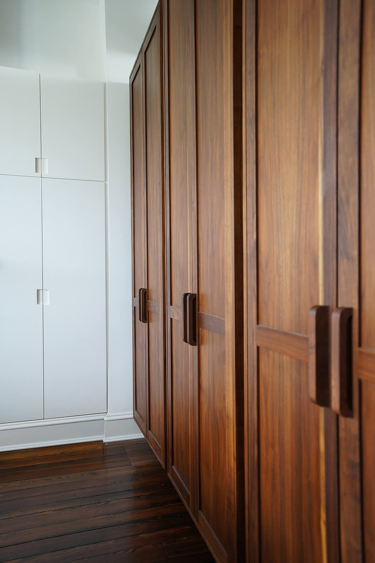
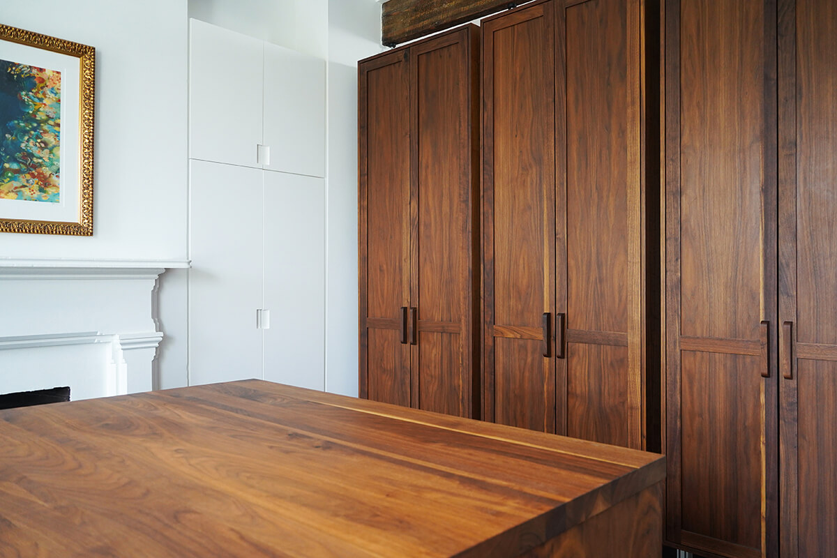
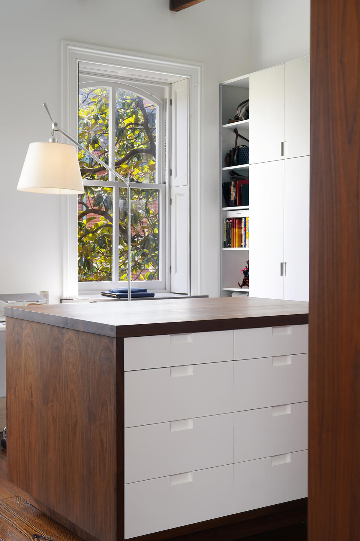
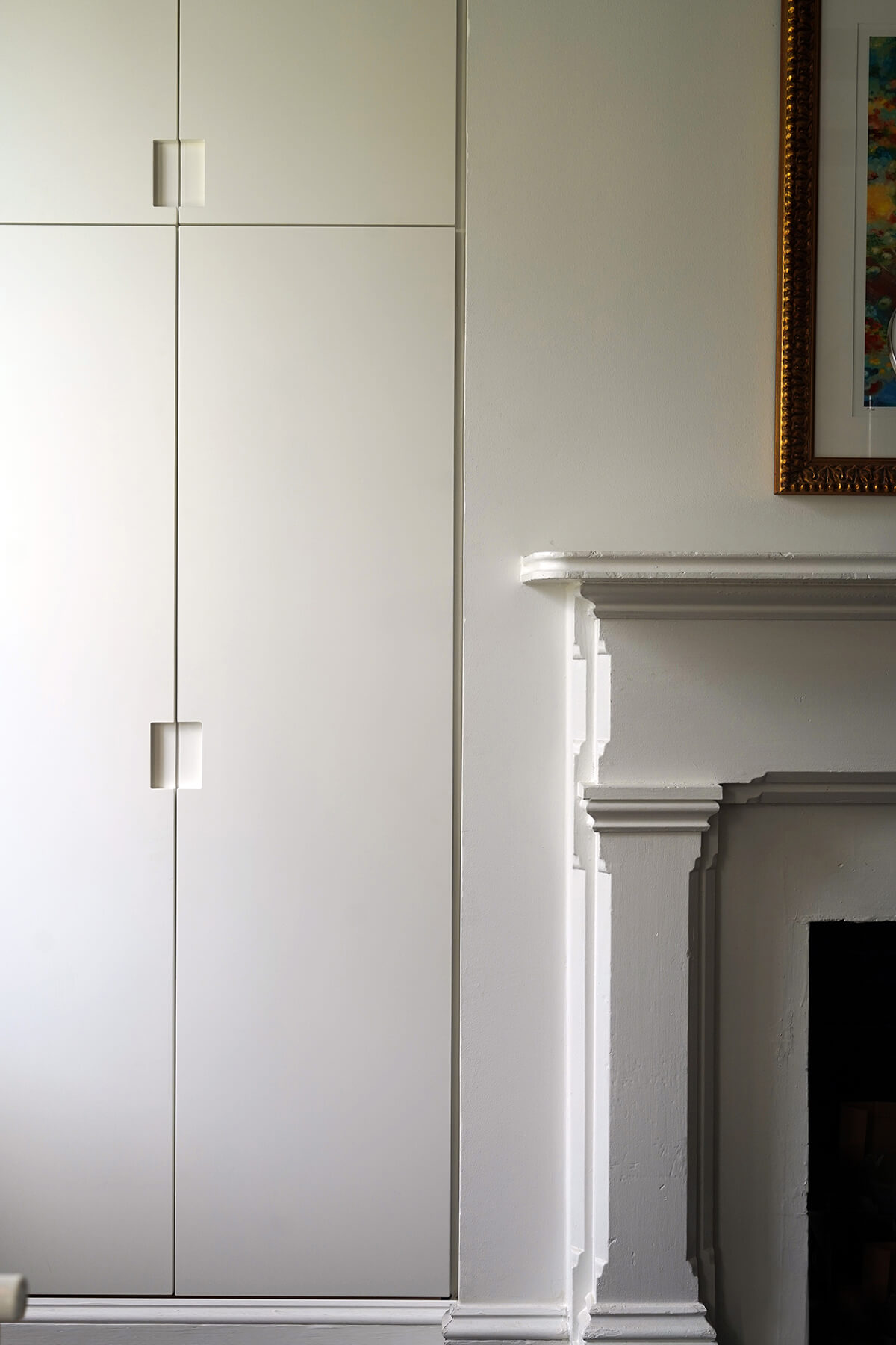
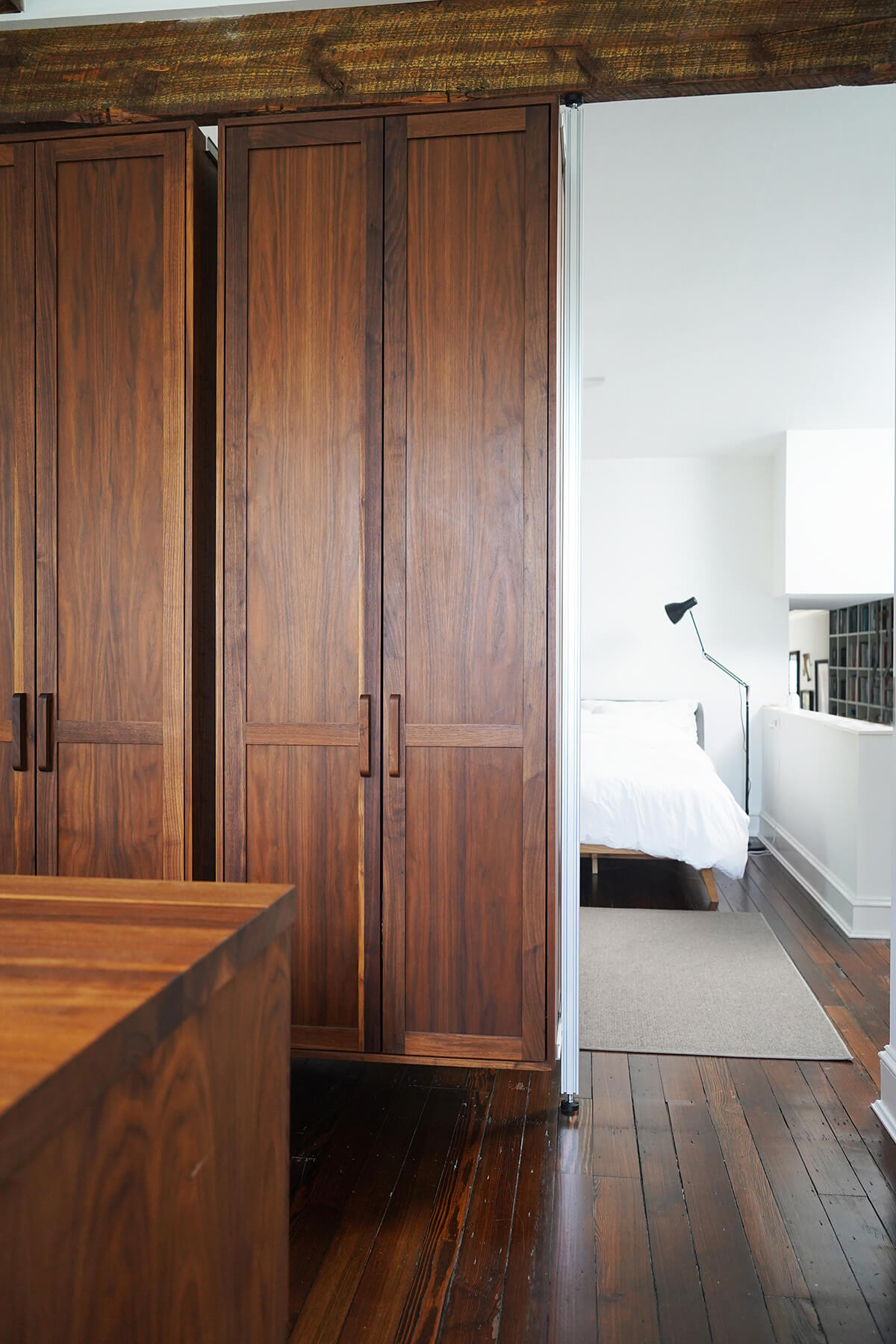
The creation of two primary closets was part of design work requested by the new owners of a Bolton Hill townhome. The clients, who have a tasteful modern aesthetic, wanted a built-in solution for closet space in the primary bedroom as well as the in-law suite for the now intergenerational household. SM+P Architects, based in Baltimore, reached out to Olivr Studio, a furniture and housewares studio also in the city, to do the build. “The wood here used is absolutely gorgeous and rich in tone,” says Wagner. “The quality of the construction is also evident in the flushness between joints and the finishing of the surfaces. Extremely high-level craftsmanship speaks for itself here.”
LANDSCAPE DESIGN | LARGE SPACE
CAMPION HRUBY LANDSCAPE ARCHITECTS
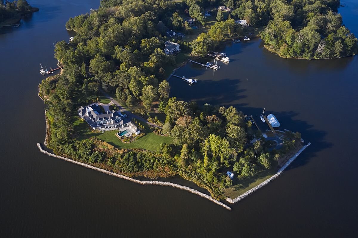
Childs Point, which sits on eight acres along the South River in Anne Arundel County, was the site of a tragic fire in 2015, but once the land healed, the new residents and Campion Hruby set out to restore and develop a waterfront buffer through intentional design.
The parcel has three waterfront sides and is located entirely within the Chesapeake Bay Critical Area, established in 1984 to improve water quality, protect the wildlife habitat, and reduce the impact of human activity on sensitive lands. Lawns were reduced, and a planting buffer circles the property to capture, filter, and infiltrate water before it enters the South River waters and Chesapeake Bay Watershed. A deck-edge pool situated in the rear of the home poses a dramatic water-to-water view and bucolic paths weave through existing woodlands.
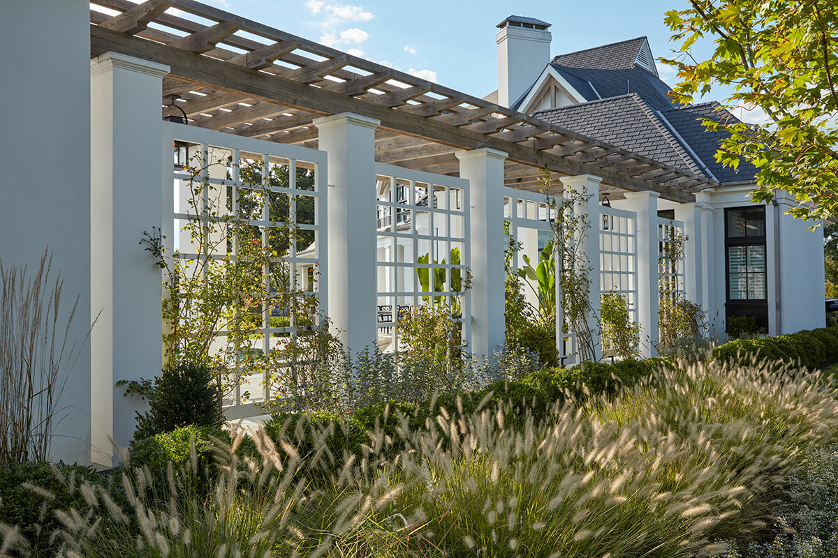
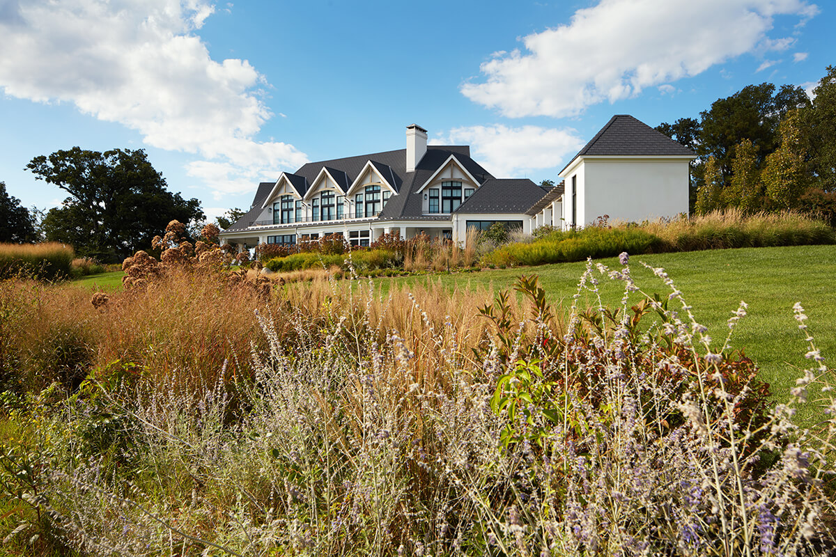
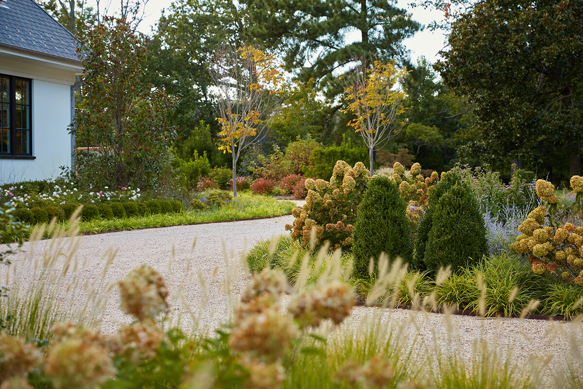
Finally, lush gardens provide constant seasonal color and texture while acting as a sanctuary for pollinators. In all, 41 trees, 520 shrubs, and over 3,000 perennials and grasses were intentionally selected and planted—each one contributing to the haven. “Every image of this project has me wishing I was strolling through it,” says Anderson. “It’s lovely, varied, scenic, and conscious of its environmental responsibility.”
DECK | ROOF DECK | PATIO | PORCH
SM + P ARCHITECTS
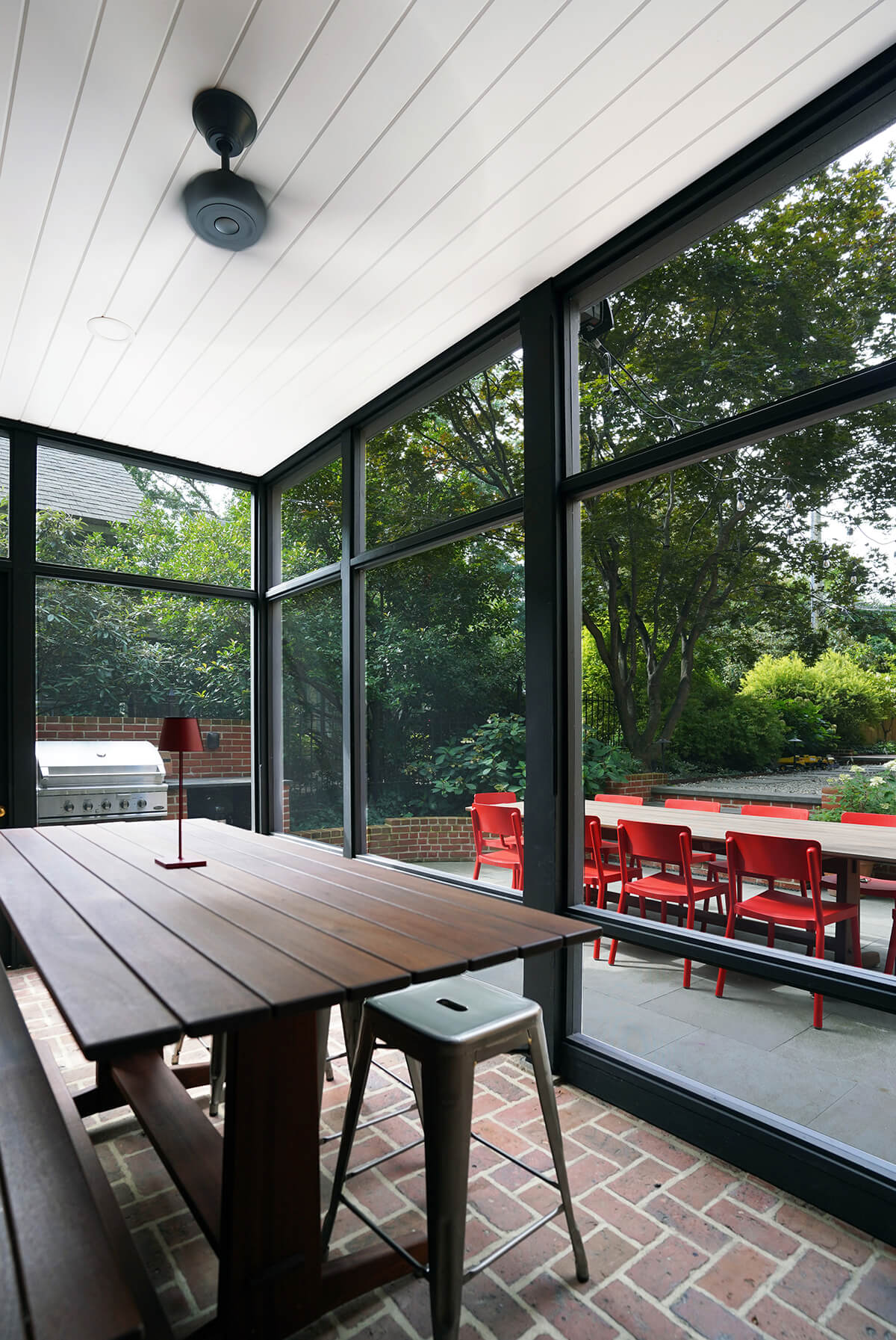
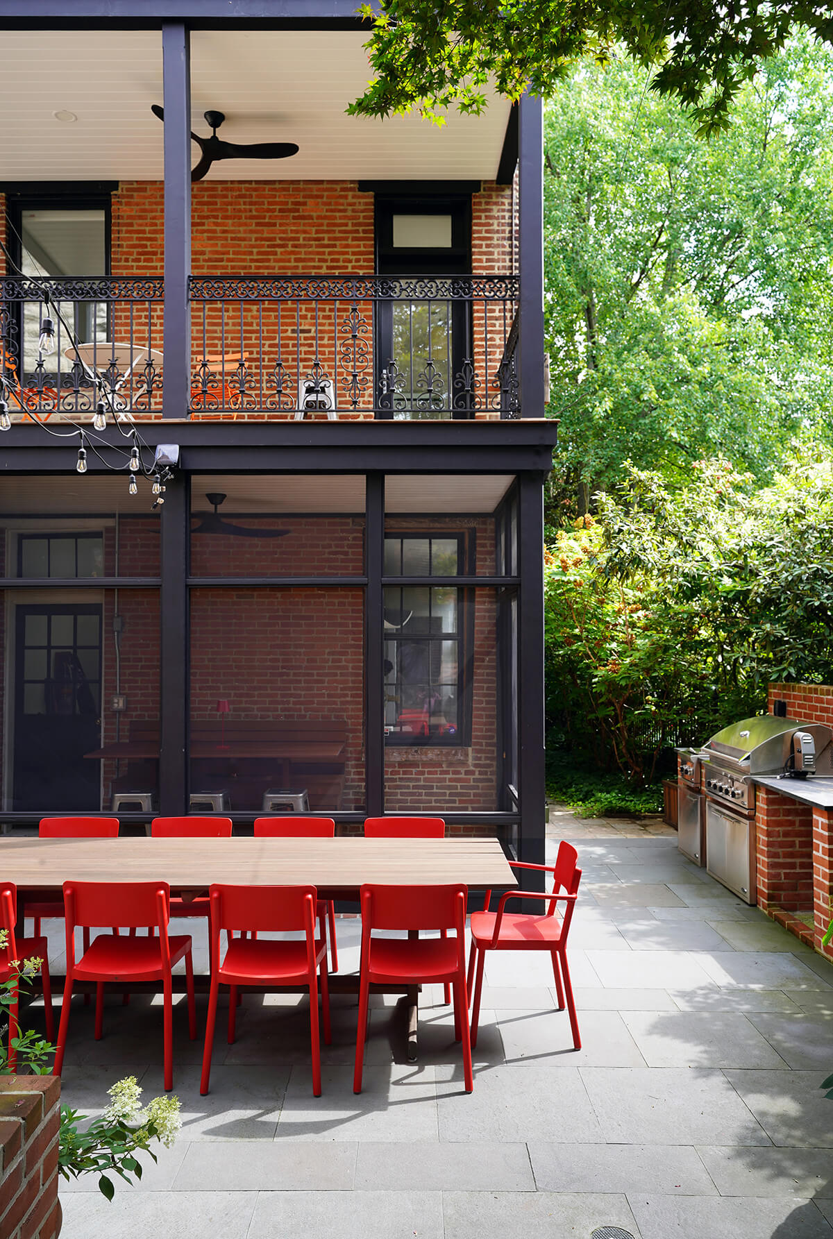
The new owners of a Bolton Hill townhouse wanted Baltimore-based SM+P Architects to completely overhaul the rear porches and backyard, including adding a screened-in porch, outdoor kitchen, dining area, and firepit area. Kamp was an instant fan. “The Bolton Hill townhome used the spaces and materials to enhance the character of the old home,” she wrote, adding, “The new spaces add more interest to the existing architecture of the home by carrying on the existing material palette and railings, while blending in the custom furniture elements.”
SWIMMING POOL OR WATER FEATURE
DELBERT ADAMS CONSTRUCTION GROUP
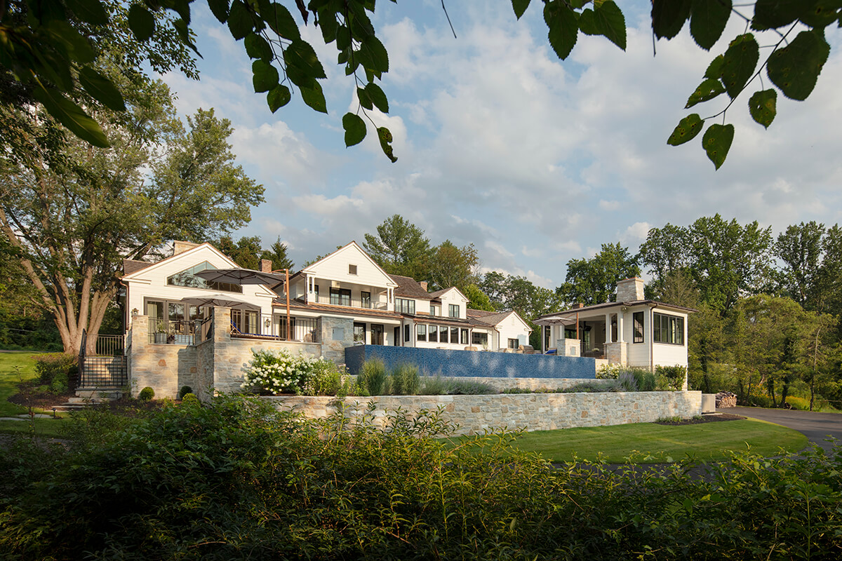
Taylor’s Hall, one of Baltimore County’s oldest homes and a testament to architectural heritage, dates back to the late 1600s, with its original log structure and a subsequent 1700s stone expansion. In 1986, the home was meticulously disassembled, each stone and log numbered, and found new life in Brooklandville’s Rockland Village, overlooking a horse farm.
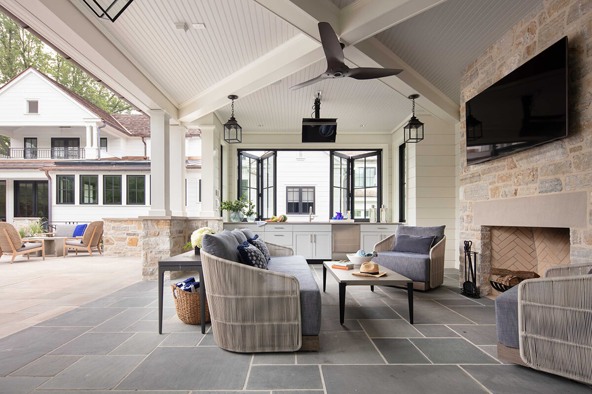
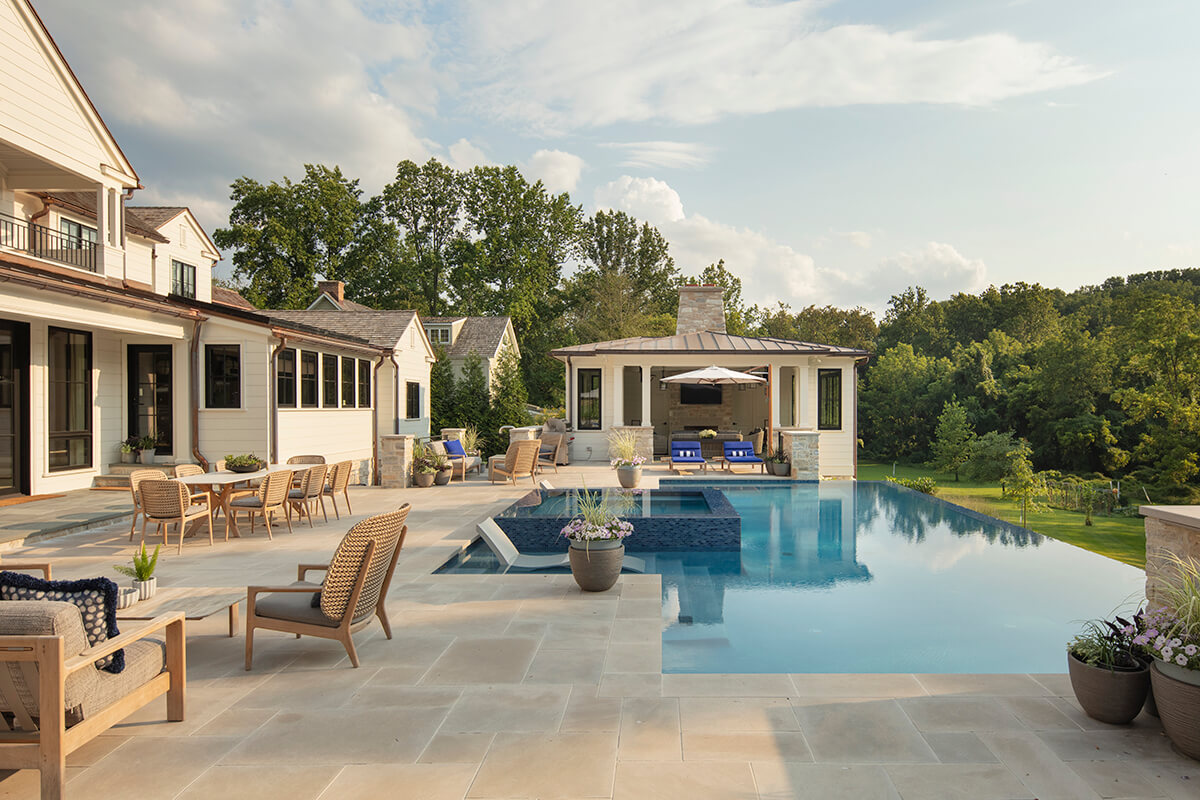
A recent renovation by Delbert Adams Construction Group blended historical reverence with contemporary sophistication, preserving the original structure while adding spacious modern elements—including a covered terrace and a sprawling infinity-edge saltwater pool. A pool house, which includes a grand hearth, bathroom, kitchen, and changing space, was also added.
“The choice of pool color and surrounding materials complement each other,” says Weed. “Additionally, the infinity-edge design works well with the grade change at the back of the project, furthering the opportunity for unobstructed views across the pool’s entire presence.”
LANDSCAPE DESIGN | SMALL SPACE
SM + P ARCHITECTS
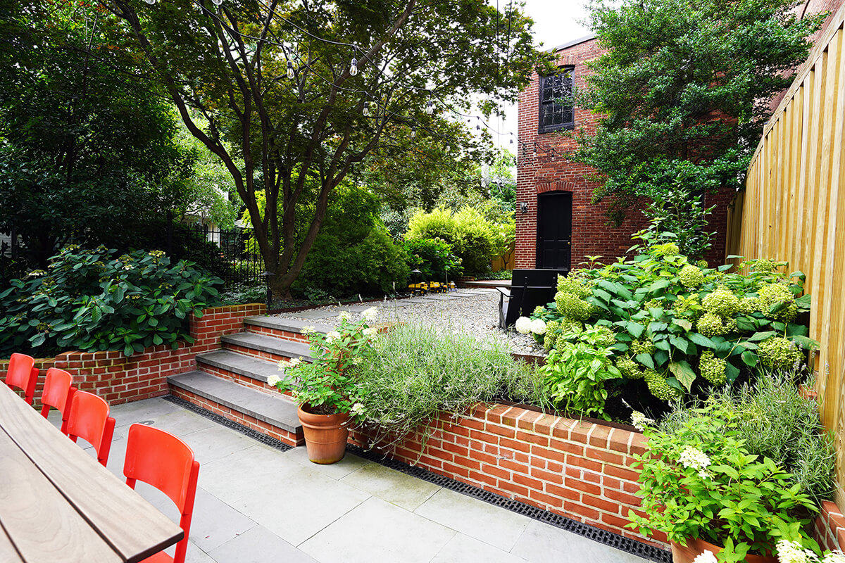
When they set out to completely transform this Bolton Hill home’s backyard, SM+P Architects goal was to transplant as many mature plantings as possible from the original yard, which helped the new space feel instantly private. “Small outdoor spaces can be quite challenging to design—especially given the design for both occupation and also landscape integration,” says Burtch. “This project successfully marries the two. Using architectural elements to ground the space—like the winding brick retaining wall—the space feels very rigid but also very much integrated into nature. This is a space of relaxation and entertainment, surrounded by a lush, green landscape.”
CURB APPEAL
GUERILLA CONSTRUCTION
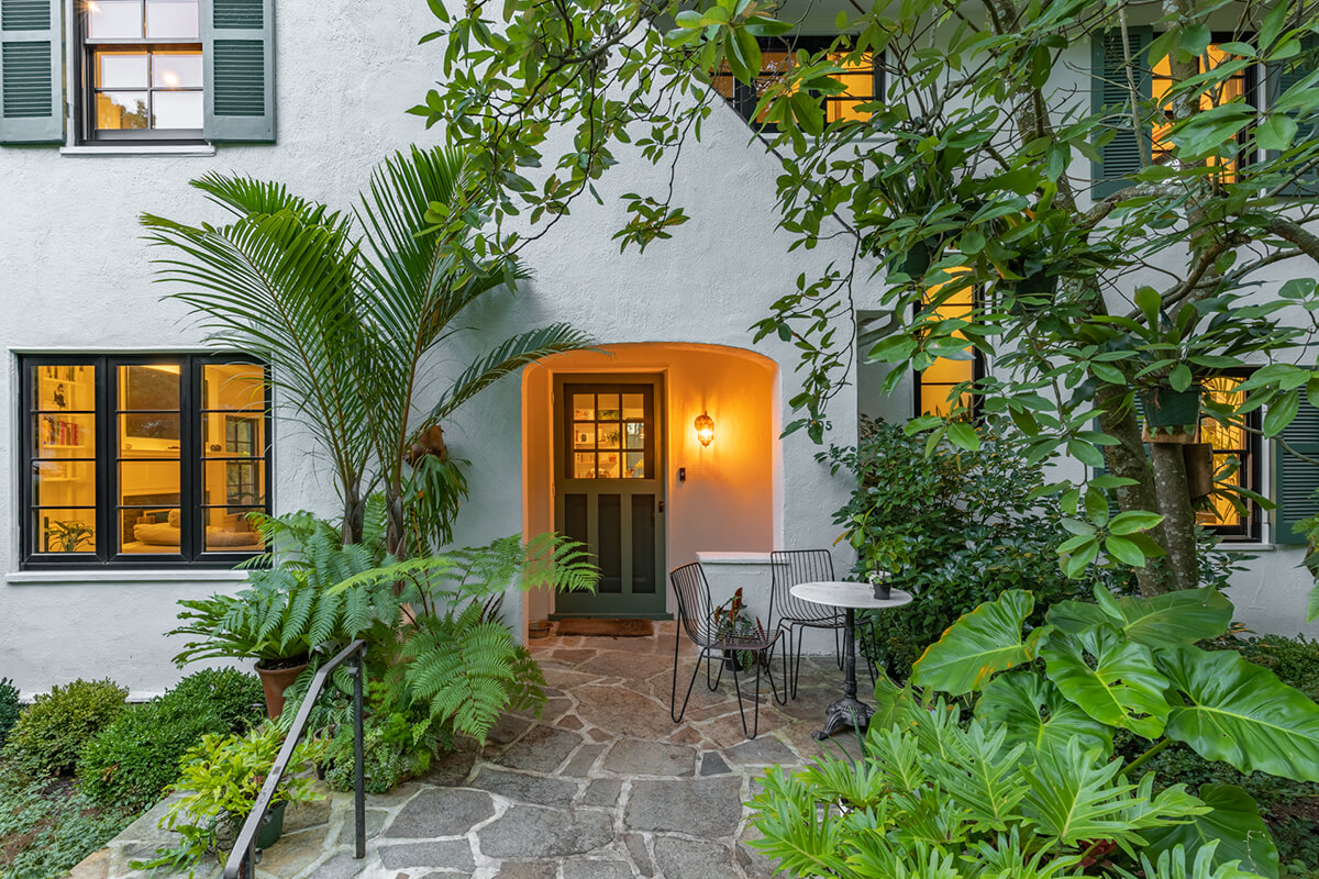
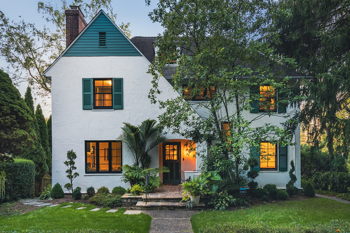
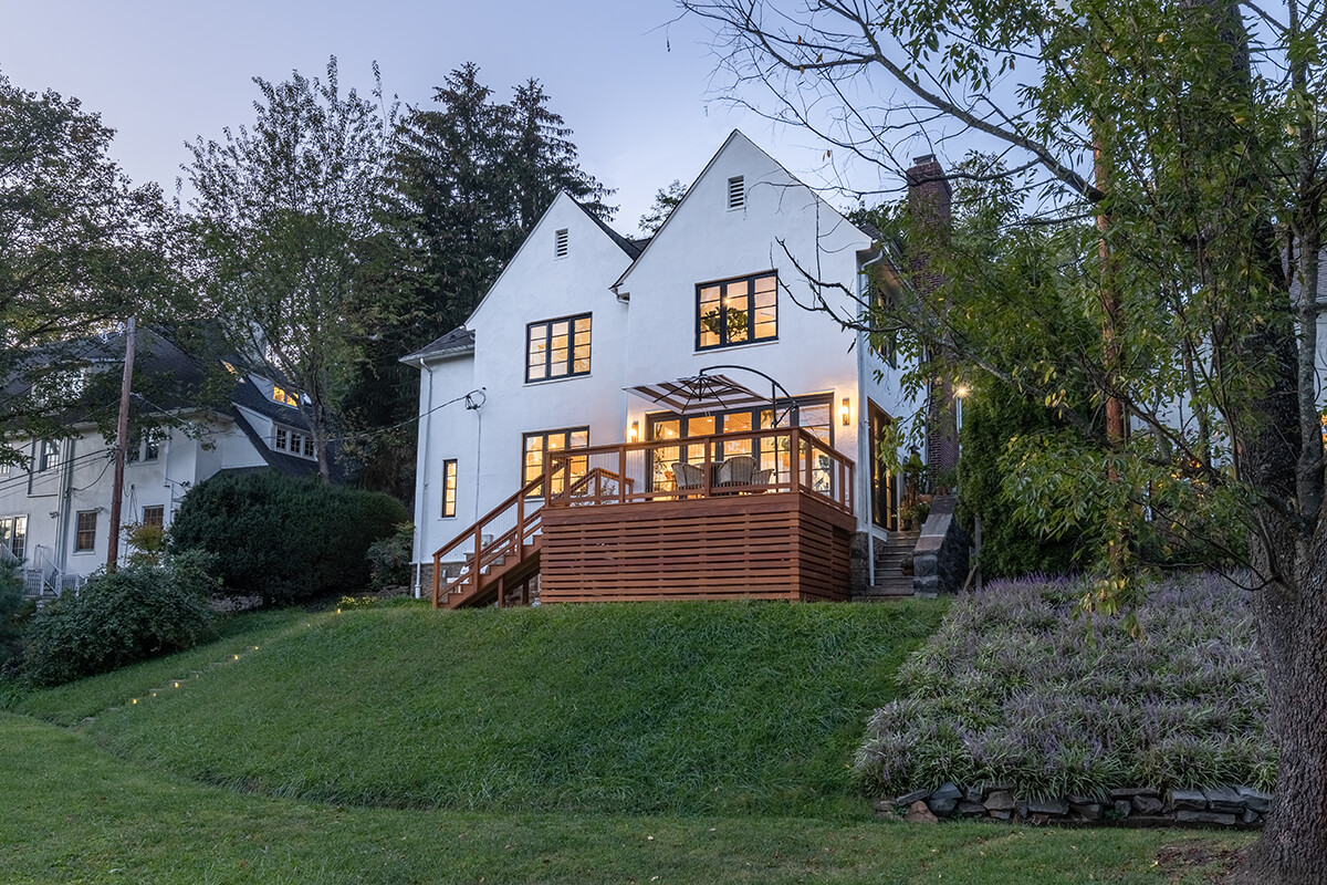
This Roland Park home renovation included a gut rehab and exterior facelift for a cottage-style stucco home. Baltimore-based Guerilla repainted the entire façade and added new windows to bring more natural light into the home. They did all that while maintaining and reconstructing original details, such as the shutters and bullnose trim. They also added a new sunroom—the better for lots of plants—and a deck with an indoor/outdoor connection via accordion doors. All of this was done in conjunction with designer and homeowner Hilton Carter, an author and plant enthusiast. “The color tones on the front elevation of this home are inviting and give the home a strong and balanced street presence,” says Burtch.
OUTDOOR LIVING
ONE SOURCE CONTRACTING
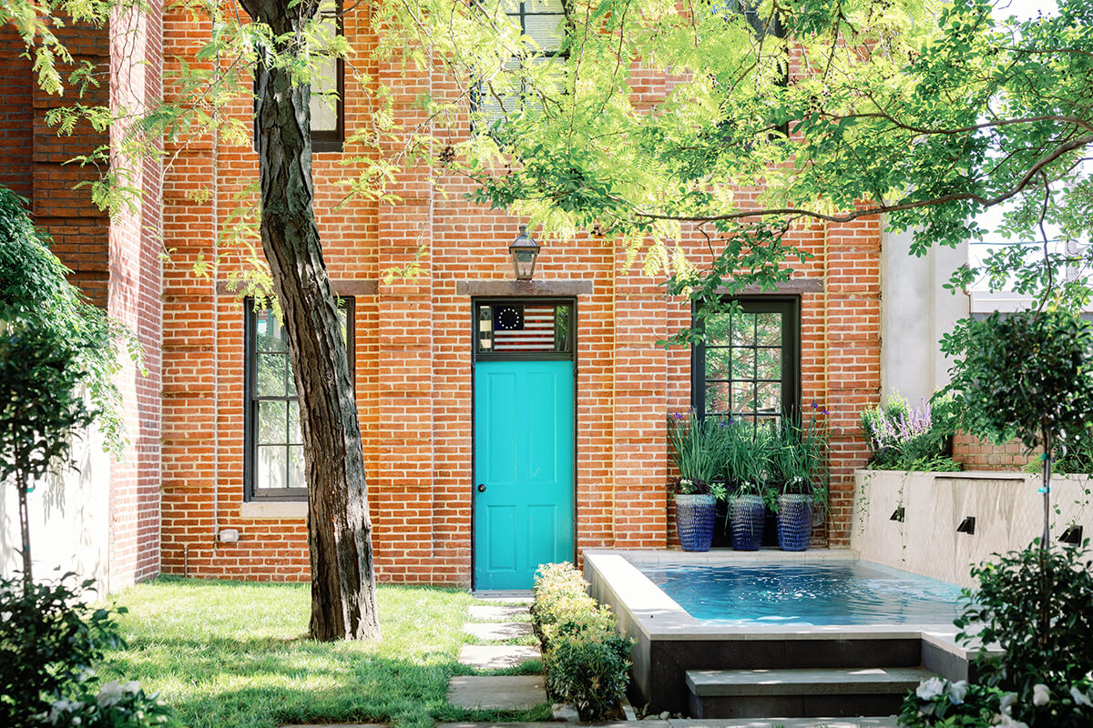
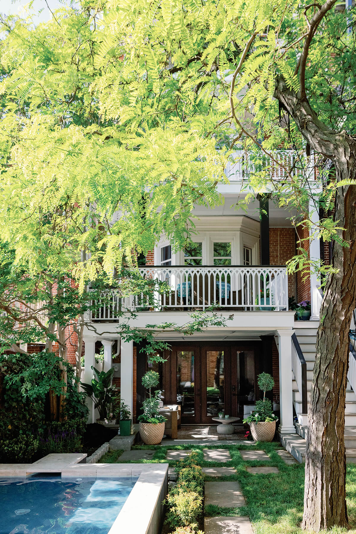
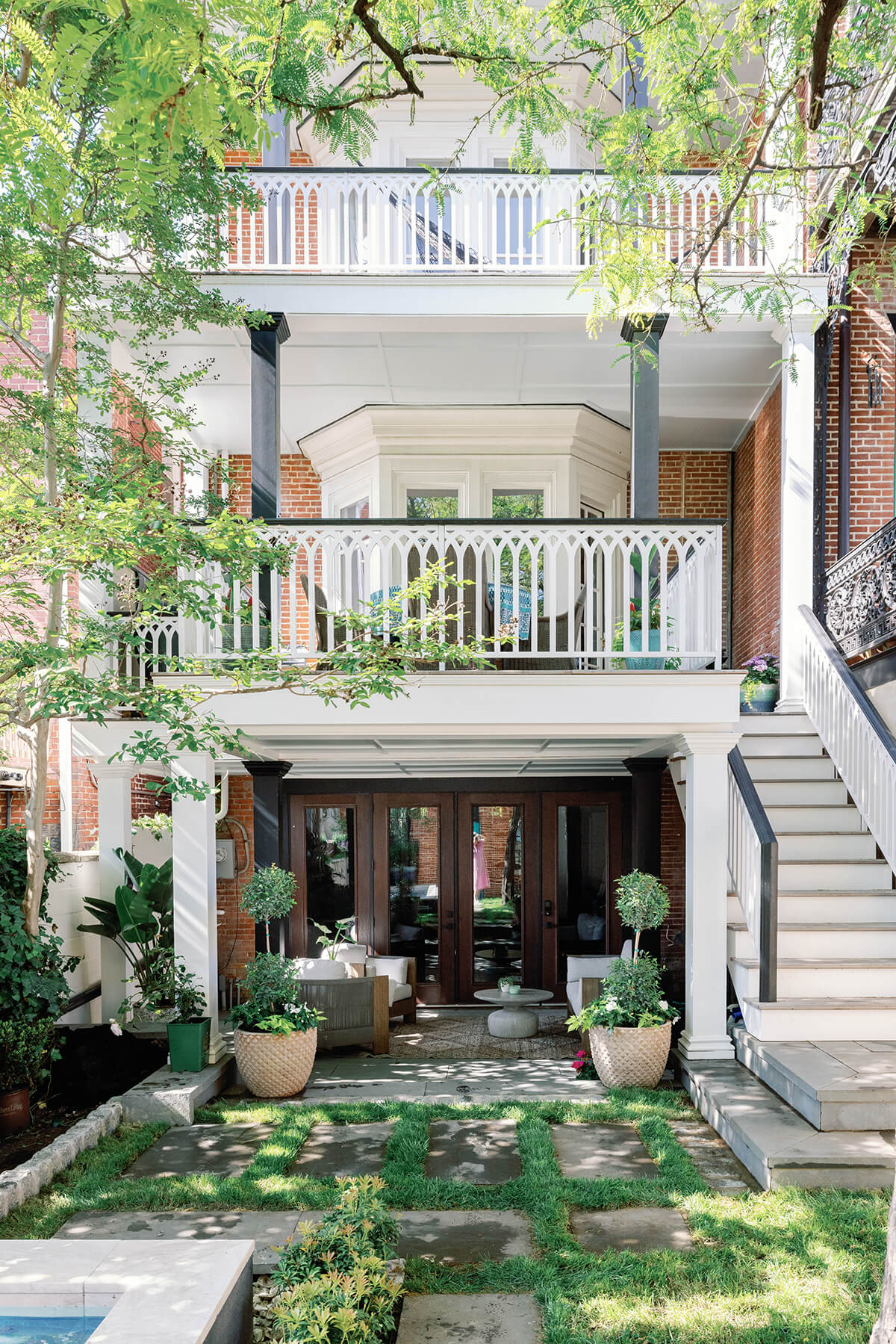
The owners of this Butchers Hill home wanted to create a backyard oasis that was both family- and entertainment-friendly and also included a swimming pool. No easy task in a rowhouse backyard with limited space. Baltimore-based One Source Contracting managed to fit an 18-by-8-foot, marble-wrapped pool, along with a ground-level patio with a wet bar and three decks with custom-built railings.
“The design is so immersive I can feel the shade and hear the water,” says Anderson. “It’s spectacularly inviting.” Burtch was impressed by how much One Source was able to accomplish in a confined area. “This compact back garden design demonstrates the ability to maximize use and function in a small space,” he says. “Good design, good flow, and good use of materials make for a very successful garden transformation.”
