Home & Living
A Galley for Grownups
These empty nesters created a kitchen for cooks, not just looks.
Often, it’s little things that precipitate big changes. For homeowners Bruce and Corinne Gilarsky, it was two minor appliance malfunctions that inspired a complete kitchen renovation, a project that allowed them to transform the family-friendly space they’d designed 23 years earlier into a gourmet kitchen for grownups.
“Our microwave broke and the light on the oven broke and Bruce said, ‘That’s it, we’re redoing the kitchen,'” says Corinne Gilarsky.
The Gilarskys, both 56, built their home on a wooded lot overlooking the NCR Trail in Sparks when their two children were little. It had a classic layout with the sink under the windows and a butler’s pantry connecting to a formal dining room. The surfaces were fashionable for the time and durable for a young family: Think oak cabinets and white Corian countertops.
But in 2013, with the children grown and living out of town, the time was right to renovate for the way the Gilarskys live now. “We went from cooking out of necessity to cooking for pleasure and entertaining,” says Corinne. “Our goal was to design a kitchen that was part of the living space of the house and that worked with the outdoors, since we have the NCR right outside.”
The couple worked with Blue Arnold and Perry Christian of Kitchens By Request in Jarrettsville to create a new layout that maximized the view and created a space suitable for socializing and cooking. They didn’t want anything fussy with too many colors, but rather a warm feel with industrial touches. Many of their choices, like bistro seating, were informed by trends they noticed in Manhattan restaurants on their visits to New York City. But most importantly, the couple wanted to buy only products and finishes that were made in America, no small ambition in today’s reality of overseas production.

“The recession was just ending and we thought if we were going to do something extravagant like a kitchen, we should be purposeful in our spending,” says Corinne, who works in finance and consulting. (Her husband is a physician.)
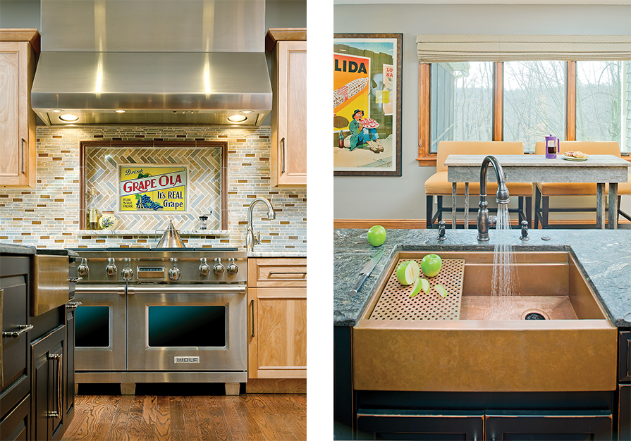
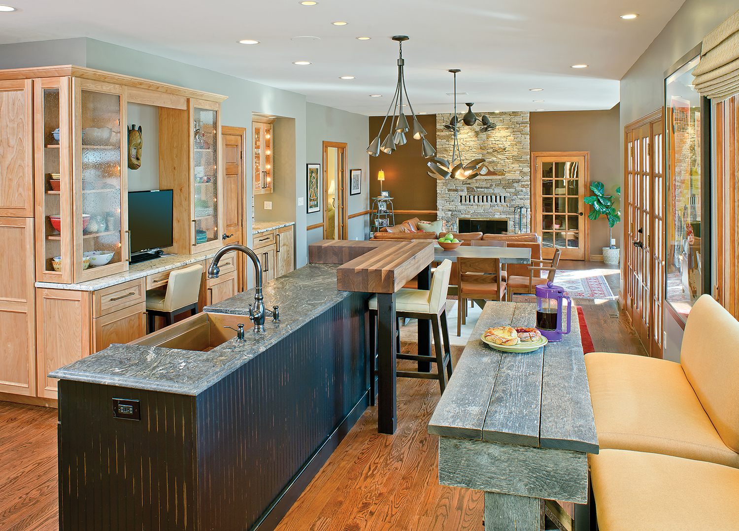
Though she admits that it was tough, they managed to find almost everything in the U.S., including wood counters from a small business in Detroit, a custom copper sink from Florida, drawer pulls made by a husband and wife in Colorado, and red birch cabinetry fabricated in Maryland. Even the oyster-toned bar stools are made in the U.S.A. And, in an online auction, Bruce found the Depression-era tin sign for Grape Ola grape juice that is inset in the range’s backsplash. It is the perfect complement to the kitchen’s patriotic commitment.
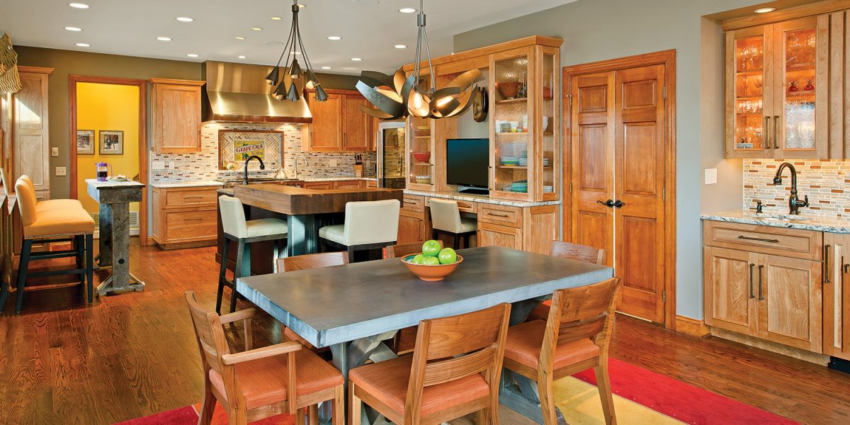
The new floor plan opened the space by removing the underused butler’s pantry, and a small window gave way to three large panes that take in the sweep of the woods outside. While you can still enjoy the view from the sink, it is now set into an island. A high, narrow bistro table constructed in the Kitchens By Request woodshop out of old barn wood sits beneath the windows, creating arena seating for culinary spectators. “I envisioned the [range] as a theater for Bruce,” Arnold explains. A new, glass-front refrigerator opposite the enlarged windows gives the illusion of a larger space.
The room has no one focal point, but rather provides different places for sitting and food prep so the experience of being in the kitchen is always evolving. Similarly, the kitchen is less about color than it is about subtle textures. On the island, for example, a walnut butcher-block counter contrasts against dark granite that is wire-brushed for depth and feel. The millwork is deep, boot black, but also brushed. “The wire-brush has a much more organic feel,” explains Arnold. “We used beadboard on the island for that Americana look.”
Another example of subtle textural change can be seen in the bar. The Gilarksys didn’t want guests diving into the main refrigerator to get drinks, so a closet was transformed into a wet bar. Unlike the other granite counters that have a smooth edge, the bar has a rough, rock edge. “There are little changes you see over time,” says Arnold, “that keep all the surfaces from being flat.”

“People feel comfortable when surfaces don’t feel plastic,” Arnold adds. “There are contemporary stainless-steel appliances for the gourmet kitchen, but that’s softened with the custom bistro table in barn wood and the textured layers.”
Perry Christian drove the selection of the colors, which lean heavily on gray-green, browns, and golds. The Gilarskys bought the large Olida poster to pick up the colors in the room with a little oversized drama. The backsplash features the same tones in glass tile made from recycled beer bottles and slate. The herringbone pattern sets the inset apart while the horizontal pattern mimics the color and pattern of the stacked-stone fireplace on the opposite wall in the open-plan family room. Zoned lighting on dimmers allows the Gilarskys to highlight artwork, seating areas, or prep zones depending on their functional or entertaining needs.
The cooking couple splurged on a speed cooker pot (in the island) that Corinne says makes “the most perfect lasagna.” And the 48-inch Wolf range has a charbroiler and griddle, as well as a wok ring. Yet the couple didn’t want to look at all the culinary baggage that comes with being gourmets, so there is storage for large, little-used appliances, like the mixer and ice-cream maker, and appliance pantries for everyday items.
The renovated kitchen, with its spirited touches, contrasts with an otherwise formal home. It’s a dichotomy Corinne says she and her husband like, and they appreciate the renovated space’s uniqueness. “People say you don’t get your money back when you do custom work, but we didn’t design the house for sale,” she explains. “This house is personal to us and we’ll be here for 15 or more years.”
Having said goodbye to children as they flew the nest, the new kitchen is the perfect place to enjoy the next chapter of their lives.
Resources
Design: Kitchens By Request
Copper sink: Rachiele
Stainless steel sinks: Franke
Lighting: Hubbardton Forge
Windows: Pella
Fixtures: Kohler
Paint: Benjamin Moore “Ashley Gray”
