Home & Living
A Galley Gamble
Fitting a new kitchen into an old house called for making something out of nothing.
When John and Mary Wynne Eisenberg moved to Stoneleigh 14 years ago, they fell in love with the charm of the neighborhood and their 1931 home. But those warm feelings never extended to the home’s narrow galley kitchen. In fact, Mary Wynne quips that “some of my worst memories” are of trying to cook for her 10-person book club with one oven in the cramped space.
But the challenge they face is not an uncommon one in Baltimore, where thousands of homes like theirs were built in the 1920s and early ’30s, but with tiny kitchens more reminiscent of the 1890s. But a simple redesign was not the solution—the space itself was the problem.
“We knew we wanted a better kitchen but the question was, how do we do that?” says John Eisenberg. There was simply not enough space to merely remodel the old kitchen and end up with anything functionally better. “Obviously, it was going to take some out-of-the-box thinking.”
A friend in real estate connected the couple with architect Peter Twohy, who understood that the Eisenbergs wanted a bigger space both for cooking and entertaining. “The kitchen was designed in the ’30s for that lifestyle,” says Twohy, referring to the fact that the very basic kitchens of the era were about function, not form—they were really just for food preparation, sometimes by servants, and not entertaining. “The goal was to keep the charm of the home but add a modern kitchen.”
The house is built into a hill and falls away at the back. Early on, plans looked at stealing space at the back of the house from a disused garage that sat below the grade of the main level. A previous owner had already borrowed room from the garage to build a closet and had oddly placed a full bathroom directly off the dining room. By the time Twohy arrived at the project, the Eisenbergs were only able to store yard equipment and lawn furniture in what was left of the garage, so sacrificing it entirely was not a hard decision.
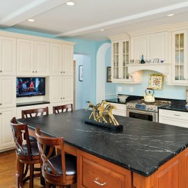
The redesign took the roof off the garage, reclaimed its foundation, and used some of the existing walls to define a new, two-story addition to contain both the kitchen and a master suite on the floor above. The only thing that remained of the awkwardly placed closet and bathroom were two arched doorways, which were kept for architectural interest and to create a pleasant flow from the kitchen to the dining room.
Twohy recruited Dave Rackl of Rackl-Christopher Associates and contractor Dale German II of D2 Contractors to build the addition.
“Dave and Peter asked us a lot of questions about how we cook, where we stand when we cook—the stuff you do day in and day out that you don’t think about,” says John.
Without question, the new structure needed to be respectful of the original home, as well as the aesthetic of the neighborhood. “I also wanted something light,” says Mary Wynne. “We’re from Texas, and living here we miss that light, bright look. We knew we wanted a lot of windows and for it to be an airy space.”
John, a sportswriter at
The Sun for many years who is now an author and columnist at baltimoreravens.com, had his own unique request: The island had to be large enough that he could read the newspaper—the real, paper newspaper—open and lying flat.
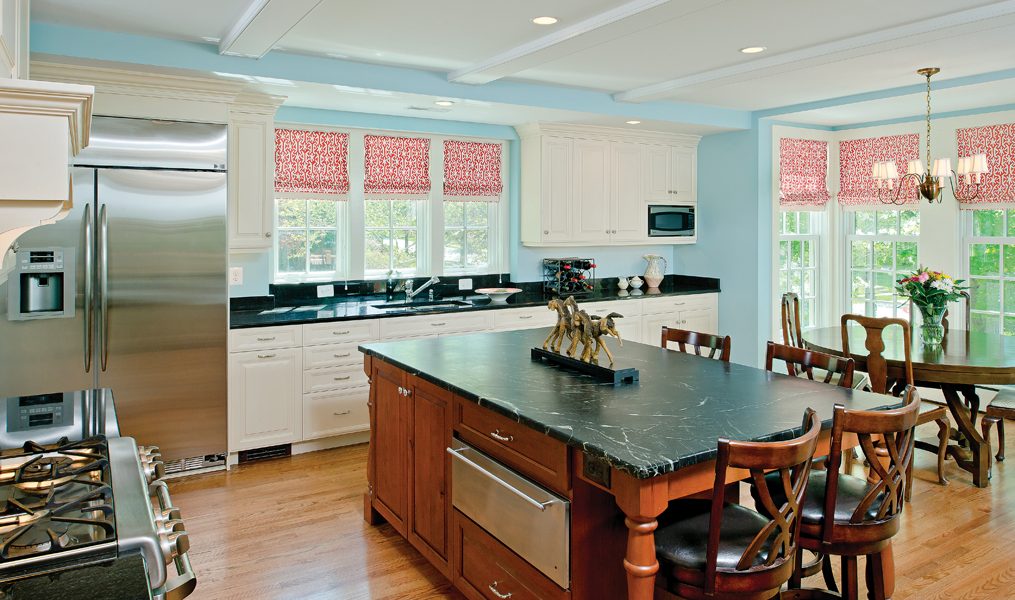
The completed kitchen is about 500 square feet with a work area close to the dining room and an eating and entertaining area situated in front of a large bay window. French doors bring in more light and open to a new, large deck. Twohy and Rackl worked together on the layout of the room.
“I started, as I always do, with the position of the refrigerator,” says Twohy, “trying to make sure it’s close enough to the work triangle, but doesn’t interfere with the cook if someone else wants to get into it.”
The sink was placed under narrow windows, selected to match the window shape used in the original house. The remaining wall could then be used for storage. A walk-in pantry was not in keeping with the age of the house and there was no room for it. Instead, Rackl crafted a wall of cabinets for storage that have a low crown to feel more proportional, like a piece of art.
“We didn’t want it to look like a room with a whole bunch of cabinets,” says Rackl. “We wanted everything to have the feel of furniture, like you see on the [kitchen] island, where there’s a turned leg.”
The island is honed from cherry and topped with a dark Brazilian soapstone countertop. A horse sculpture Mary Wynne picked up at a decorator show house separates the sitting area of the island from the meal prep area and pays homage to John’s many books on horseracing. Mary Wynne selected dark countertops, like the “Black Pearl” granite used on the kitchen perimeter, to balance the light, the white cabinetry, and the warm glow of the oak floors.
Wesley Finnerty, co-owner of Antique Exchange, helped the Eisenbergs select interior touches like the blue wall paint, a shade deeper and richer than the blue of the adjacent dining room, and the bright coral window treatments made from a Thibaut fabric. “I wanted it to pop and be happy, and that fabric was bright and happy without being juvenile,” Finnerty explains.
The large room begged for some form of ceiling treatment, and it was contractor Dale German II who suggested beams. Recessed lighting keeps the view to the backyard uninterrupted and draws attention to the singular chandelier delineating the dining space. Here, Finnerty chose a large round table with a dark, hand-rubbed finish for that Old-World look.
“I love a round table, as it promotes conversation and can make just one or two people comfortable, but can also seat up to eight people,” Mary Wynne says.
The eating area blends well into the working kitchen, but by dimming the lights, it can easily transition into a refined but casual dinner destination. “We just hosted a bridal shower and the house worked so well,” says Mary Wynne. “People sat [in the kitchen], in the dining room. It was warm enough that we opened the French doors, and people could sit outside—it just flows so well.”
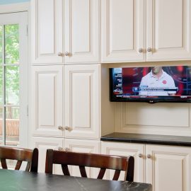
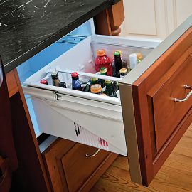
The opportunity to design a kitchen from scratch gave the Eisenbergs a chance to include little touches to suit their lifestyle. The couple can now watch football games when they cook. At the touch of a remote-control button, a flat-screen television drops down from the wall of pantry cabinetry. There is a drawer especially designed for spices next to the range, and a refrigerator drawer in the island for beers.
Finally, a pretty powder room was placed in space reclaimed from the old kitchen. But for the most part, the former galley kitchen was revitalized into something more appropriate to its 1930s proportions—a hallway.
After about nine months of construction and carryout food, the Eisenbergs were able to start using their new kitchen. They hosted a Thanksgiving party and report that the kitchen quickly became a popular gathering place. Especially in the winter, the sunsets through the bay window and leaf-less trees are spectacular.
“We don’t leave here,” laughs Mary Wynne. “We don’t even go out to dinner as much.”


