Home & Living
Style For Life
A Baltimore County home gets a makeover for an owner’s modern tastes and retirement needs.
A two-toned pink kitchen, dark rooms, and a foyer with cracked, pink-swirled marble floors are generally not strong selling points for a house. But Arlene Bekman liked that this particular home was in a gated community and on one floor so she could age in place easily.
Luckily, the 68-year-old retired assistant principal has an eye for potential, plus a team of professionals on speed-dial who she knew could help her transform the house from dark and dingy to contemporary and bright. So she bought it, stained carpets and all, and embarked on a 10-month renovation.
“The house was very dated, cluttered, and closed,” says Bekman. “I wanted it to be relaxed and open, a place where you don’t feel like you can’t sit on the chairs.”
Unlike the pink kitchen, which screamed 1970s, she wanted something timeless and airy. When she bought the one-level house, the kitchen, living room, and dining room were each separate spaces with little natural light. So she called Penza Bailey Architects, with whom she’d worked in the past, knowing they had no compunction about knocking out a few walls.
“The house had nice bones, but it didn’t meet Arlene’s aesthetic,” says Jeff Penza. “She’s always been very contemporary, and, with this project, she seemed to want to go even more modern.”

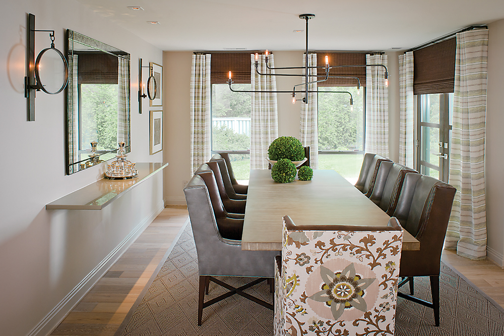
Sure enough, the solution was to start knocking things down. Dated built-ins in the dining room, for example, were demolished in exchange for a simple floating shelf. Then there were the walls.
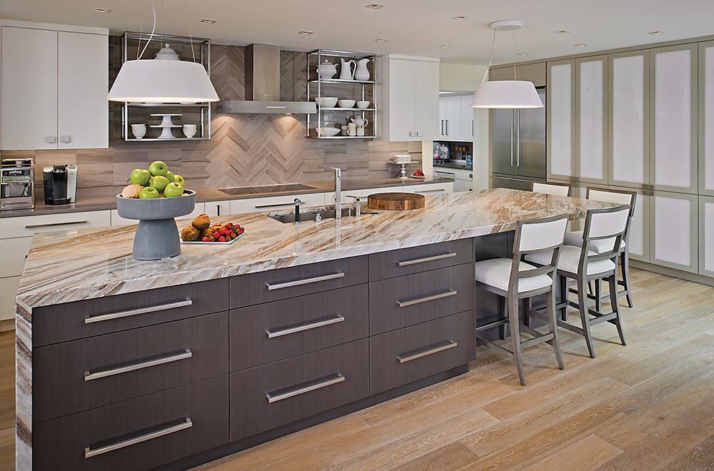
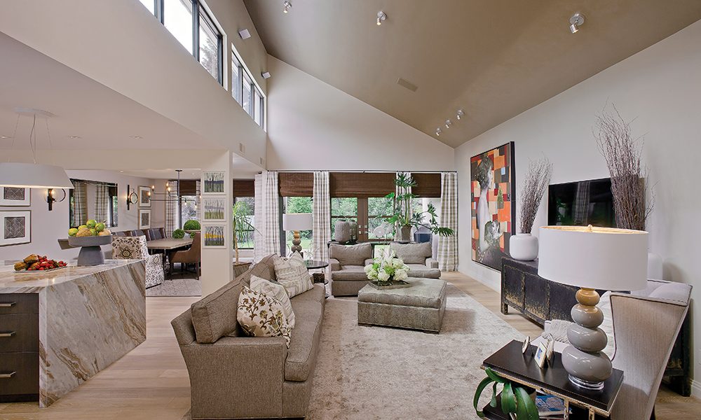
“We cut them away, leaving behind only what was structurally required,” says Dwayne Van Horn, the project manager and designer for Penza Bailey. Arnold Wallenstein, president of Artisan Renovations, helped execute a design that also introduced new windows into a clerestory that brings more natural light into the living area. Exterior metal sliding doors were replaced with swinging doors. In the kitchen, the architects reorganized the entire layout, placing electrical appliances against a wall and inserting plumbing into a new island.
With the dust now cleared, the kitchen, living room, and dining room remain separate, yet still relate very closely.
That new, oversized island, with its granite waterfall edge that stretches to the floor, became a visual anchor in the kitchen. “We thought about how this island could define the space,” says Penza. “It also presents something to the living room that’s not just cabinets.”
To refine the look, Bekman found the perfect interior designer practically next door in the form of neighbor Jackie Martin, principal of Jackie Martin Designs. Martin designed the kitchen backsplash’s interlocking pattern, which was executed in limestone, and the open shelving on either side of the range hood to maintain the open feeling Bekman envisioned.
“Arlene’s dictate was that she wanted the home to be contemporary, but not slickly done with a lot of shiny surfaces,” says Martin. “She wanted neutrals with a little bit of color.”

Martin’s design relies heavily on grays and browns. A large, gray sectional and oversized ottoman in the living room make this a comfortable space for Bekman to watch her smart TV or relax with her four grandchildren when they visit. A large piece of artwork from Renaissance Fine Arts, Chloe by Anke Schofield and Luis Garcia-Nerey, “provides the exclamation point” to the otherwise neutral room, says Martin.
Bekman says she wanted a fresh start in this home, so most furnishings are new, picked up at Shofer’s Furniture. Martin particularly likes the color-blocked side chairs in the dining room “because they add personality.” Thanks to the home’s open floor plan, the dining room gets plenty of use, so Martin selected an indoor-outdoor rug and chairs in faux leather, making it easy to clean up behind grandchildren.
Old carpeting and broken tile floors were replaced with wide-plank oak floors treated with a pickled finish. In the foyer, new doors allow more light into the home, and a large chandelier from Jones Lighting drops down, giving scale to the high ceiling. Martin also used a striking wall covering by Phillip Jeffries to create interest in the space. Made of hemp, it features a hand-studded custom pattern.
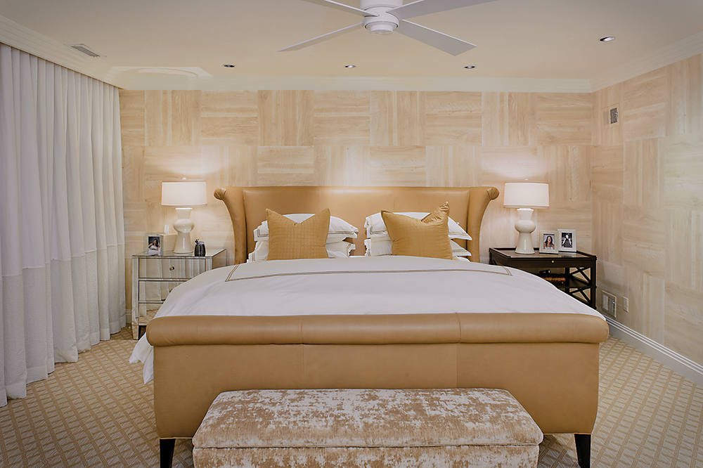
Unique wall coverings are a hallmark of this project. In the master suite, Martin asked the wallpaper installer to cut into rectangles the pale beige paper, which has white rubbed into the faux-bois pattern. They were then applied in a pattern like a parquet floor. In the den, Artstar Custom Paintworks painted the walls and window trim a jade green lacquer.
A powder room is always a great canvas for a touch of whimsy in a home, but the previous owners took that too far with bright orange walls in a room with a low ceiling. Martin used rectilinear shapes—which appear throughout the home and give it a calm, contemporary look—such as the wall-to-wall soapstone counter set with a basalt sink. Horizontal rectangular tiles on the walls create the illusion of height. Wallpaper and a narrow strip of mirrors on the ceiling make the room seem taller and brighter.

The master bathroom presented more of a challenge: A vaulted ceiling with a clerestory window brought in natural light, but it could also wreak havoc on the bathroom’s reflective surface. The lighting plan became very important.
“Trying to put in recessed lighting would make too much glare,” says Van Horn. “A large pendant light in the vaulted space makes the room glow and brings the scale down, too, introducing a nice architectural lighting element.”
Now the bathroom is a mixture of natural and high-gloss elements, like leathered marble on the walls and floors and a lacquered wood vanity. Subtle touches give the room its distinctly modern feel, like the vertical mirror inset flush with the marble, and faucets that stream directly from the mirror into square basins.
“The intent was to make something contemporary, but that could allow Arlene to age in place,” adds Penza, noting that the glass shower is wheelchair-accessible and all the clearances are designed for accessibility.
What began as a compartmentalized and dated home was transformed into an open and flowing one, with bright, warm, and contemporary spaces that Bekman can enjoy for years. Hers is a home not only about style, but lifestyle.
