Home & Living
From the Ground Up
A new build gives a couple a house that finally feels like them.
Homeowners Lisa and David knew they were ready to leave behind the Owings Mills house where they raised their three children. While it held good memories, the couple was not sentimental about jettisoning its center-hall colonial style.
“We always thought we’d build some day, but, with three children in private school, we had other priorities,” Lisa says.
So, looking to downsize, the couple, who asked their last name be withheld, cast a wide search net. “We looked at condos and rowhouses in the city, but nothing piqued our interest,” David says.
Plan B: They switched gears and decided to build from scratch, purchasing a private “flag lot”—real estate parlance for a parcel lying at the end of a long driveway—in Lutherville. The driveway is the metaphorical flagpole, while the shape of the lot is rectangular, like a flag.
They then enlisted the expertise of Peter Twohy of 2e Architects and interior designer Lela Knight to construct a new home that would be the complete opposite of their traditional former abode.
“When we first met with Peter, he gave us homework,” David says. “He gave us a questionnaire that got down to the minutiae of everything we did in the house, down to whether Lisa put on her makeup standing up or sitting down.”
After the exhaustive survey, meant to provide Twohy with clarity on their lifestyle and priorities, he asked that they look online and in magazines to find stylistic inspiration, which, for the couple, turned out to be a be a mid-century aesthetic. Lisa, whose father was a commercial architect, grew up in a home that had mid-century touches, while David discovered an interest in the designs of California-based builder Joseph Eichler and a passion for clerestory windows, a section of wall with windows above eye level. This was all good news to Twohy.
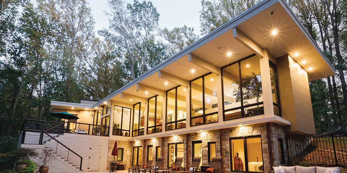
“The magic of this flag lot is it is significantly behind any neighbors and it’s a sloped lot, not good for a family with kids to set up a soccer goal, but perfect for an upside-down house with the main living at the entry level and more bedrooms at ground level with an exit to a pool,” says Twohy.
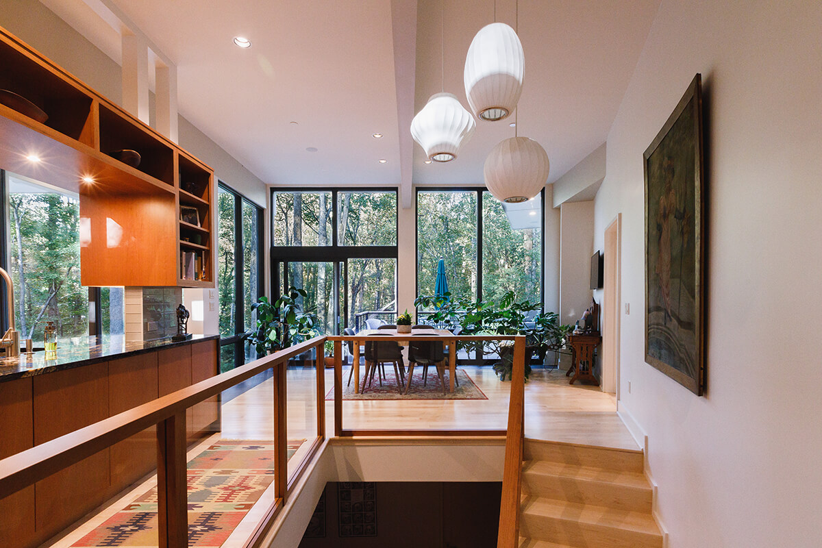
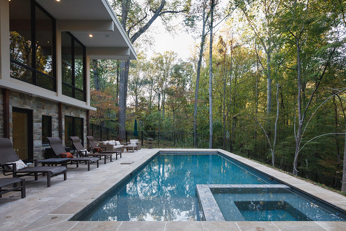
Lisa and David had a reasonable wish list: For one, they frequently entertain and wanted to be able to leave a mess in the kitchen and not see it when they host a dinner. They also typically have more than 20 guests for Thanksgiving, so they needed a large dining space and commissioned a custom table for that purpose.
In addition, each of the children needed a bedroom for extended visits, as only one child lives nearby, and they requested an elevator for aging in place.
Usually, Twohy creates detailed drawings, but they can be hard for laypeople to visualize, so he also used virtual reality this time around, enabling the clients to actually be “in” the house and move through it, creating absolute clarity of the end design.
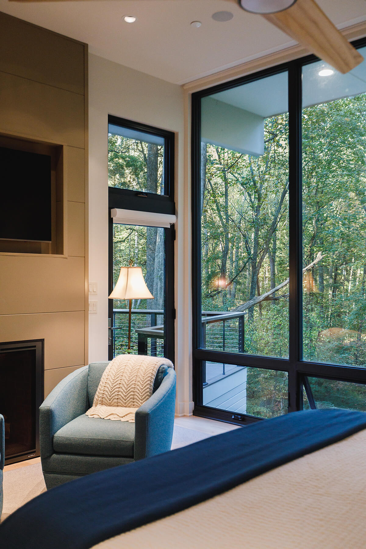
Twohy’s design nestles the 3,800-square-foot home into the slope. A master suite, kitchen, and living and dining areas are all at entry level, so the couple can live almost entirely on one floor. At ground level, there are bedrooms for the kids, a recreation area, and a workout niche, all facing onto the pool. Rather than ruin the home’s view with a deck extending across the home’s back, Twohy offset it.
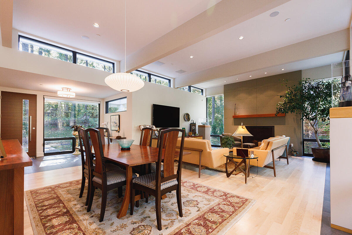
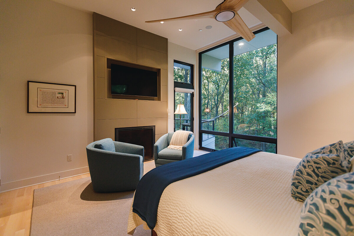
It was a tight buildable area, but nothing about the house feels cramped. On the contrary, it soars. Entering from the driveway into a foyer with eight-foot ceilings, guests step through into another world, a treehouse world, where the ceilings rise to 11 feet and a wall of glass looks out on woods and down on the pool.
Massive beams of a cantilevered roof, supported on only one end, shoot across the ceiling straight out through the glass windows, creating a 10-foot overhang, a feat of engineering genius, while the clerestory windows David wanted bring in more light while preserving privacy and creating a canvas for the couple’s artwork. The ceiling is uninterrupted inside, so Twohy sculpted the interior spaces with half-walls and floating cabinetry enclosing the kitchen and pantry.
David describes the house as a bit like the tent in a Harry Potter film: normal and unassuming outside, but an expansive magical otherworld inside. “People come in and literally stop and stare,” says Lisa.
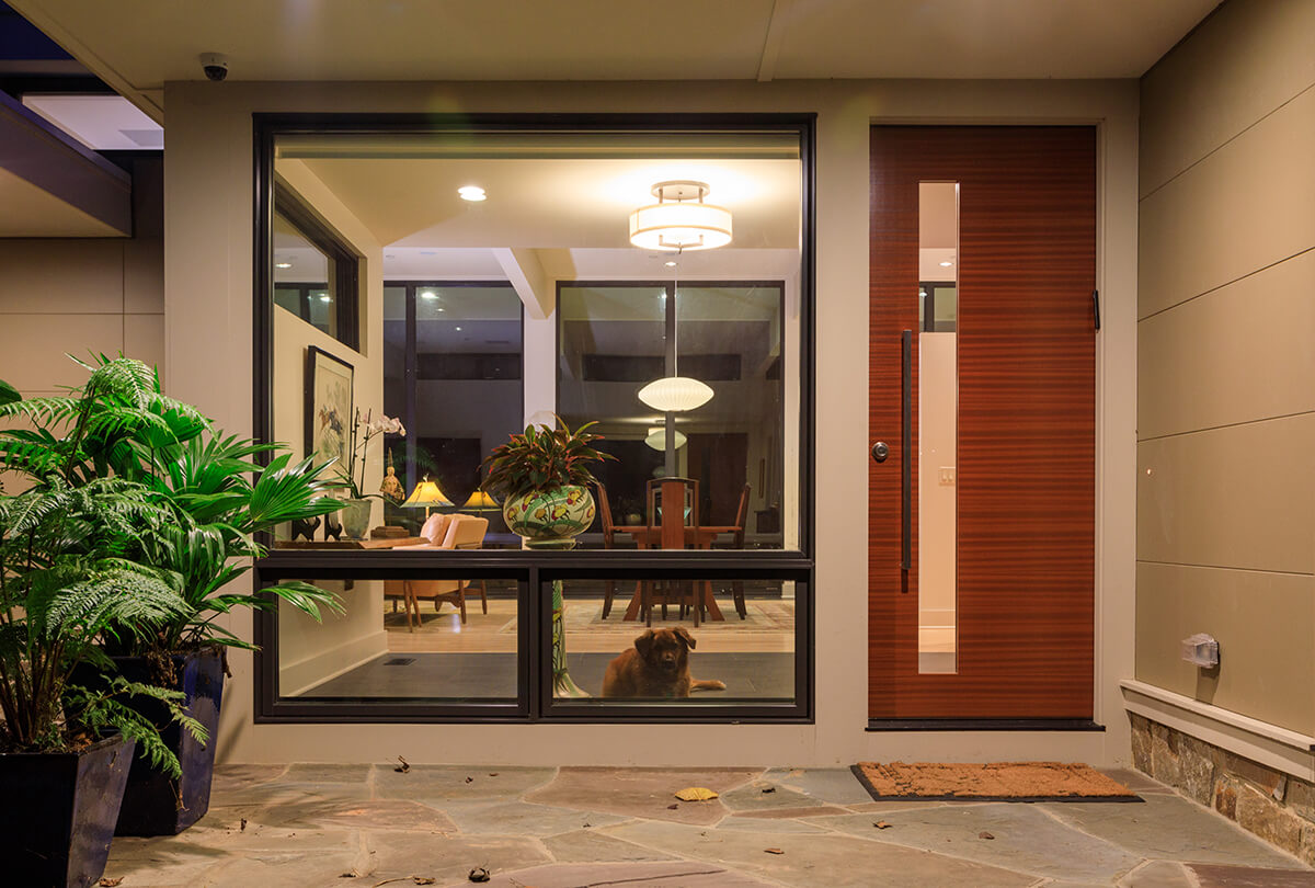
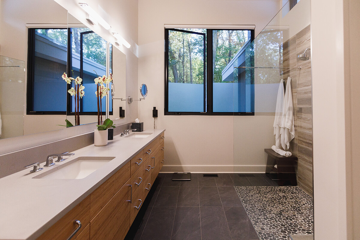
The exterior is stone and stucco. Nichiha panels are used on the interior and exterior, complementing the extensive glass while blurring the line between inside and out. Other rooms share this naturalistic vibe, like the master bath with its river-rock floor, blue slate porcelain tile, and disappearing glass shower wall.
“We wanted the house to be part of the exterior with clean lines that nestled into rather than dominated the site,” Twohy says, “so we used all natural and natural-toned materials.”
“When you walk in and see that view, it is so peaceful, so beautiful, it is all about nature,” says Lela Knight of Lela Knight Interiors. “Everything else is a backdrop.”
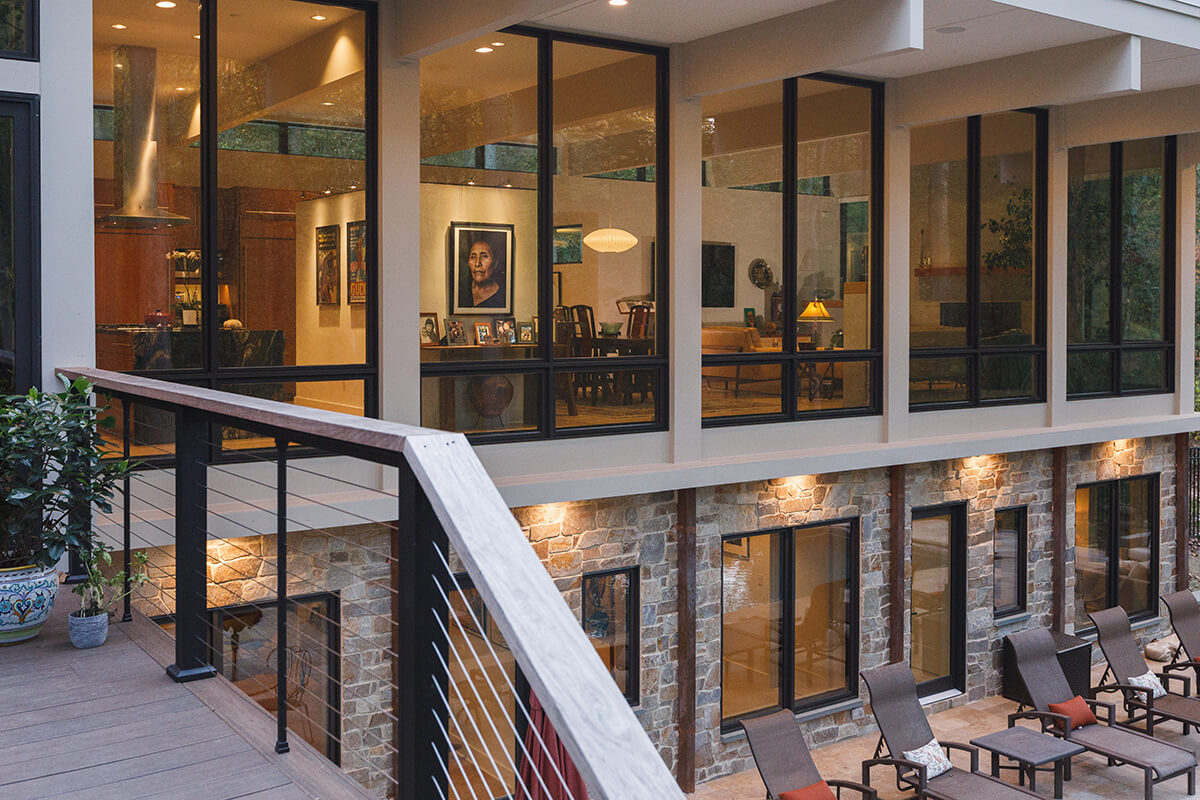
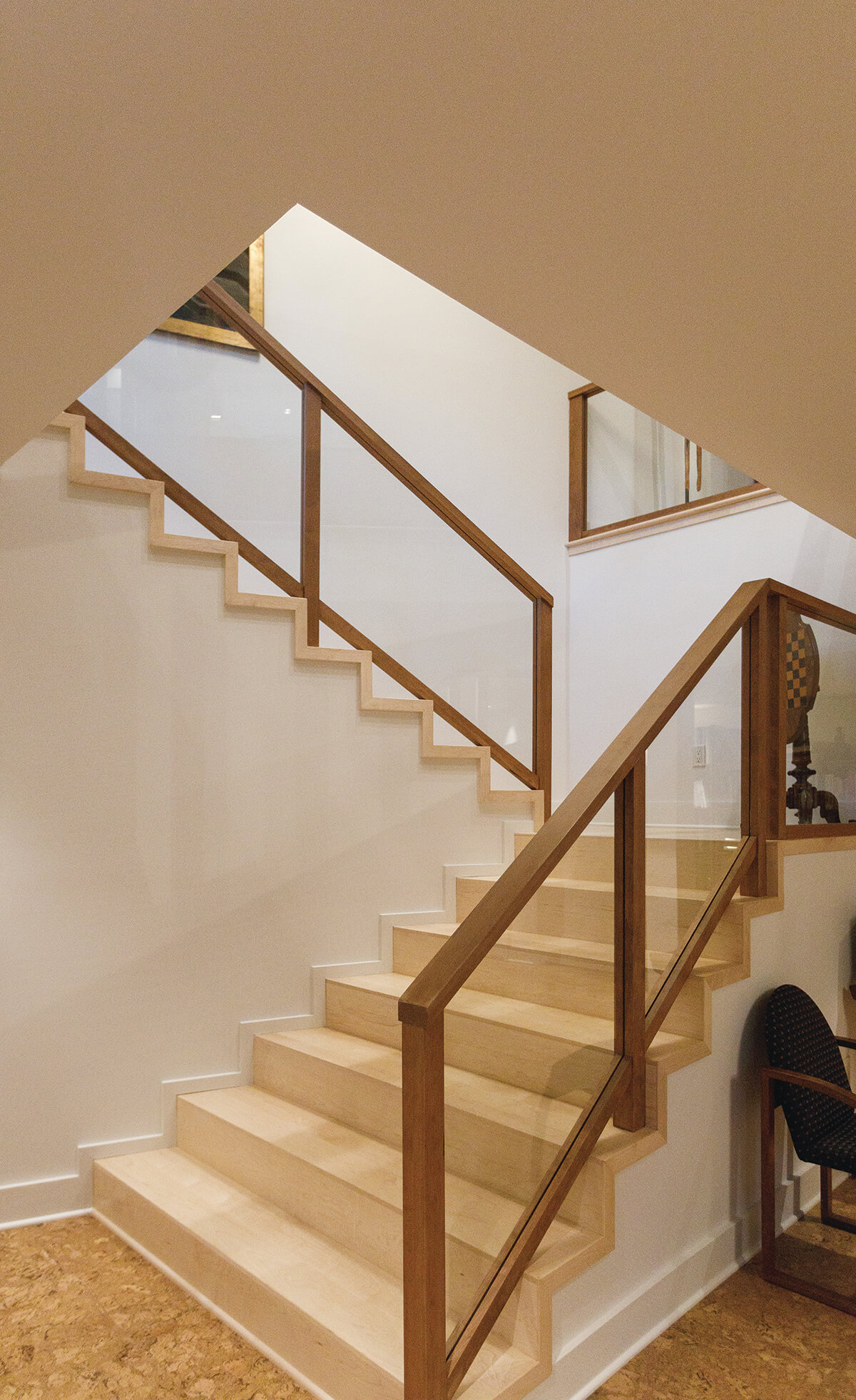
The entire home used only two paint colors. The floors are made of light-colored maple with a slate-toned porcelain tile trim bordering the entire main level, where the owners can keep their extensive collection of houseplants without fear of damaging wood floors. The ground-level floors are cork and the home operates on a geothermal system.
Much of the furniture and the couple’s extensive collection of art, rugs, and collectibles came from the previous home. Knight says she enjoyed the process of curating their belongings.
“There’s a nod to mid-century modern in the split-level feel, and in certain light fixtures, like the George Nelson bubble lamps,” she says. “Some pieces of furniture, like the custom dining-room table, have a Frank Lloyd Wright feel.”
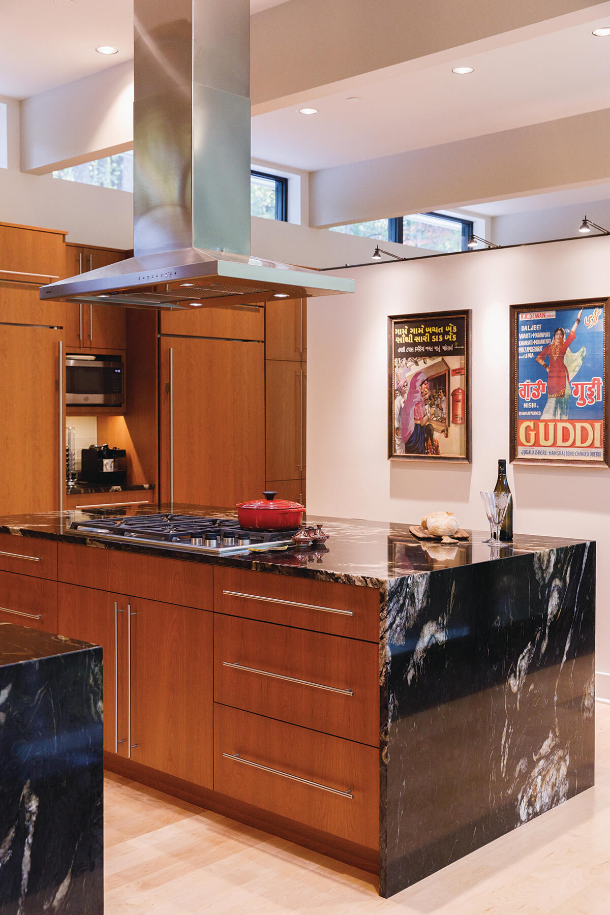
Twohy and Knight are both enthralled by the kitchen, which features floating double- sided cherry cabinetry. The island, with its double waterfall edge in “Cosmic Black” granite, sits like a sculptural monolith.
“David spent hours driving around looking for just the right slab,” says Knight. “He really was passionate about it.”
David was also adamant in his dislike of downspouts. Builder F.C. Batton & Son provided a solution, encasing the downspouts at the glass height so they become part of the structure, then dropping them into copper lines that are buried and carry water away from the house underground.
Twohy and Knight agree that the owners’ interest in the design process and the collaboration that ensued was remarkable. In fact, the group became friends. Pre-COVID, they started a supper club that, in the pandemic, morphed into an online game night. The couple also successfully hosted one large Thanksgiving before COVID-19 paused their entertaining. Yet the pandemic was not all bad news.
“We live in this house so comfortably and we were fortunate to have it during the quarantine, especially when two of our three children returned home for extended stays,” says Lisa. “It was an unexpected windfall to have that time with our children as adults.”
“The biggest compliment I can pay this house,” she continues, “is that though I was hesitant to leave our family home and those memories, we don’t miss it at all, and neither do our kids.”
Architecture: 2e Architects Interior Design: Lela Knight Interior Design Builder: F.C. Batton & Son Structural Engineer: Sweeney Engineering, P.C. Kitchen Design: Rackl Christopher Associates Pool Design: Paradise Pools Custom Furniture and Mantels: John Landis Cabinetworks Granite: Rock Tops Fabrication Landscape: Tannenhof Horticultural Services Cabinetmaker: Dreamwoods Limited
