Home & Living
In Living Color
Modern meets midcentury in the Burkom family redesign.
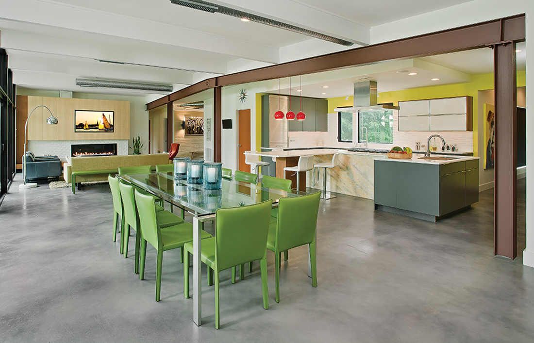
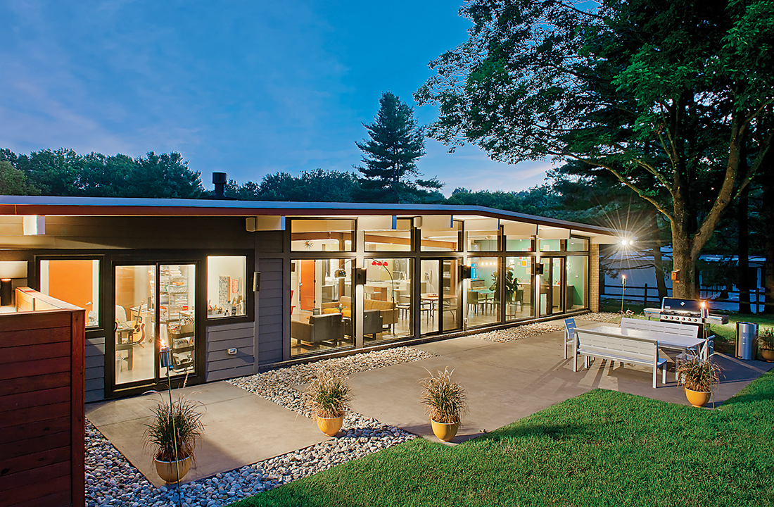
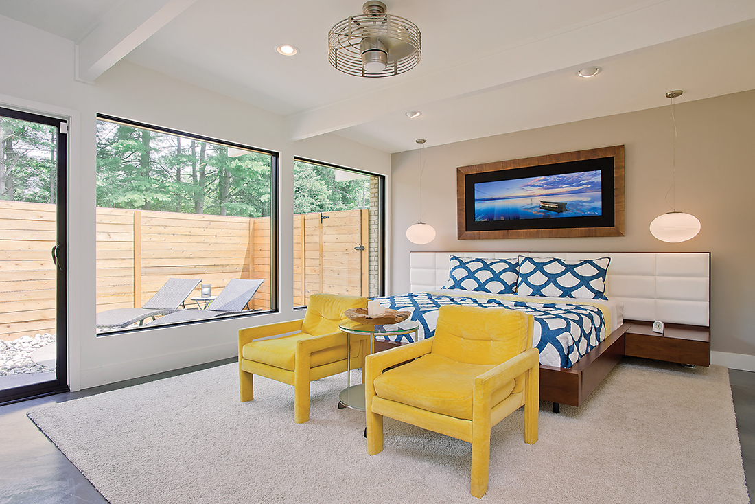
There are no drapes in Ken and Andrea Burkom’s 3,900-square-foot, one-story home. Instead, in the master bedroom and bath, wood-fenced courtyards provide privacy while extending the rooms’ visual boundaries and bringing in light and a sense of nature. And in the main room, a 48-foot-long wall of floor-to-ceiling windows blurs the line between the modern interior and the tree-lined yard.
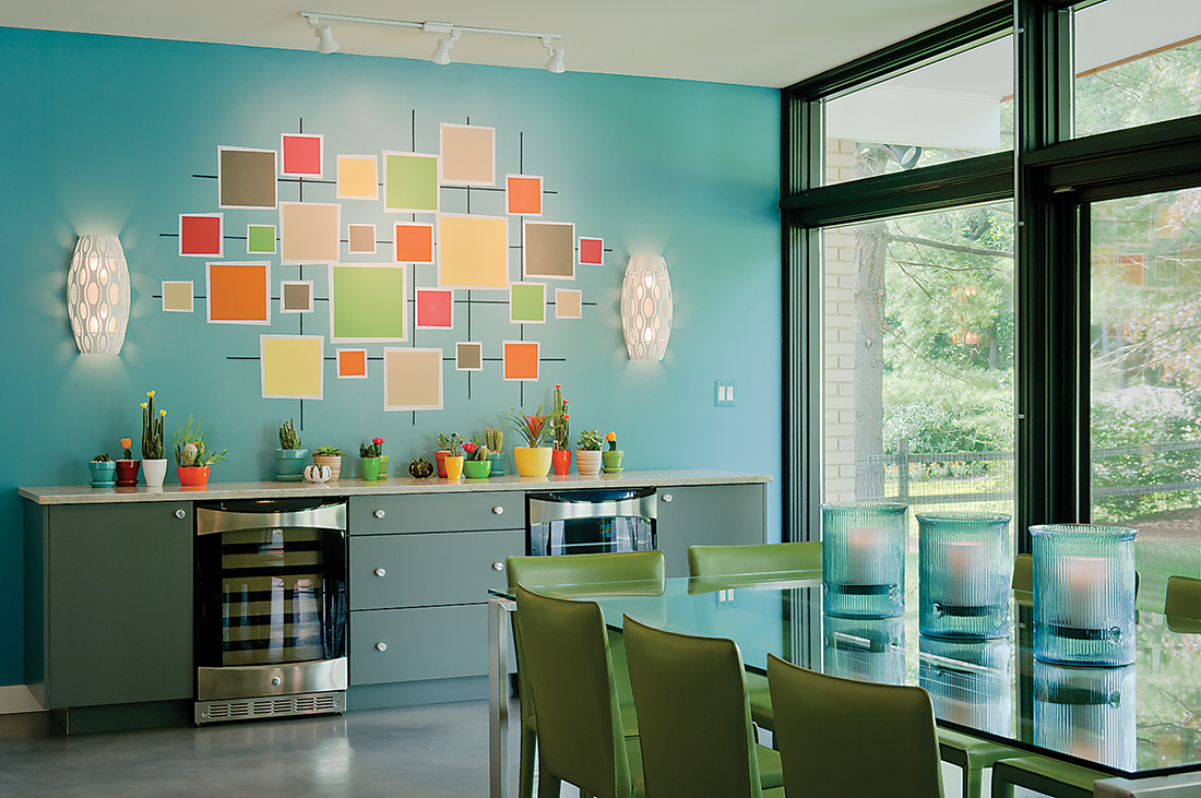
To liven up the austerity of the simple design, vibrant pops of color (think orange doors, cherry-red light fixtures, and an abstract, Mad Men-style wall mural) punctuate the living spaces and incorporate the family’s personality into the simple midcentury aesthetic.
Before moving into this home in July 2014, the Burkoms lived in a custom home in Reisterstown that Andrea had designed from the ground up. After 11 years, the couple hoped downsizing and moving closer to the city would make life easier for them and their sons, TJ, 13, and Casey, 9.
“We wanted to live closer to everything, to be more centrally located to our lives and our kids’ lives, to simplify through one level,” Andrea says. “We also wanted to simplify by having a slightly smaller but more useful space, where we use every single square inch, instead of having rooms that we don’t use very often.”
That was when they stumbled across the distinctive community of midcentury-modern homes off Stevenson Road in Pikesville, built from the 1940s through the 1960s by developer Gordon E. Sugar. While each home is unique, they share an emphasis on natural light and incorporating the landscape—most are single-story homes with a nearly flat roof and a long wall of floor-to-ceiling windows.
When the Burkoms first saw the property, it didn’t take them long to decide it would be their next abode. “We walked around for 10 minutes and I told Kenny, ‘This is it, this is the one,’” says Andrea, an artist. “It’s not exactly that we were looking at what was there at the time, it was more about the vibe it gave me, the instinct.”
Visualizing a home’s potential can be tricky, says Peter Twohy of 2e Architects, whom the Burkoms hired to help them open up the floor plan and breathe new life into the design. Structurally, the couple removed a wall and bulky fireplace enclosing the kitchen, replaced the carport with a storage area and temperature-controlled two-car garage, added a gym and art studio, and designed an addition for their sons that includes two bedrooms, a study area, and their own laundry room. Aesthetically, however, the project was a carefully considered back-and-forth between Andrea and Twohy.
“We had a very unique relationship,” says Twohy, as he and Burkom stand in a hallway between the pantry’s chalkboard barn door and a supersized painting of the family’s English bulldog, Ozzy. “Every client dictates what happens aesthetically, but she was much more than that. The interior designer on this project was you,” he tells Burkom. “You selected every single color.”
Because her personal tastes can stray from eclectic to modern, Burkom devised a system to stay true to the playful, midcentury-modern aesthetic she and her husband envisioned. A manila folder with colors and inspirational photos served as a guidepost. “If I was looking at something to use in the house, I had to run it by my checklist,” says Andrea. “And if it didn’t fit, it was out.”
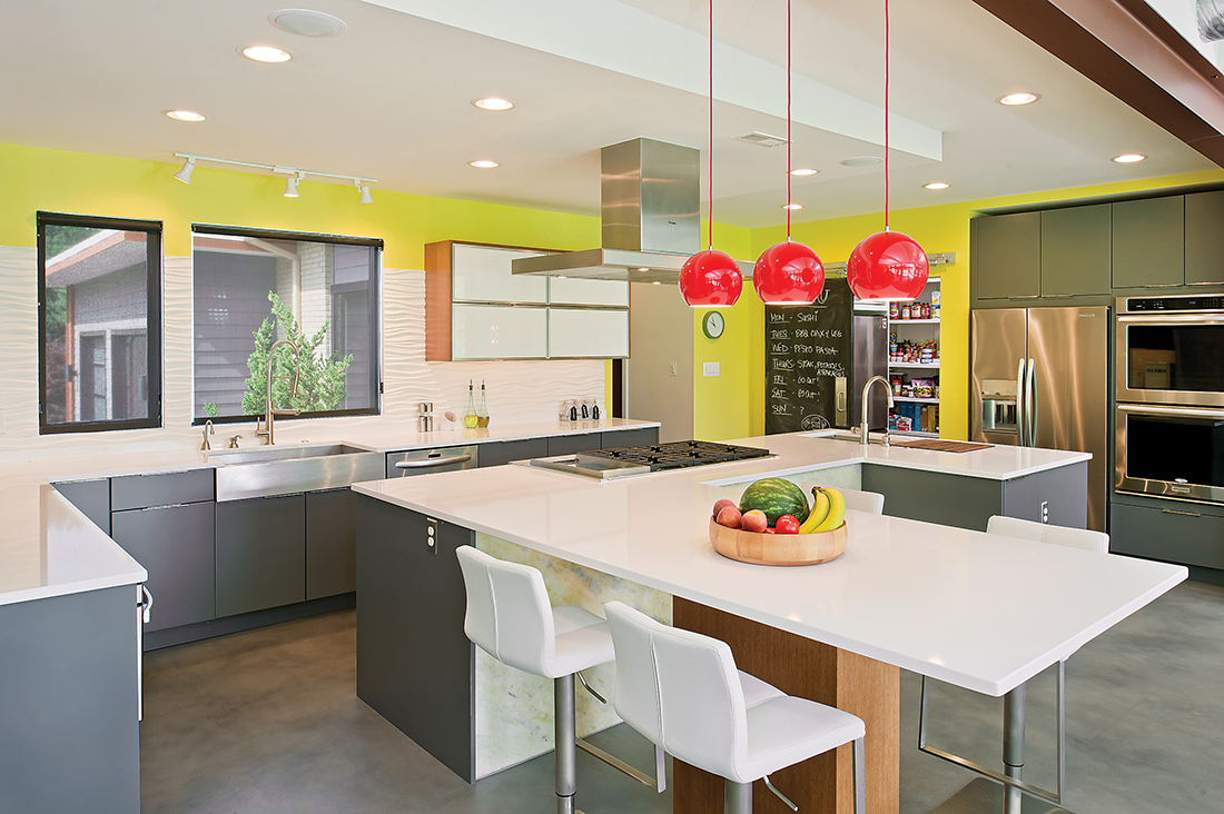
Twohy emphasizes that there’s more to design than beauty. “A house is a machine that people live in,” he says. Twohy’s designs are meant to be as logical as they are visually appealing. For example, the Burkom home’s garage opens up to a mudroom, which continues to a bathroom, pantry, and kitchen. “The kitchen is the heart of the house,” he adds.
And to make that heart visible, they removed a load-bearing wall separating the kitchen from the open feeling of the main dining and living room. “We’re always striving for beauty, but, for me, the beauty is meaningless if it’s not functional,” says Twohy, as he points out the kitchen’s more practical elements. A deep drawer by the stove hides away spatulas and whisks. The dishwasher is adjacent to the sink for convenient cleanup. “It’s easy to live here,” he says.
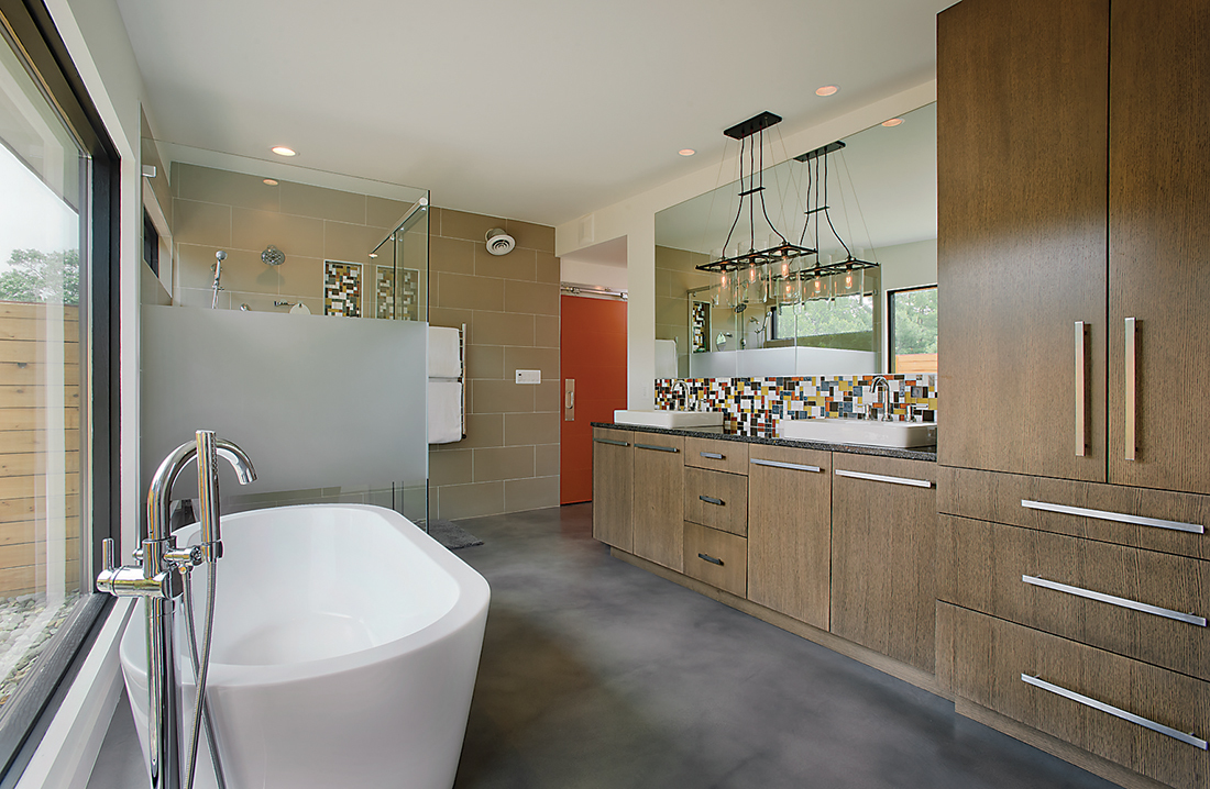
Designing her prior home from scratch gave Burkom the perspective to see what is needed for simpler living. Although their current home is 1,000 square feet smaller than their last house, the thoughtful design makes the lost space almost unnoticeable. “There’s a place for everything,” says Burkom. One way she made things easy was by installing concrete flooring throughout most of the home. “They kept asking me about the floor, ‘Are you sure you want the concrete in your closet, in your bathroom?’ I was like, yes, I want to simplify. I didn’t want a different floor in every room.”
Like construction in any half-century-old home, Burkom and Twohy encountered a few surprises. “Time and again, the house presented challenges, and we would come up with some sort of a solution,” says Twohy. For example, when elevating the ceiling in the entryway, they discovered that the brickwork on one wall didn’t extend to the ceiling. The pair considered a few solutions, including faux painting, but in the end decided on simple, white drywall and added an oversized transom window to maximize the added height. “I’ve trained myself to say, ‘Here’s an opportunity to reinforce the design,’” says Twohy. A tall, narrow window beside the door allows the eye to flow along the brick wall from inside to outside, making the space seem to extend beyond its boundary, a design principle famously used by architect Frank Lloyd Wright.
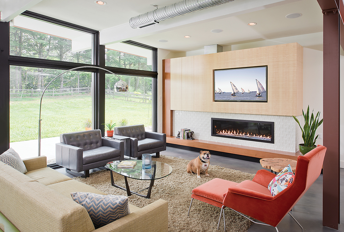
Sitting on the living room couch, Twohy points out how interior-design elements allow the open great room—which encompasses the dining room, kitchen, bar, and living room—to feel intimate. “It’s an interesting trick to make the space work for 50 and for two,” says Twohy. Controlling ceiling height and creating rooms without walls help to achieve the effect. And the space required special attention while decorating, too. “You have to really use restraint, because you can see everything at once,” adds Burkom. “It was a challenge.”
After going from concept to finished home, and living in it for nearly six months, the Burkoms are happy with the finished product.
“You see the result of a thousand great decisions,” says Twohy, “and it’s fun to see that.”