Home & Living
Clean Slate
Risa Alberts talks about her kitchen rehab in her mid-century modern Stevenson split-level.
Back to the Future: I would say my home aesthetic is European modern.
Separation Anxiety: The kitchen was divided into two halves, with the eating area on one side and everything else on the other. We wanted to open up the space because there wasn’t enough storage or counter space.
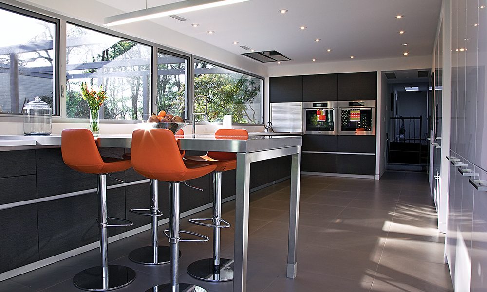
Let There Be Light: This architectural style typically has long, rectangular windows, so we knocked out the whole wall so that the windows ran the full length of the wall. It makes it feel like an indoor/outdoor type of room and seem even bigger than it is.
Euro Trip: We realized we wanted to use a European cabinet company because of the materials they use and the way that they finish everything. We’ve used an architect named Janet Bloomberg of Kube Architecture in D.C. for a couple of different things over the years, and she suggested the Italian company Pedini.
Hidden Objects: One of the Pedini principals, whose name is Roy Wellman, helped design the space. He sized them so you wouldn’t know what was behind each cabinet. My refrigerator, trashcan, and dishwasher are in lacquer so you don’t know what function is behind each.
Orange Is The New Black: The orange chairs by SohoConcept are counter length. We wanted to add a splash of color, and the stools were the way we chose to bring that in.
Galley Chic: The kitchen has a professional feel while still being residential. I like the fact that it’s not laid out the way most kitchens I’ve been in have been laid out. But it’s also incredibly functional.
Sunny-Side Up: This room is located on the south side of my house, and it’s just the sunniest and nicest room in the house. We all just want to be in the kitchen all the time because it is so cheerful and beautiful.
