Home & Living
The Diplomat's Son
Inside writer and graphic designer Taylor Hubbard’s Mount Vernon carriage home.
FAMILIAR TERRITORY: I’ve lived in the house next door for eight years now and I bought this property right next door two years ago.
FOREIGN EXCHANGE: I am a D.C. native but I grew up all around the world because my parents are diplomats. I’ve lived in Europe and Asia, places like Paris, Tokyo, Manila, and Kuala Lumpur. Living in very design-oriented cities and spending time in museums growing up, my aesthetic is ancient-meets-modern. I like the combination of the very old with modernist sensibilities, which is different than contemporary.
LIFE OF THE PARTY: Tyson Street has a really amazing history. In the 1960s, it was sort of the Haight-Ashbury of the area so I have hippies come by and tell me stories about “Mama Cass” Elliot, Janis Joplin, and Frank Zappa partying here.
FIXER UPPER: People always fall in love with this street, but it’s another thing to take on one of these houses. It takes a certain amount of stewardship—they’re small, they’re funky, they’re old, and things go wrong.
PATIENCE IS A VIRTUE: Really, from a design standpoint, the house dictates the design and you can’t impose a suburban vision on it. You have to work with what you got and that takes a certain kind of temperament.
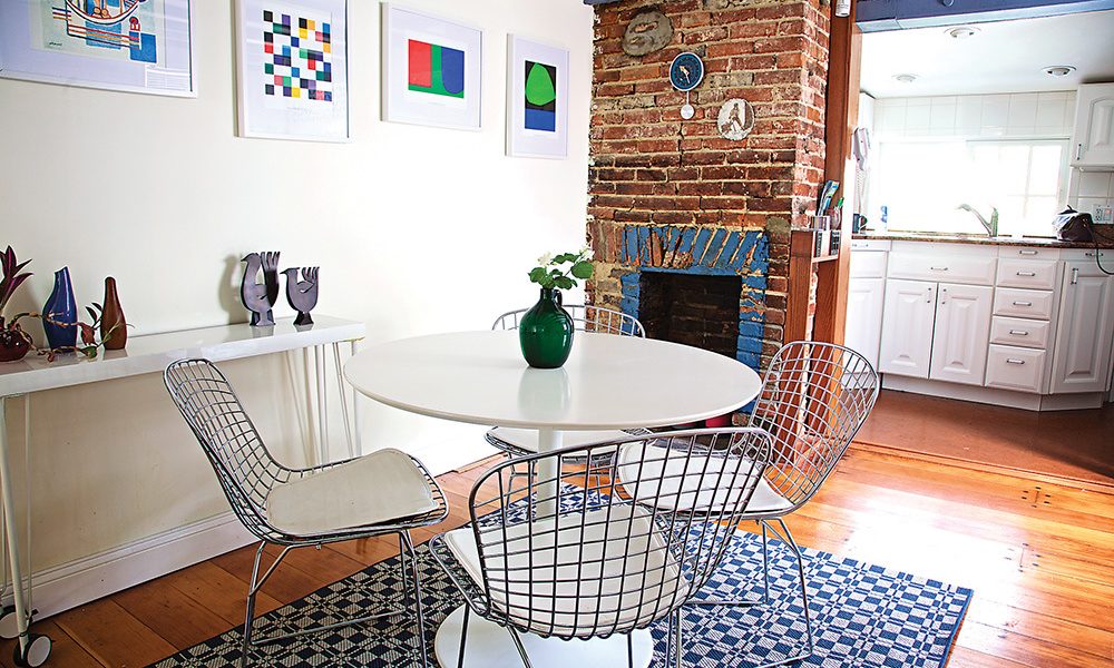
KEEP IT LIGHT: Often the design instinct with a 230-year-old house such as this is to fill it with period or heavy furniture. My goal was to demonstrate through editing and selecting bright appropriately scaled statement furniture that the ancient and modern can work in harmony and be functional for the 21st century lifestyle.
ROOM AND HOARD: The running joke amongst family and friends is that I needed two houses to hold all of my “proclivities,” as my dad terms it. I’ve been collecting art, crafts, and furniture since I was a child and definitely needed the extra basement space.
MIX AND MATCH: I made the side table myself from the leftover parts area of IKEA. I chose bright lithographs from an Ellsworth Kelly folio and framed and mounted them in white to pull a controlled graphic punch.
TRICKS OF THE TRADE: I’ve definitely applied “tricks” I’ve learned as a graphic designer. The modernist screen concealing the fridge was cut out of PVC and allows light to flow and adds a graphic element.
A LITTLE GOES A LONG WAY: I have good design karma and a particular eye and will not pass up an opportunity. My most important rule of thumb is to only acquire objects I personally respond to and ones that tell a story. A small hand-crafted ceramic vase can go for miles.
